Interfaces - Screens & Events
SCREENS
Screens are applications User Interface. Screens helps in building the user interface for your application that are used to provide the inputs and responses. Screens are a part of Interfaces in Explorer pane.
Screens Overview
In this section, we will have a look at the general features available in screens. As and when an application is created, there will be a screen created by default called Home Page under Interfaces. You can rename & use the same screen for creating application to start with & then keep adding new screens on top of this as per requirement.
On the left of screen canvas, right below Explorer pane, is the Palette section with the list of screen elements that can be used to configure application's screen and, on the right, will be the canvas where you can add screen elements and build application’s UI. More details on screen elements will be explained in screen configuration section.
Screen Details
When a screen gets created, you will get screen details section on the right side of screen canvas. This section includes, Name, On Load Event, Height and Width, Full screen check box and Settings.
Name- This is the name of the Screen which was provided while creating the screen. You can also modify the screen name at any point during development if desired.
On Load event- On Load event is a field where you can choose to load a frontend event automatically whenever user navigates to the current screen in deployed application. This field will have list of events created under Interfaces - Events. You can choose the desired event from this list.
Height(px) and Width(px) -You can modify height of the element by changing value in Height field and modify the width of element by changing value in Width field. By default, Height and Width is set to 1920 and 1080 pixels respectively.
Full Screen checkbox- This is used to view the screen in full screen mode. It is unchecked by default. If user checks this checkbox, the current screen will appear in full screen mode.
Settings - Enabled Toggle - This feature allows users to temporarily deactivate a screen within PIES studio. All the screens will be enabled by default and you can disable the screen if required. When you disable a screen, that particular screen will not be considered during application build or while deploying your application. This functionality is valuable when you want to pause or temporarily halt an event for various reasons. For instance, if you want to debug the created screens, you can try disabling screens one after the other to conclude on the screen that’s causing issues in development. Unlike deleting a screen, disabling does not result in permanent data loss. Screen details and settings will be retained, making it easy to reactivate the screen, when necessary, without re-entering all the information.
o For your application to run as expected, you need to make sure all necessary screens are enabled. Enable & Disable is an auto save feature. Whenever you
o Turn on or turn off the toggle switch, changes will be saved automatically.
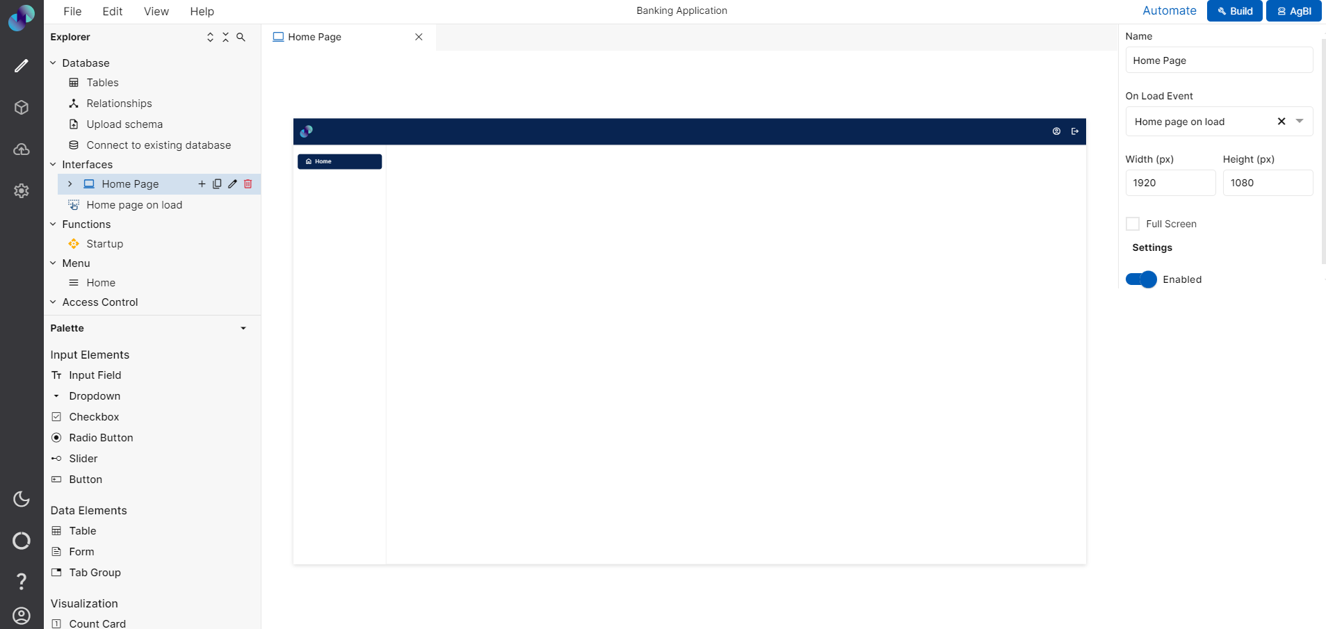
Fig 1: Screen Details
Screen Details
Screen Configuration
In this section, we will see how to add screen, edit screen, duplicate screen & delete screen. You can also check this section on available icons/options against screens.
Add Screen
To create a new screen, you can click on monitor icon which can be found next to Interface option on Explorer pane or you can also choose New Screen under File section.
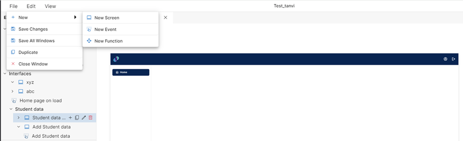
Create New Screen via File
When you click on new screen option from File section, you will get an add screen popup to provide a Name to your screen and a Description.
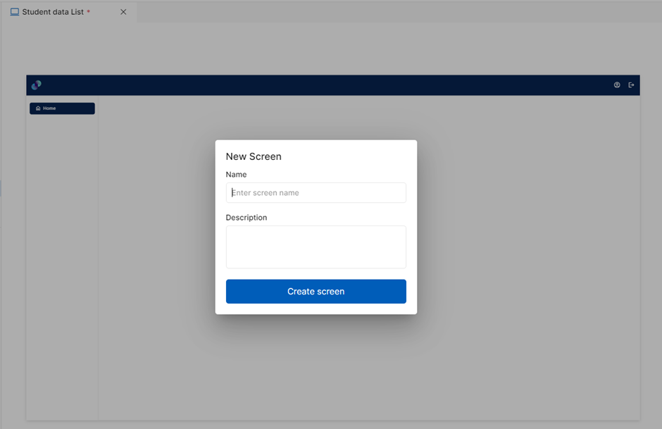
Fig 2: New Screen Popup
When you click on monitor icon next to Interface, a blank text box will appear and user can provide a screen name by typing keywords in the text field. After entering desired keyword, press enter key. A new screen will be created.
Create screen via clicking on Monitor Icon
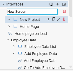
Fig 3: Provide Screen name in the text field and press enter
We suggest simple & straightforward screen names, so it becomes easier for other users in the organization to understand application’s flow.
Once a screen is created, you will get a blank canvas on the right. In this canvas, you can drag & drop screen elements based on the screen you create. Make sure the size of widgets used are aligned with the screen size.
Edit Screen
If you like to use an existing screen or the Home Page screen which was created by default, you can click on pencil icon which can be found next to screen name under Interfaces. When you click on pencil icon, the text box becomes editable and you can change the existing name to desired name of your choice. Once you rename, you can press enter key and you will see a success message on top of the explorer screen.
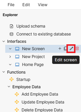
Fig 4: Edit Screen via Pencil Icon
You can also edit the name by renaming/entering Name in the screen details section in the right side of the canvas and then click on Save Changes from File menu.
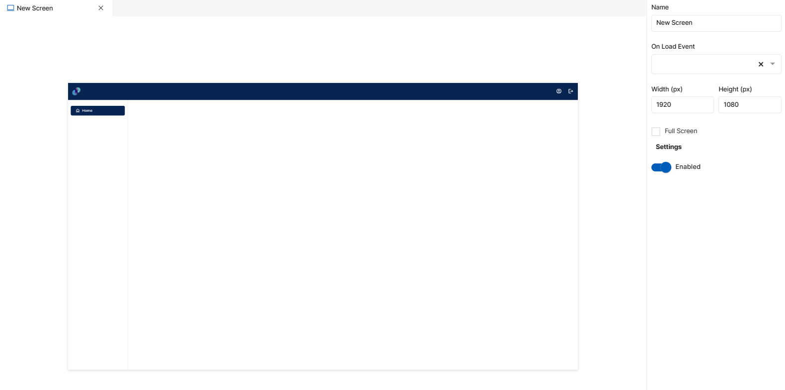
Fig 5: Edit File via Screen details and Save Changes
Delete Screen
To delete a screen, you can click on delete icon present next to the screen name under Interfaces. You will get a popup to confirm deletion. Click OK to proceed or click Cancel to go back.
When you click Ok, current screen will be deleted and will no longer appear in the screens list.
Important Note: If there are any events associated with the screen that you are deleting, on clicking OK the events associated with the screen will also be deleted.
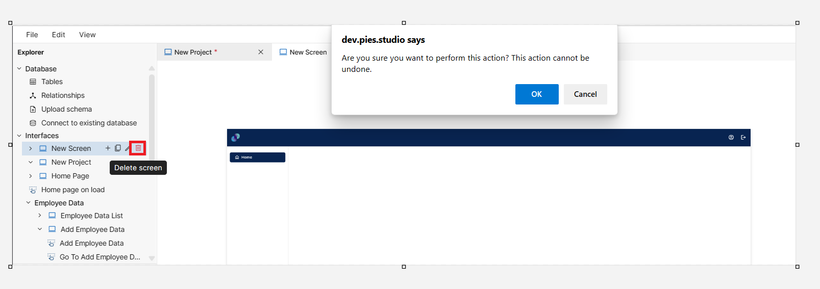
Fig 6: Delete Screen
If the screen you are trying to delete is mapped to a menu item, you will get a popup called Cannot delete *Screen Name* & you won’t be able to delete the screen. To delete this screen, you need to delete screen mapping or delete the menu item under Menu in Explorer. Please refer Menu section on how to remove mapping or to delete menu item.
Duplicate Screen
To duplicate a screen, you can click on Duplicate option under File. The screen will be duplicated as it is with all the screen elements & it’s configuration without any changes.
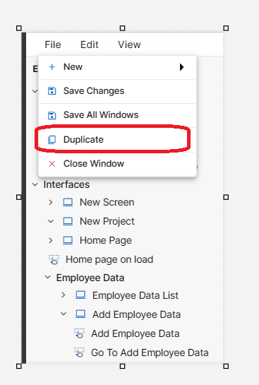
Fig 7: Duplicate Screen via File
Screen can also be duplicated using duplicate screen icon which can be found next to the screen name under Interfaces. You will get a popup to confirm duplication. Click Ok to proceed or click Cancel to go back.
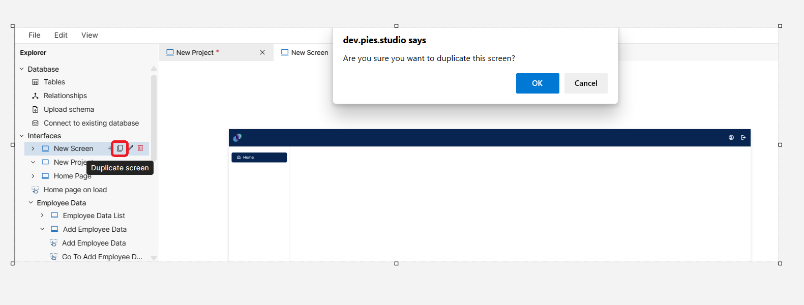
Fig 8: Duplicate screen via Duplicate screen Icon
When you click Ok, current screen will be duplicated as it is with all the screen elements & it’s configuration. You will get a success message stating Screen duplication successful.
Duplicated screen will appear at the end of existing screen list with the original name suffixed by copy. You can go ahead and modify the duplicated screen as desired.
Screen Elements
We have four different screen element categories.
Input
Data
Visualization
Visual
Input
PIES Studio offers six different element types to capture end user input. These elements can be placed on the screen canvas by dragging & dropping the desired element in desired location on the canvas. More details on Input elements are described below:
Input Field
This element can be used inside a form element or can also be used directly in plain canvas. Only difference is, if placed outside form, you won't see any form field under properties panel to map the element with application’s database. So, you will have to configure the element manually. If you want to use input field inside form, first drag & drop a form element on the screen canvas and then drag & drop the input field element inside form.
Input Field is used to capture various types of data like alphanumeric, numeric, date, or binary objects/ files etc. This element needs to be configured before using it in the application. Configuration is as below.
Properties
Input field configuration is done through Properties panel. Below are the attributes under properties panel that can be configured as desired:
Element ID - This is a unique id given to each element. This id will be used to identify the screen elements when used in other modules like events. By default, element id will be the element type. When more than one element of its type is placed in canvas, element type will be followed by unique identifier. The element’s value can be accessed using $<element_id> in desired event.
X-Coordinate- Instead of aligning the element in canvas, you can also change the x coordinate value in X-Coordinate field to adjust x axis
Y-Coordinate- Instead of aligning the element in canvas, you can also change y coordinate value in Y-Coordinate field to adjust y axis.
Height-You can modify height of the element using cursor in canvas or by changing value in Height field
Width-You can modify the width of element using cursor in canvas or by changing value in Width field.
Form Field - This is a dropdown field with list of all columns present under selected form's data table. This field will appear only if input field is dropped inside form element.
Hint Text - Hint is a help text to be displayed by default in the input box to end users. Depending on the selected form field, Hint will automatically appear. If developers intend to change the auto-populated hint text, they can provide an appropriate text in the provided input field.
External Label - External label is more like a title to the input field. Label will also appear automatically depending on selected form field. If you don't want a label, you can uncheck this checkbox & label will be removed from UI. Also, you can add your own label by checking External label and entering label name in the “Enter the label for text” text box.
Type - We support different data types like Text, Numeric, Date, Date Time, File & Password data types. This is a mandatory dropdown field used to choose the right data type for your input field element.
Min length and Max length - This attribute specifies the permissible minimum length and the maximum length (number of characters) that a user can input in this field. End users’ input will be restricted based on maximum length value. You can modify the default value if desired.
Prefix & Suffix - If you wish to prefix or suffix the data in input field with a default value, you can do that using these 2 fields. For example, prefixing a currency field with dollar sign is possible by providing $ in the prefix field.
Disabled - Under options, we have an option to disable input field. When disabled checkbox is checked, end users will not be able to provide any input in this field. This box is unchecked by default. You can modify the configuration if desired. In order to make it obvious for the users, you can also change the background color of input field under styles section.
Hidden - When hidden checkbox is checked, input field will be hidden by default when the screen loads. This box is unchecked by default. You can modify the configuration if desired.
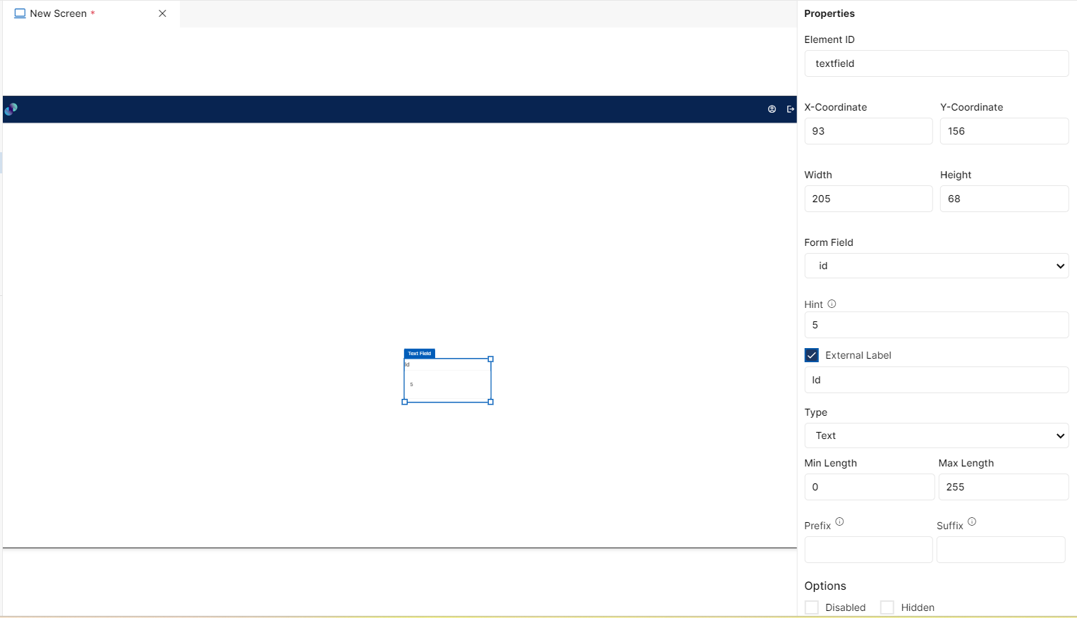
Fig 9: Input Field Properties Section
Styles
You will see Styles right below the Properties section, which helps in formatting your Input field in different ways.
Following style properties are applicable for Input field. These are optional attributes.
Background Color - Click on background color to choose a color from color palette for input field background
Font Family - Here, you will get a list of various font options to choose from. Chosen font will be applied to input field text
Font Size - Change font size of input field text manually by entering a value in this input field
Font Color - Click on font color & choose a desired color to change the default black font color of input text
Font Style - Click on this dropdown field to change font style from normal to italic
Font Weight - Click on this dropdown to change font from normal to bold
Text Decoration - You can underline the input text by selecting underline from this dropdown field
Border Thickness - You can add thickness to the input field border by manually entering a value in this field
Border Color - A desired border color for the input box can be selected using border color field. Click on border color & choose a desired color of your choice to change existing color.
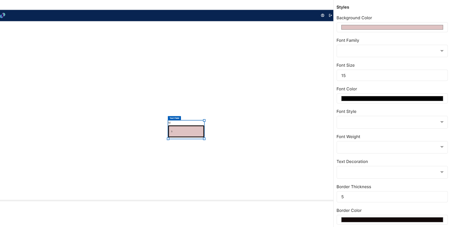
Fig 10: Input Field Styles Section
Events
You can find Events right below the Styles section, that helps you to trigger front end event for the input field if desired.
When you click on + symbol next to Event, a Configure Event pop up appears with Event Type and Select Event fields.
Event Type has following 3 options in the dropdown list to trigger an event: -
On Click - On click implies that an event will be triggered on clicking the input field.
On Change - On change implies that an event will be triggered when users navigate or shift or tab from one element to another.
On Hover - On hover implies that an event will be triggered when hovered over this input field.
When you select any of the above fields, you are expected to select an event to be triggered from the list of events in Select Event dropdown. Click on Configure Parameters button if you have any parameters to configure for the event. You can add parameter value in the text box and click on Add Event. The Event will be configured successfully Note: There could be events without any parameters added to it.
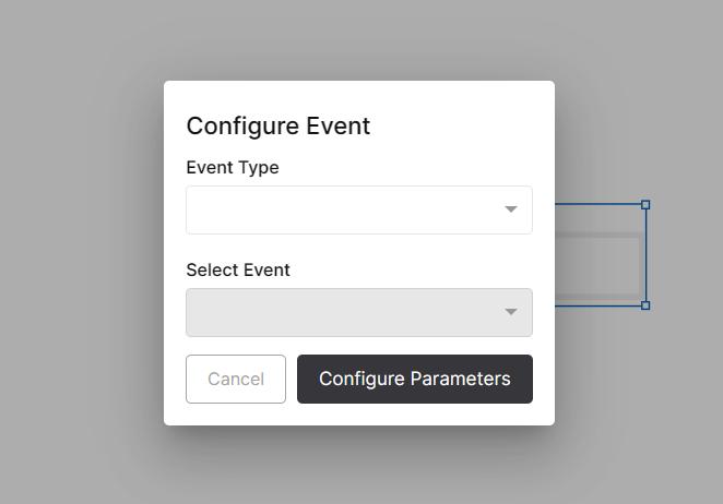
Fig 11: Configure event
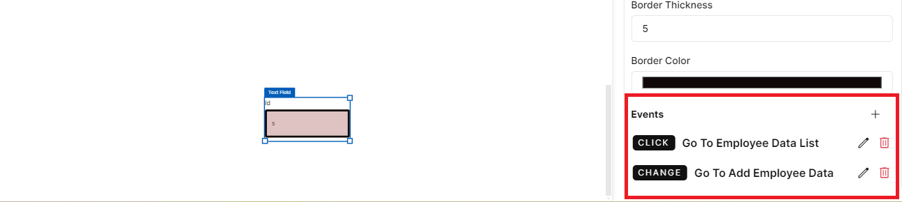
Fig 12: Events Configured
Input Field - Properties, Styles & Events
Dropdown
This element is used to capture user input when input belongs to a set of predefined limited values. This element can be used inside a form element or can also be used directly in plain canvas. Only difference is, if placed outside form, you won't see any form field under properties panel to map the element with application’s database. So, you will have to configure the element manually. If you want to use dropdown field inside form, first drag & drop a form element on the screen canvas and then drag & drop the dropdown element inside form.
Configuration for dropdown element is as below.
Properties
Dropdown element configuration is done through Properties panel. Below are the attributes under properties panel that can be configured as desired:
Element ID - This is a unique id given to each element. This id will be used to identify the screen elements when used in other modules like events. By default, element id will be the element type. When more than one element of its type is placed in canvas, element type will be followed by unique identifier. The element’s value can be accessed using $<element_id> in desired event.
X-Coordinate- Instead of aligning the element in canvas, you can also change the x coordinate value in X-Coordinate field to adjust x axis
Y-Coordinate- Instead of aligning the element in canvas, you can also change y coordinate value in Y-Coordinate field to adjust y axis.
Height-You can modify height of the element using cursor in canvas or by changing value in Height field.
Width-You can modify the width of element using cursor in canvas or by changing value in Width field.
Form Field - This is a dropdown field with list of all columns present under selected form's data table. This field will appear only if dropdown element is dropped inside form element.
External Label - External label is more like a title to the dropdown. Label will also appear automatically depending on selected form field. If you don't want a label, you can uncheck this checkbox & label will be removed from UI. Also, you can add your own label by checking External label and entering label name in the “Enter the label for dropdown” text box.
Dropdown Type - We have two ways to configure dropdown items. Custom & Data Table.
o If you choose custom, you will have to manually provide the dropdown items that needs to be added. When You click on + symbol next to Options You will get a popup with Text field to enter a label that will be displayed in dropdown to end users and a Value field to enter a value that should be passed to the backend on selecting this dropdown item. Add button captures & renders the values in Text and Value fields. For example, if you want In Progress to be displayed as dropdown item to end users, but you want 121 as the value to be passed to backend upon selecting this option, you need to provide In Progress in Text field and 121 in Value field. You can view the added dropdown items under Options. You will also find two dummy placeholders option1 & option2. You can click on Delete icon against each item to delete the same.
The one we just added can be seen below the dummy placeholders. We can also edit the added or dummy placeholder by clicking on Edit icon next to each dropdown.
o If you choose Data Table from dropdown, data will be automatically rendered from data table source without having to manually provide inputs. Under Data Table Source, you will get a list of all tables from created data model. Select a desired source table. In Label Field, you can select a column to be displayed as label. Under Value Field, you can select a column to be applied to the dropdown in backend upon selecting this option.
Disabled - Under options, we have an option to disable dropdown field. When disabled checkbox is checked, end users will not be able to provide any input in this field. This box is unchecked by default. You can modify the configuration if desired. In order to make it obvious for the users, you can also change the background color of dropdown field under styles section.
Hidden - When hidden checkbox is checked, dropdown will be hidden by default when the screen loads. This box is unchecked by default. You can modify the configuration if desired.
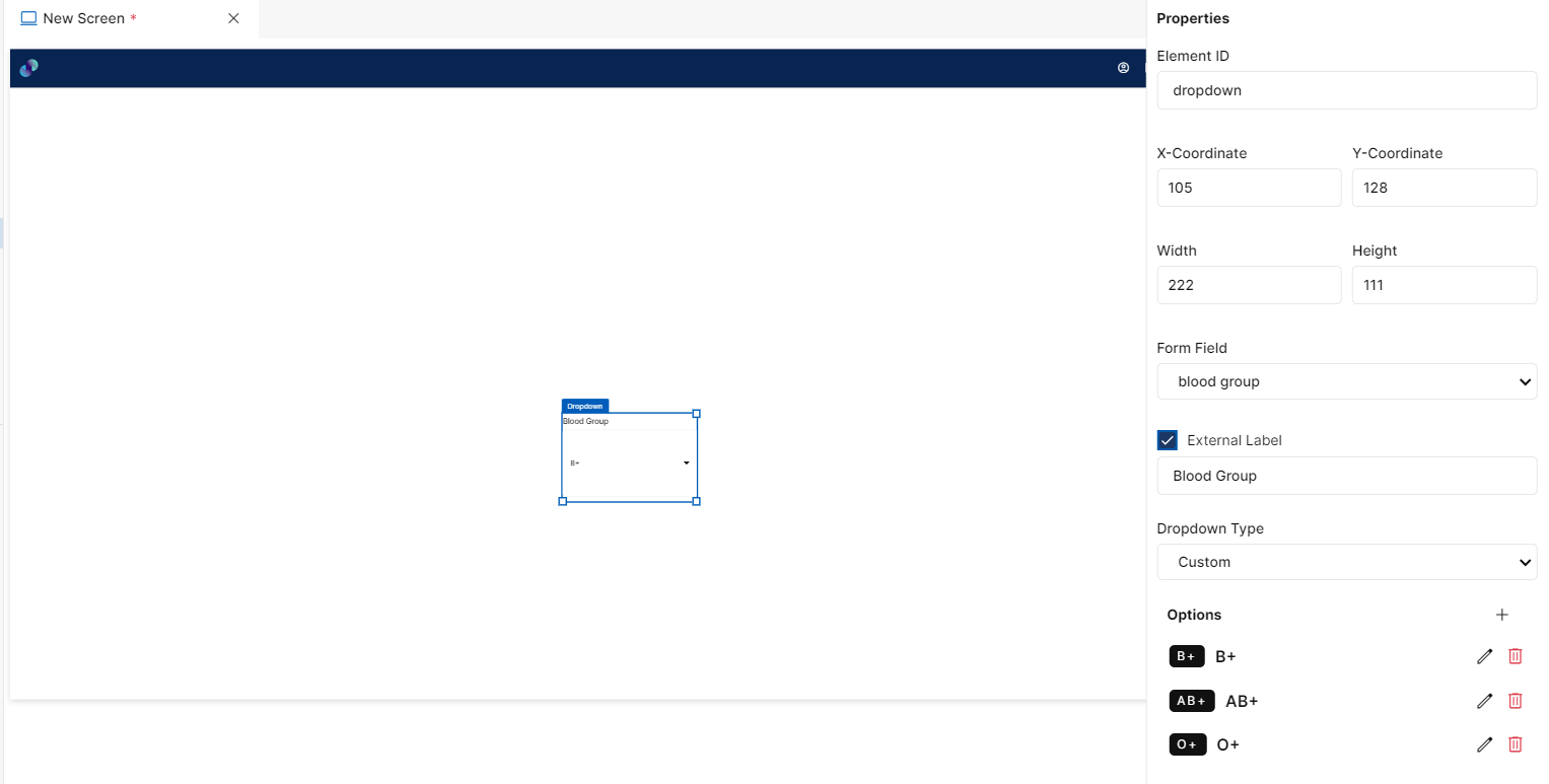
Fig 13: Dropdown Properties Section
Styles
You will see Styles right below the Properties section, which helps in formatting your dropdown element in different ways.
Following style properties are applicable for dropdown. These are optional attributes.
Background Color - Click on background color to choose a color from color palette for dropdown element background
Font Family - Here, you will get a list of various font options to choose from. Chosen font will be applied to input field text
Font Size - Change font size of dropdown text manually by entering a value in this input field
Font Color - Click on font color & choose a desired color to change the default black font color of text
Font Style - Click on this dropdown field to change font style from normal to italic
Font Weight - Click on this dropdown to change font from normal to bold
Text Decoration - You can underline the text by selecting underline from this dropdown field
Border Thickness - You can add thickness to the dropdown box border by manually entering a value in this field
Border Color - A desired border color for the dropdown box can be selected using border color field. Click on border color & choose a desired color of your choice to change existing color.
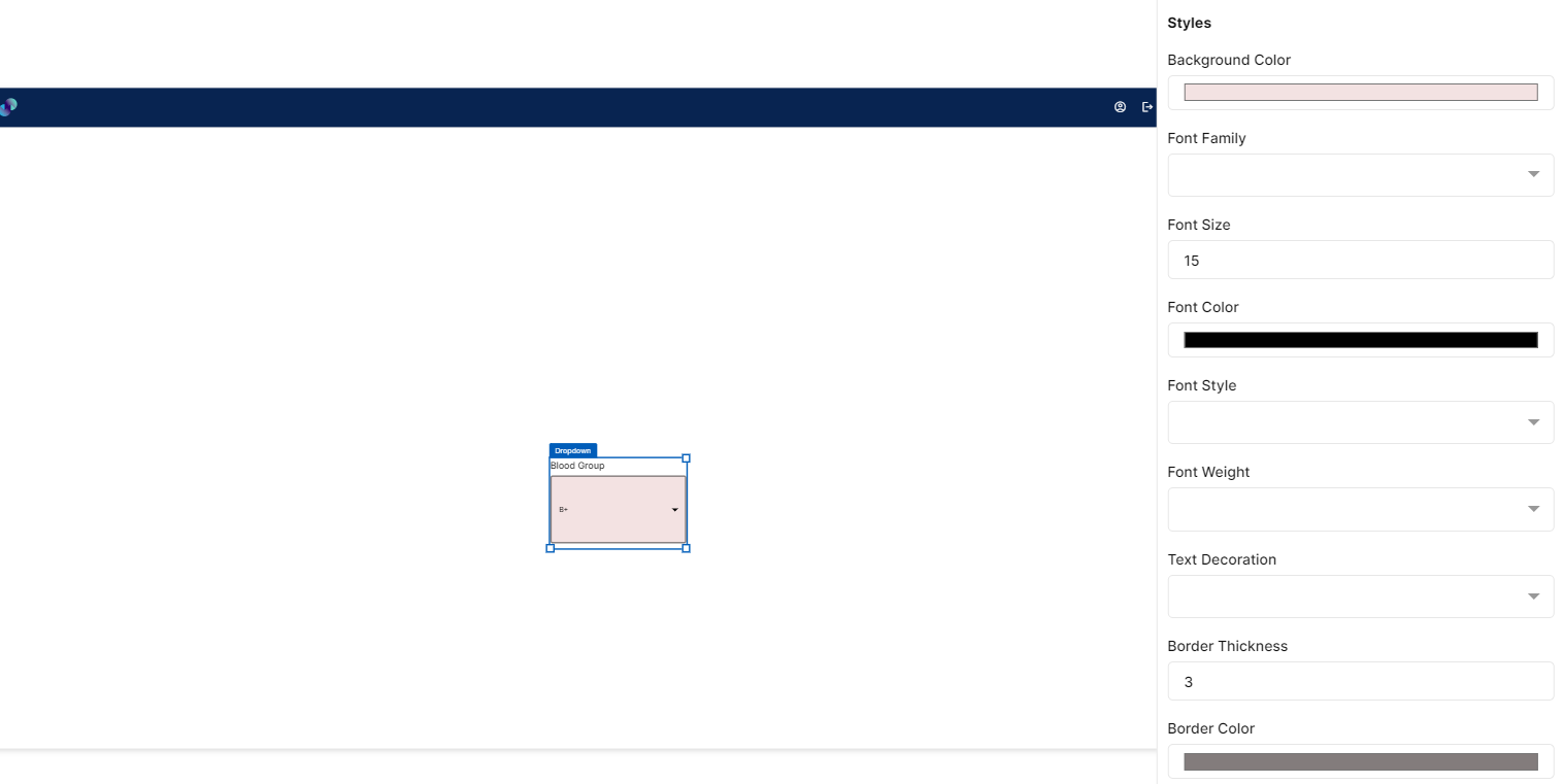
Fig 14: Dropdown Styles Section
Events
You can find Events right below the Styles section, that helps you to trigger front end event for the dropdown if desired.
When you click on + symbol next to Event, a Configure Event pop up appears with Event Type and Select Event fields.
Event Type has following 3 options in the dropdown list to trigger an event: -
On Click - On click implies that an event will be triggered on clicking the dropdown.
On Change - On change implies that an event will be triggered when users navigate or shift or tab from one element to another.
On Hover - On hover implies that an event will be triggered when hovered over this dropdown.
When you select any of the above fields, you are expected to select an event to be triggered from the list of events in Select Event dropdown. Click on Configure Parameters button if you have any parameters to configure for the event. You can add parameter value in the text box and click on Add Event. The Event will be configured successfully Note: There could be events without any parameters added to it.
Fig 15: Configure event
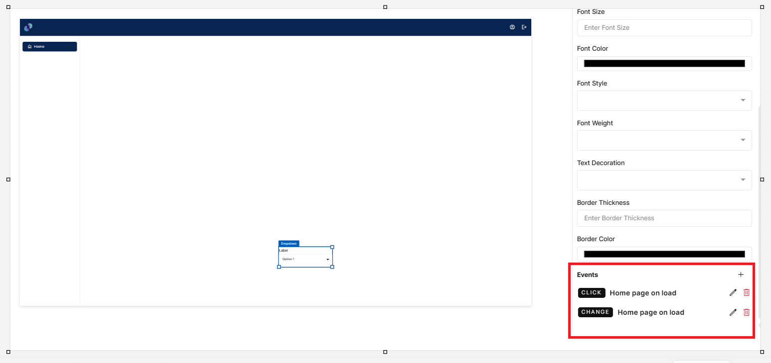
Fig 16: Events Configured
Dropdown - Properties, Styles & Events
Checkbox
This element helps you to capture user input when the user response is expected to be binary i.e. either an affirmation or negation. This element can be used inside or outside the form element.
Configuration for checkbox element is as below.
Properties
Checkbox element configuration is done through Properties panel. Below are the attributes under properties panel that can be configured as desired:
Element ID - This is a unique id given to each element. This id will be used to identify the screen elements when used in other modules like events. By default, element id will be the element type. When more than one element of its type is placed in canvas, element type will be suffixed by unique identifier. The element’s value can be accessed using $<element_id> in desired event.
X-Coordinate- Instead of aligning the element in canvas, you can also change the x coordinate value in X-Coordinate field to adjust x axis
Y-Coordinate- Instead of aligning the element in canvas, you can also change y coordinate value in Y-Coordinate field to adjust y axis.
Height-You can modify height of the element using cursor in canvas or by changing value in Height field.
Width-You can modify the width of element using cursor in canvas or by changing value in Width field.
Form Field - This is where you can map checkbox to application’s database. This is a dropdown field with list of all columns present under selected form's data table. This field will appear only if checkbox element is dropped inside form element.
External Label - External label is more like a title to the checkbox. Label will also appear automatically depending on selected form field. If you don't want a label, you can uncheck this checkbox & label will be removed from UI. Also, you can add your own label by checking External label and entering label name in the “Enter the label for checkbox” text box.
Checkbox Label - This is an input field to provide a label to the checkbox that should be displayed to end users
Default - A radio button field to choose whether the checkbox should be checked or unchecked by default when current screen loads
Disabled - Under options, we have an option to disable checkbox field. When disabled checkbox is checked, end users will not be able to provide any input in this field. This box is unchecked by default. You can modify the configuration if desired. In order to make it obvious for the users, you can also change the background color of checkbox field under styles section.
Hidden - When hidden checkbox is checked, checkbox will be hidden by default when the screen loads. This box is unchecked by default. You can modify the configuration if desired.
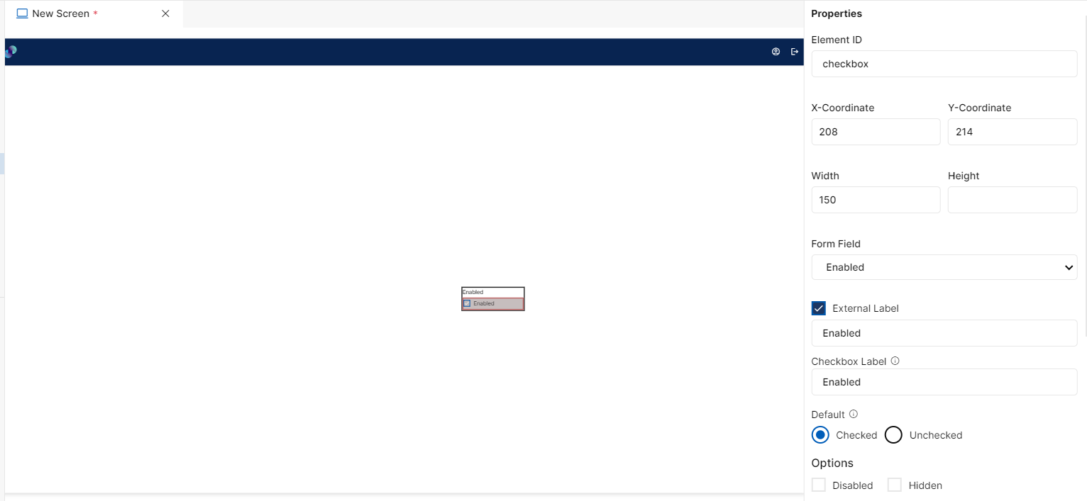
Fig 17: Checkbox Properties Section
Styles
You will see Styles right below the Properties section, which helps in formatting your checkbox element in different ways.
Following style properties are applicable for checkbox. These are optional attributes.
Checked Color - Click on checked color to change the color of checkbox when it is checked
Background Color - Click on background color to choose a color from color palette to change background color
Font Family - Here, you will get a list of various font options to choose from. Chosen font will be applied to checkbox label
Font Size - Change font size of checkbox text manually by entering a value in this input field
Font Color - Click on font color & choose a desired color to change the default black font color of text
Font Style - Click on this dropdown field to change font style from normal to italic
Font Weight - Click on this dropdown to change font from normal to bold
Text Decoration - You can underline the text by selecting underline from this dropdown field
Border Thickness - You can add thickness to the checkbox label border by manually entering a value in this field
Border Color - A desired border color for the checkbox label can be selected using border color field. Click on border color & choose a desired color of your choice to change existing color.
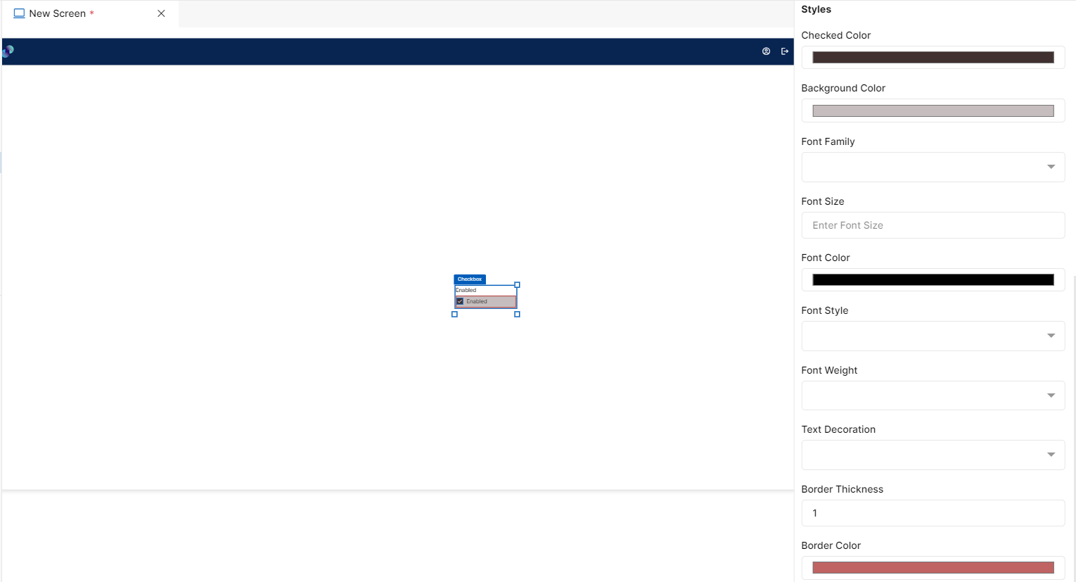
Fig 18: Checkbox Styles Section
Events
You can find Events right below the Styles section, that helps you to select the right type of event for checkbox.
When you click on + symbol next to Event, a Configure Event pop up appears with Event Type and Select Event fields.
Event Type has following 3 options in the dropdown list to trigger an event: -
On Click - On click implies that an event will be triggered on clicking the checkbox.
On Change - On change implies that an event will be triggered when users navigate or shift or tab from one element to another.
On Hover - On hover implies that an event will be triggered when hovered over this checkbox.
When you select any of the above fields, you are expected to select an event to be triggered from the list of events in Select Event dropdown. Click on Configure Parameters button if you have any parameters to configure for the event. You can add parameter value in the text box and click on Add Event. The Event will be configured successfully Note: There could be events without any parameters added to it.
Fig 19: Configure event
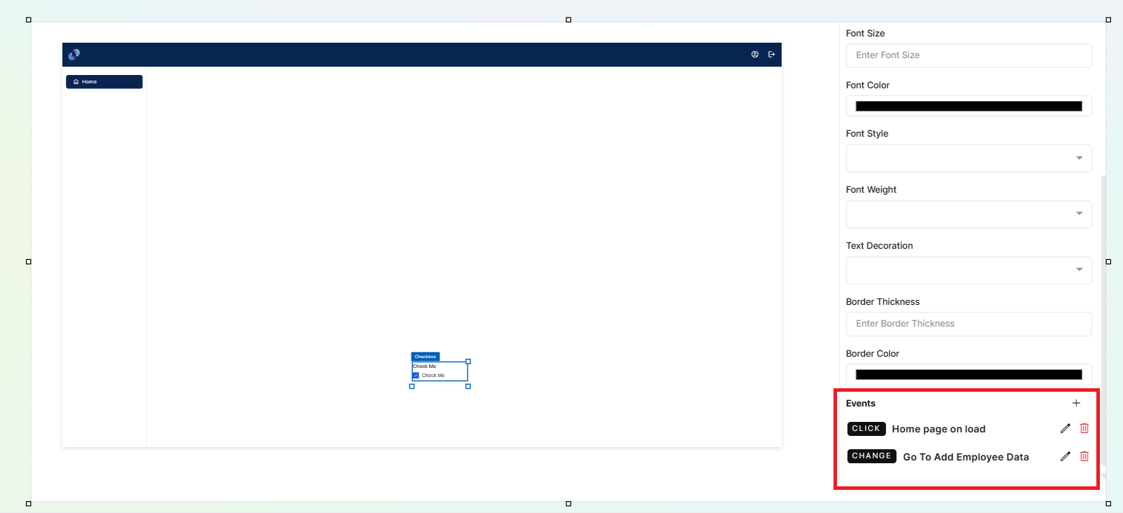
Fig 20: Events Configured
Checkbox - Properties, Styles & Events
Radio Buttons
Use a radio button as an Input field when you want end users to indicate the presence or absence of a response. For example, allowing users to provide a ‘Gender’ input in the form by providing a radio button with two choices. Radio buttons are better when compared to end users having to type in the input.
This element can also be used inside or outside form element. Only difference is, if placed outside form, you won't see any form field under properties panel to map the element with application’s database. So, you will have to configure the element manually. If you want to use radio buttons inside form, first drag & drop a form element on the screen canvas and then drag & drop the radio button element inside form.
Configuration for checkbox element is as below.
Properties
Radio Button element configuration is done through Properties panel. Below are the attributes under properties panel that can be configured as desired:
Element ID - This is a unique id given to each element. This id will be used to identify the screen elements when used in other modules like events. By default, element id will be the element type. When more than one element of its type is placed in canvas, element type will be suffixed by unique identifier. The element’s value can be accessed using $<element_id> in desired event.
X-Coordinate- Instead of aligning the element in canvas, you can also change the x coordinate value in X-Coordinate field to adjust x axis
Y-Coordinate- Instead of aligning the element in canvas, you can also change y coordinate value in Y-Coordinate field to adjust y axis.
Height-You can modify height of the element using cursor in canvas or by changing value in Height field.
Width-You can modify the width of element using cursor in canvas or by changing value in Width field.
Form Field - This is where you can map radio button to application’s database. This is a dropdown field with list of all columns present under selected form's data table. This field will appear only if radio button is dropped inside form element.
External Label - External label is more like a title to the radio button. Label will also appear automatically depending on selected form field (when placed inside form) else, default external label would be Label. You can modify the same if desired. If you don't want a label, you can uncheck this checkbox & label will be removed from UI.
Radio Buttons- When you click on + icon next to Radio Buttons, a pop up will appear having Label field which is an input field to enter the label text to be displayed right next to the radio button to end users and Value field which is an input field to enter a value to be applied to the backend on selecting this radio button group. When you enter Label field and Value field and click Add Option button, it captures the values in Label and Value fields and creates a new radio button and adds it to the radio button group. There will be 2 default radio buttons as button1 and button2.
Added radio button will be displayed below the default radio buttons. We can also Edit/Delete the added or default radio buttons by clicking on Edit/Delete icon next to each Radio Button. A minimum of 2 radio buttons must be present under Radio Buttons.
Display - Display is a dropdown field to change the alignment of radio buttons as desired. We support horizontal & vertical alignments. When horizontal alignment is selected, radio buttons will be displayed right next to each other & when vertical is selected, radio buttons will be displayed one below the other
Disabled - Under options, we have an option to disable radio buttons. When disabled checkbox is checked, end users will not be able to provide any input in this field. This box is unchecked by default. You can modify the configuration if desired. In order to make it obvious for the users, you can also change the background color of checkbox field under styles section.
Hidden - When hidden checkbox is checked, selected radio button will be hidden by default when the screen loads. This box is unchecked by default. You can modify the configuration if desired.
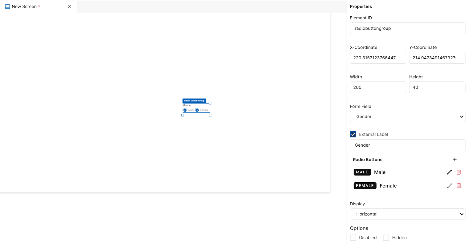
Fig 21: Radio button Properties Section
Styles
You will see Styles right below the Properties section, which helps in formatting your radio button element in different ways.
Following style properties are applicable for radio button. These are optional attributes.
Selected Color - Click on selected color to change the color of radio button when it is selected
Background Color - Click on background color to choose a color from color palette to change background color
Font Family - Here, you will get a list of various font options to choose from. Chosen font will be applied to radio button text
Font Size - Change font size of radio button text manually by entering a value in this input field
Font Color - Click on font color & choose a desired color to change the default black font color of text
Font Style - Click on this dropdown field to change font style from normal to italic
Font Weight - Click on this dropdown to change font from normal to bold
Text Decoration - You can underline the text by selecting underline from this dropdown field
Border Thickness - You can add border thickness to the radio button text by manually entering a value in this field
Border Color - A desired border color for the radio button text can be selected using border color field. Click on border color & choose a desired color of your choice to change existing color.
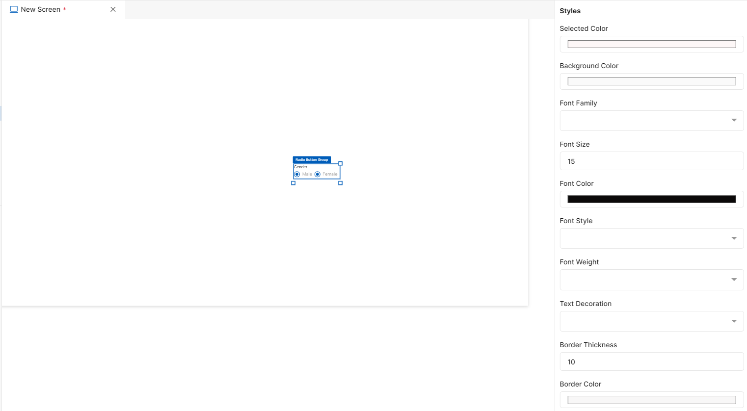
Fig 22: Radio Button Styles Section
Events
You can find Events right below the Styles section, that helps you to select the right type of event for radio button.
When you click on + symbol next to Event, a Configure Event pop up appears with Event Type and Select Event fields.
Event Type has following 2 options in the dropdown list to trigger an event: -
On Click - On click implies that an event will be triggered on clicking the radio button.
On Hover - On hover implies that an event will be triggered when hovered over this radio button.
When you select any of the above fields, you are expected to select an event to be triggered from the list of events in Select Event dropdown. Click on Configure Parameters button if you have any parameters to configure for the event. You can add parameter value in the text box and click on Add Event. The Event will be configured successfully Note: There could be events without any parameters added to it.
Fig 23: Configure event
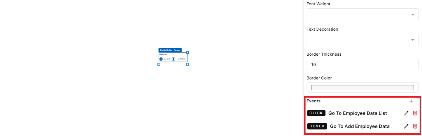
Fig 24: Events Configured
Radio Button - Properties, Styles & Events
Slider
This element is used to provide inputs by simply dragging the slider bar up to desired value. You can use this element where a user is expected to provide an input value within a definite range. You can define the step value for increment or decrement based on the movement of the slider bar.
This element can also be used inside or outside form element. Only difference is, if placed outside form, you won't see any form field under properties panel to map the element with application’s database. So, you will have to configure the element manually. If you want to use slider inside form, first drag & drop a form element on the screen and then drag & drop the slider element inside form.
Configuration for slider element is as below.
Properties
Slider element configuration is done through Properties panel. Below are the attributes under properties panel that can be configured as desired:
Element ID - This is a unique id given to each element. This id will be used to identify the screen elements when used in other modules like events. By default, element id will be the element type. When more than one element of its type is placed in canvas, element type will be suffixed by unique identifier. The element’s value can be accessed using
$<element_id>in desired event.X-Coordinate- Instead of aligning the element in canvas, you can also change the x coordinate value in X-Coordinate field to adjust x axis
Y-Coordinate- Instead of aligning the element in canvas, you can also change y coordinate value in Y-Coordinate field to adjust y axis.
Height-You can modify height of the element using cursor in canvas or by changing value in Height field.
Width-You can modify the width of element using cursor in canvas or by changing value in Width field.
Form Field - This is where you can map slider to application’s database. This is a dropdown field with list of all columns present under selected form's data table. This field will appear only if slider is dropped inside form element.
External Label - External label is more like a title to the slider. Label will also appear automatically depending on selected form field (when placed inside form) else, default external label would be Label. You can modify the same if desired. If you don't want a label, you can uncheck this checkbox & label will be removed from UI.
Min Value - This is an input field to specify starting value or minimum value for slider bar
Max Value - This is an input field to specify ending value or maximum limit for slider bar
Steps - Steps field is to specify the size of each movement. That is, increment or jump between min & max values
Disabled - Under options, we have an option to disable slider. When disabled checkbox is checked, end users will not be able to provide any input in this field. This box is unchecked by default. You can modify the configuration if desired. In order to make it obvious for the users, you can also change the background color of slider field under styles section.
Hidden - When hidden checkbox is checked, selected slider will be hidden by default when the screen loads. This box is unchecked by default. You can modify the configuration if desired.
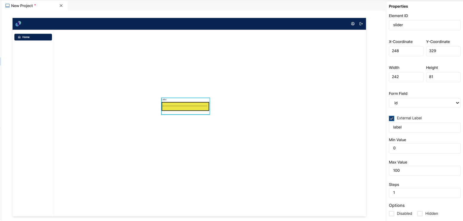
Fig 25: Slider Properties Section
Styles
You will see Styles right below the Properties section, which helps in formatting your slider element in different ways.
Following style properties are applicable for slider. These are optional attributes.
Slider Color - Click on slider color to change the color of radio button when it is selected
Background Color - Click on background color to choose a color from color palette to change background color
Font Family - Here, you will get a list of various font options to choose from. Chosen font will be applied to text
Font Size - Change font size of text manually by entering a value in this input field
Font Color - Click on font color & choose a desired color to change the default black font color of text
Font Style - Click on this dropdown field to change font style from normal to italic
Font Weight - Click on this dropdown to change font from normal to bold
Text Decoration - You can underline the text by selecting underline from this dropdown field
Border Thickness - You can add border thickness to the slider by manually entering a value in this field
Border Color - A desired border color for the slider can be selected using border color field. Click on border color & choose a desired color of your choice to change existing color.
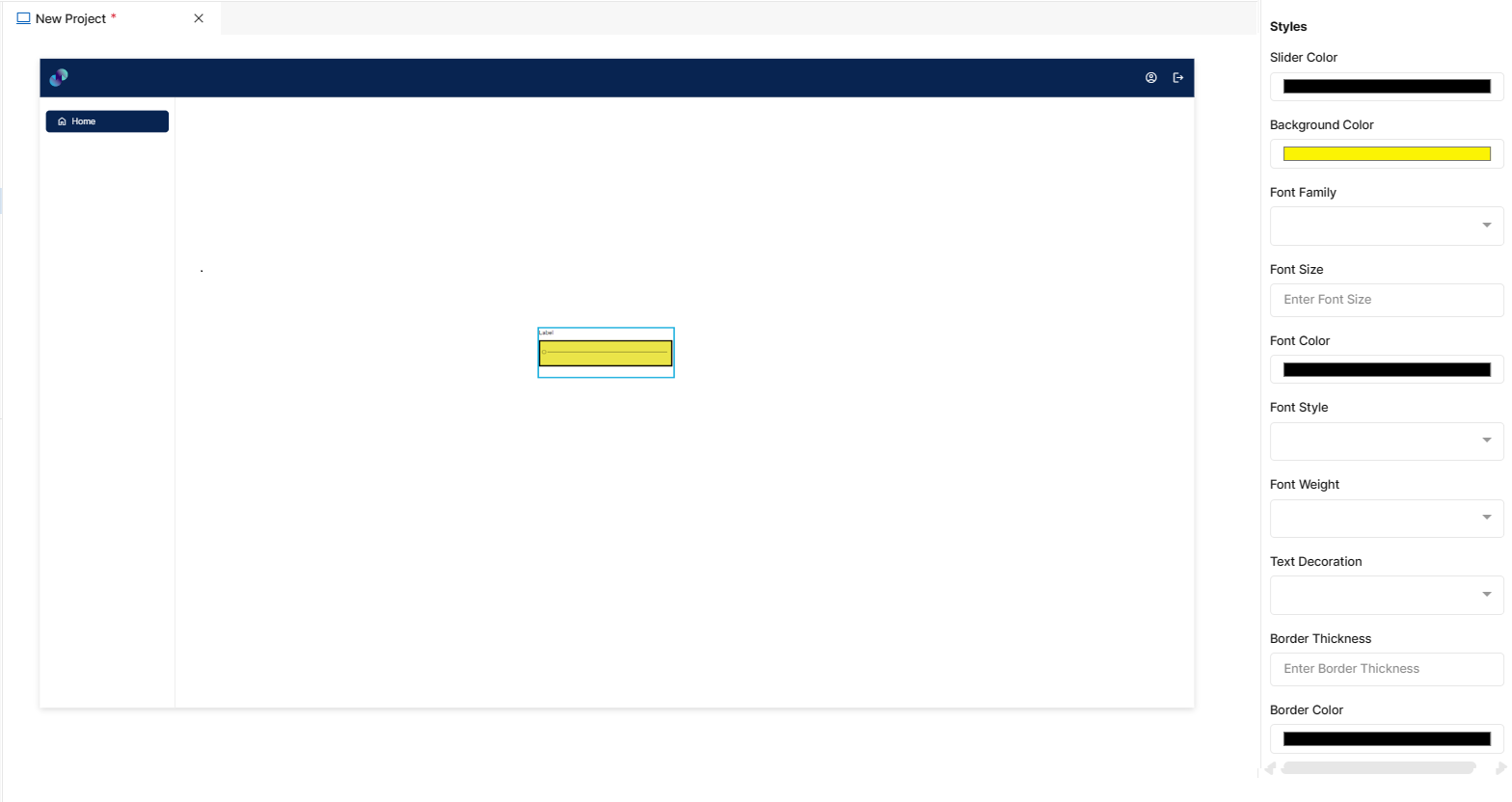
Fig 26: Slider Styles Section
Events
You can find Events right below the Styles section, that helps you to select the right type of event for slider.
When you click on + symbol next to Event, a Configure Event pop up appears with Event Type and Select Event fields. There are 2 ways you could trigger an event.
On Click - On click implies that an event will be triggered on clicking the slider.
On Hover - On hover implies that an event will be triggered when hovered over slider.
When you select any of the above fields, you are expected to select an event to be triggered from the list of events in Select Event dropdown. Click on Configure Parameters button if you have any parameters to configure for the event. You can add parameter value in the text box and click on Add Event. The Event will be configured successfully Note: There could be events without any parameters added to it.
Fig 27: Configure event
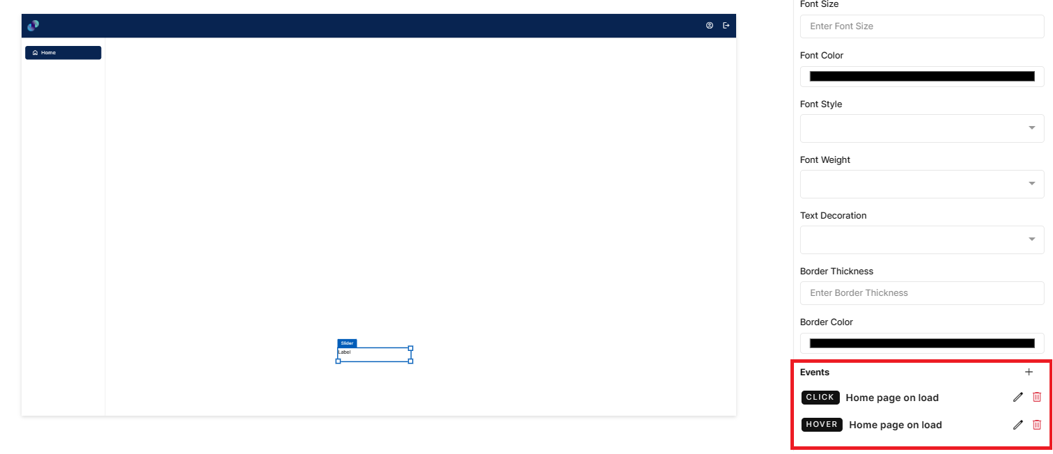
Fig 28: Event Configured
Slider - Properties, Styles & Events
Button
Button is a visual element that is used to initiate actions in the form after users have entered data in it. Examples of some of the frequently performed user actions on the form include ‘Clear’, ‘Submit’, ‘Add’ etc This element can be used inside or outside the form element.
Configuration for button element is as below.
Properties
Button element configuration is done through Properties panel. Below are the attributes under properties panel that can be configured as desired:
Element ID - This is a unique id given to each element. This id will be used to identify the screen elements when used in other modules like events. By default, element id will be the element type. When more than one element of its type is placed in canvas, element type will be suffixed by unique identifier. When button is placed inside form, element is will be, button_form, button_form_1, button_form_2 etc. The element’s value can be accessed using $<element_id> in desired event.
X-Coordinate- Instead of aligning the element in canvas, you can also change the x coordinate value in X-Coordinate field to adjust x axis
Y-Coordinate- Instead of aligning the element in canvas, you can also change y coordinate value in Y-Coordinate field to adjust y axis.
Height-You can modify height of the element using cursor in canvas or by changing value in Height field.
Width-You can modify the width of element using cursor in canvas or by changing value in Width field.
Button Type - This is a dropdown field to choose an appropriate button type from the list of available options. There are four button types available at the moment - Text Button, Icon Button, Text & Icon Button, Icon & Text Button
Label - When Text type, Text & Icon type or Icon & Text type is selected, you will get this label field to provide a label text to your button
Select Icon - When Icon, Icon & Text or Text & Icon button type is selected, you will get this select icon field to select an icon for button. When clicked on Home, you will get a popup to choose from the list of available material & font awesome icons. Here, you can also search for desired icons & select the same. Once selected, you can see the selected icon under select icon field
Disabled - Under options, we have an option to disable button. When disabled checkbox is checked, end users will not be able to provide any input in this field. This box is unchecked by default. You can modify the configuration if desired. In order to make it obvious for the users, you can also change the background color of button under styles section.
Hidden - When hidden checkbox is checked, button will be hidden by default when the screen loads. This box is unchecked by default. You can modify the configuration if desired.
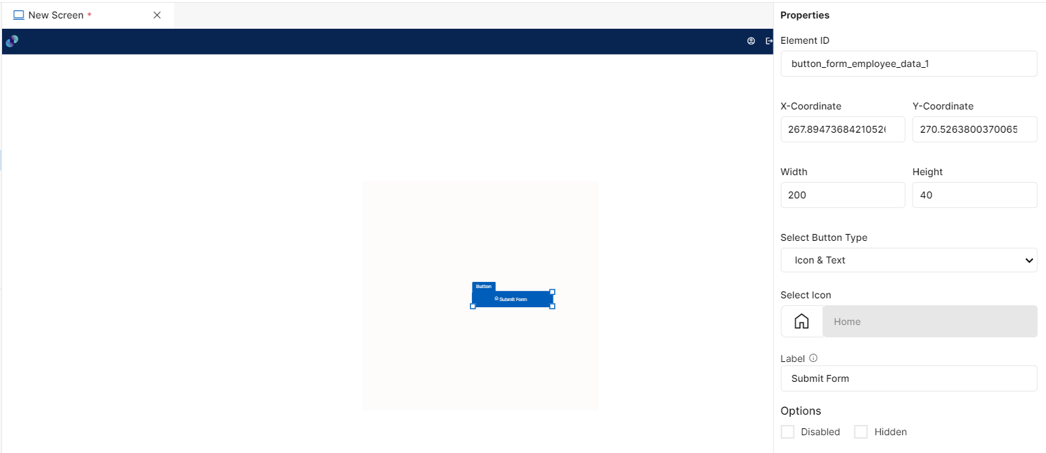
Fig 29: Button Properties Section
Styles
You will see Styles right below the Properties section, which helps in formatting your button element in different ways.
Following style properties are applicable for button. These are optional attributes.
Icon Color - This field is not applicable only for text type button. Click on Icon color to change the color of icon in the button
Icon Style -This field is not applicable only for text type button. Click on this dropdown field to change icon style from normal to italic
Icon Size - This field is not applicable only for text type button. This is an input field to manually enter a size to the icon
Background Color - Click on background color to choose a color from color palette to change background color of button
Font Family - This field is not applicable only for icon type button. Here, you will get a list of various font options to choose from. Chosen font will be applied to text in button
Font Size - This field is not applicable only for icon type button. Change font size of button text manually by entering a value in this input field
Font Color - This field is not applicable only for icon type button. Click on font color & choose a desired color to change the default black font color of text
Font Style - This field is not applicable only for icon type button. Click on this dropdown field to change font style from normal to italic
Font Weight - This field is not applicable only for icon type button. Click on this dropdown to change font from normal to bold
Text Decoration - You can underline the text by selecting underline from this dropdown field
Border Thickness - You can add thickness to the button’s border by manually entering a value in this field
Border Color - A desired border color for the button’s border can be selected using border color field. Click on border color & choose a desired color of your choice to change existing color.
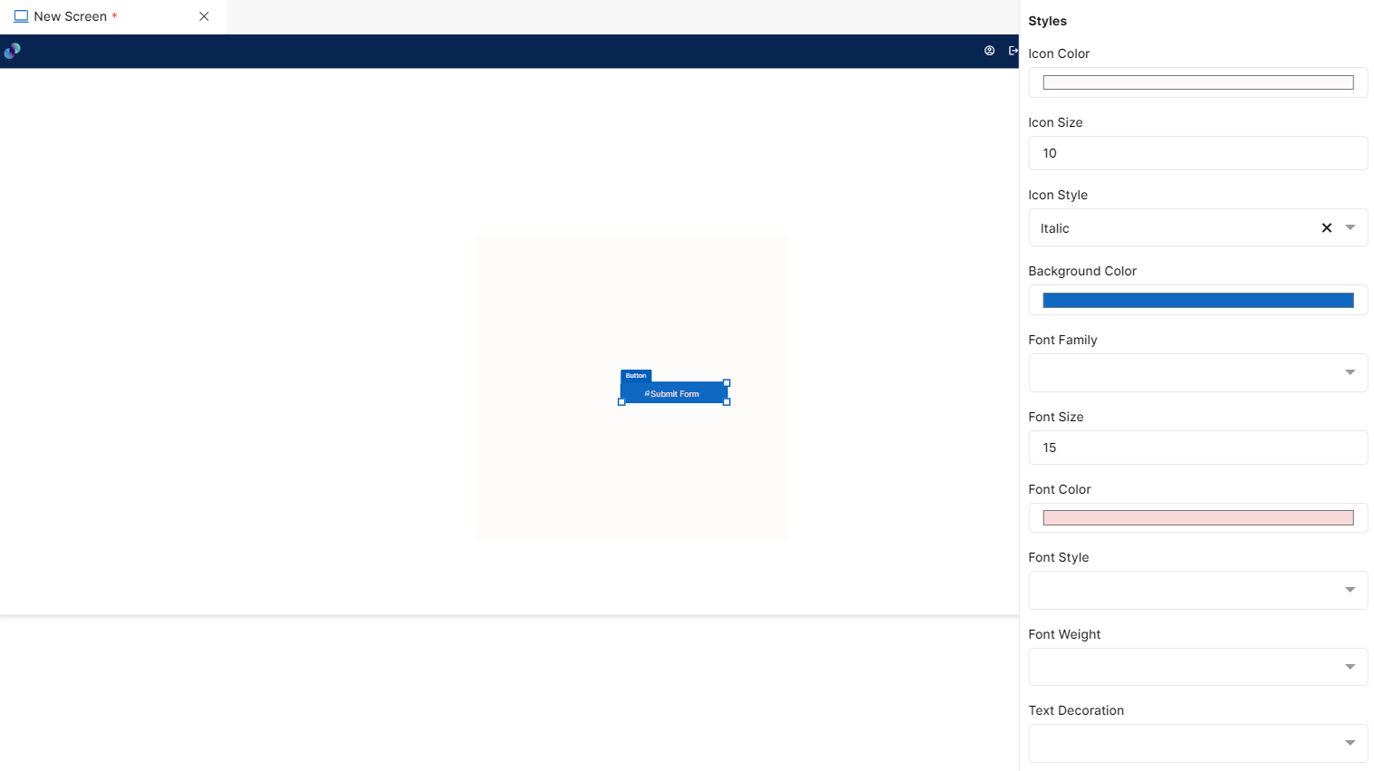
Fig 30: Button Styles Section
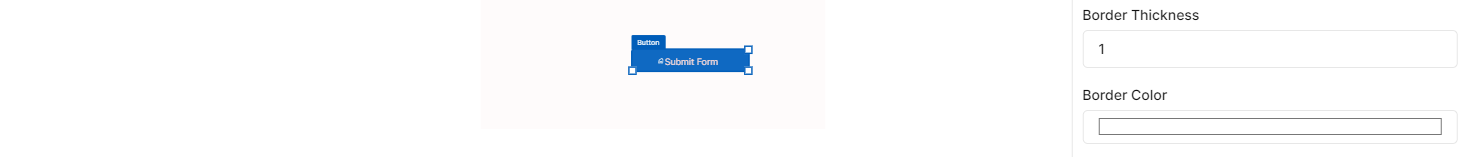
Fig 31: Button Styles Section
Events
You can find Events right below the style section, that helps you to select the right type of event for button.
When you click on + symbol next to Event, a Configure Event pop up appears with Event Type and Select Event fields. There are 2 ways you could trigger an event.
On Click - On click implies that an event will be triggered on clicking the button
On Hover - On hover implies that an event will be triggered when hovered over button
When you select any of the above fields, you are expected to select an event to be triggered from the list of events in Select Event dropdown. Click on Configure Parameters button if you have any parameters to configure for the event. You can add parameter value in the text box and click on Add Event. The Event will be configured successfully Note: There could be events without any parameters added to it.
Fig 32: Configure event
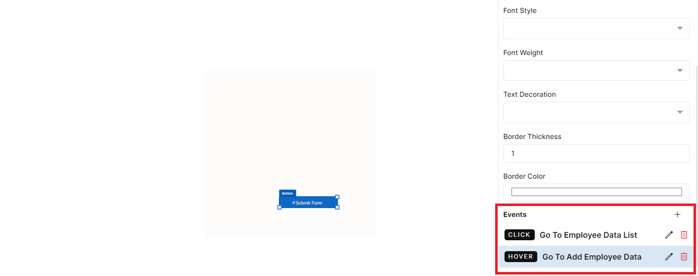
Fig 33: Events Configured
Button - Properties, Styles & Events
Data
Elements from data section can be used to capture a set of user input values that is logically related and needs to be stored collectively. Elements under data section include:
Table
Form
Tab
Table
Tables display the data in tabular or grid format on the screen and can be used to display list of records. To present data in table format, drag this element and place it on the screen canvas at desired location.
Configuration of table element is as below.
Properties
Table element configuration is done through Properties panel. Below are the attributes under properties panel that can be configured as desired:
Element ID - This is a unique id given to each element. This id will be used to identify the screen elements when used in other modules like events. By default, element id will be the element type. When more than one element of its type is placed in canvas, element type will be suffixed by unique identifier.
X-Coordinate- Instead of aligning the element in canvas, you can also change the x coordinate value in X-Coordinate field to adjust x axis
Y-Coordinate- Instead of aligning the element in canvas, you can also change y coordinate value in Y-Coordinate field to adjust y axis.
Height-You can modify height of the element using cursor in canvas or by changing value in Height field.
Width-You can modify the width of element using cursor in canvas or by changing value in Width field.
Lazy-Loaded - This is a checkbox field which is used when you have millions of records to display. Enabling this feature will only display visible records from the server in deployed application thereby improving performance. When you check this checkbox, Filterable & Downloadable options will not be available for the table.
Page Length - In this field, you can specify the number of records you would like to show in a single page. Default is set to 10 which means 10 records will be displayed per page. But you can modify the number of records using increment & decrement arrows or by manually entering the desired value.
Filterable - Enabling Filterable option will add a search box for table element in the deployed application, allowing end users to search for records in the table.
Downloadable - Enabling Downloadable option will add a download button for table widget in deployed application. There are 2 types of download possible. One is CSV & other is XLSX. Download option in deployed application will be available based on the option you choose here. If you choose only csv, then end users will be able to download table only in csv format. Similarly, if you choose only xlsx, end users will be able to download table only in xlsx format. When both options are selected, end users will be able to download either in csv or in xlsx format as desired.
Row Style - This field relates to how you want your table rows to be displayed. When you click on Striped check box, in deployed application alternate rows in table will be highlighted. When you leave the checkbox unchecked, all table rows will be of same format.
When you click on + icon next to Active columns a pop up appears with the Table Data Source/s field.
Table Data Source/s - This is a dropdown field. Here, you will see a list of all created tables including system generated tables. You can also choose multiple data tables and display records from multiple data tables in a single table widget. When you select Table Data source the following 3 fields appear on the pop up:-
Type - This is a dropdown field that lets you choose the type of column you want to have in your table. This dropdown contains all possible input types which is basically the same as input screen elements on the left pane. If you choose text from this dropdown, table records will be read only whereas the other column types allow end users to modify records within the table.
Column Field - This is a dropdown field, where you will get a list of all columns from Table Data Source. You have to choose the columns that needs to be displayed in your table in the order you like.
Display Label - An input field to modify the column label if desired. Default label will automatically appear when a column is selected. You can change the same if desired. Click Add column to add columns or Click Cancel to close the pop up without adding columns. Added columns will reflect under active columns.
Active Columns - All the added columns will be added under Active columns. To edit an added column, click on pencil icon next to column name & you can change any of the existing configuration and click Save Column button to proceed or click Cancel. If you wish to delete an added column, you can click on delete icon against desired column. This action cannot be undone.
Sort By - This field is used to sort table when screen loads. It’s a dropdown field to choose from the list of available columns based on which table content will be sorted. You can choose between Ascending and Descending sorting options below. Note: This particular sorting option is only when screen loads. End users will also be able to sort the table on runtime as desired.
Filter: Column - If you wish to filter entire table content, you can do so using this section. Column is a dropdown field with the list of all columns from selected Data Table Source. Filter will be applied to the column you choose here.
Operators - Dropdown field with a list of below relational & comparison operators to apply filter.
Contains: When developer selects ‘contains’ from the dropdown and enters desired value in the value field, data which contain the value entered will be filtered
Does not Contain: When developer selects ‘does not contain’ from the dropdown and enters desired value in the value field, data which do not contain the value entered will be filtered
Starts with: When developer selects ‘starts with’ from the dropdown and enters desired value in the value field, data that starts with the value entered will be filtered and displayed.
Does not start with: When developer selects ‘does not start with’ from the dropdown and enters desired value in the value field, data that does not start with the value entered will be filtered and displayed.
Equal to: When developer selects ‘equal to’ from the dropdown and enters desired value in the value field, data that is exactly equal to the value entered will be filtered and displayed.
Not Equal to: When developer selects ‘not equal to’ from the dropdown and enters desired value in the value field, data that is not equal to the value entered will be filtered and displayed.
Less than - When developer selects ‘less than’ from the dropdown and enters desired value in the value field, data that is less than the entered value (excluding the entered value) will be filtered
Less than or equal to - When developer selects ‘less than or equal to’ from the dropdown and enters desired value in the value field, data that is less than the entered value or equals the entered value will be filtered
Greater than - When developer selects ‘greater than’ from the dropdown and enters desired value in the value field, data that is greater than the entered value (excluding the entered value) will be filtered
Greater than or equal to - When developer selects ‘greater than or equal to’ from the dropdown and enters desired value in the value field, data that is greater than the entered value or equals the entered value will be filtered
In - When developer selects ‘in’ from the dropdown, the Value field below Operators field, will accept multiple entries as input and these entries can be separated by a comma. When developer enters a single value, ‘equal to’ functionality will be applied to ‘In’ as well. When developer enters more than one value, the entries that are equal to the entered values will be returned
Not In - When developer selects ‘not in’ from the dropdown, the Value field below Operators field, will accept multiple entries as input and these entries can be separated by a comma. When developer enters a single value, ‘not equal to’ functionality will be applied to ‘Not In’ as well. When developer enters more than one value, the entries that are not equal to the entered values will be returned
Is Null - When developer selects ‘is null’ from the dropdown, count of blank records will be filtered. The Value input field will be disabled when you select this option.
Is Not Null - When developer selects ‘is not null’ from the dropdown, count of all the records that are not blank will be filtered. The Value input field will be disabled when you select this option.
Value - A mandatory input field to enter a value for the filter
Add Filter - This is a button. Once you have provided above information, you can click this button to apply respective filter. Default logical operator for now will be ‘AND’. You can repeat the above process to apply multiple filters. Note: Actual count will be visible only in the deployed application.
Added filters can be seen just below Add Filter button. This section includes Column, Operator, Value & Action fields. Column, Operator & Value will be fetched form Filter section and Action field will contain a ‘Delete’ icon. If you click on delete icon against a filter, the corresponding filter will be removed.
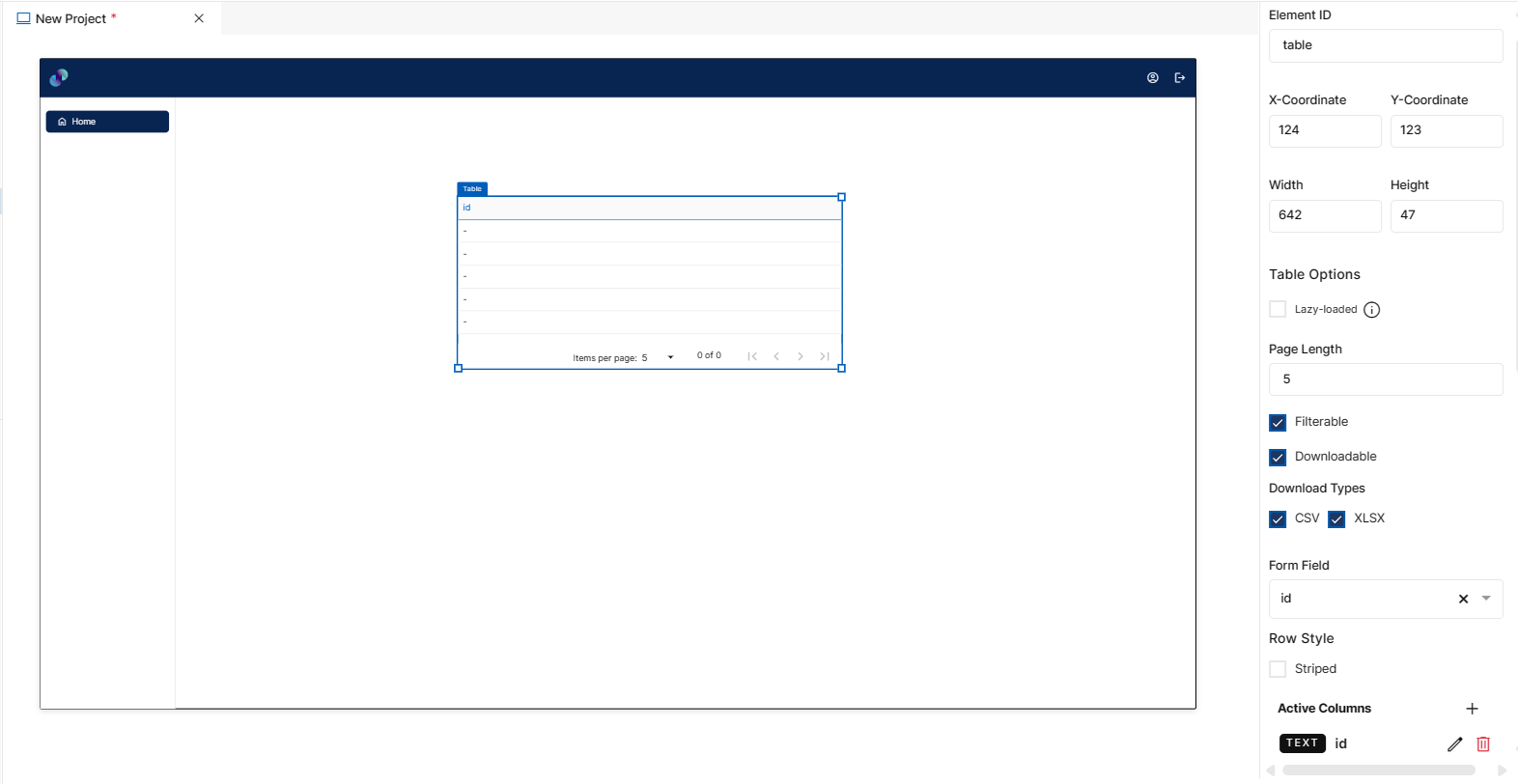
Fig 34: Table Properties section
Styles
You will see Styles right below the Properties section, which helps in formatting your Table in different ways.
Following style properties are applicable for table. These are optional attributes.
Header Background Color - Click on background color to choose a color from color palette to change background color of table header
Header Text Color - Click on header text color to choose a color from color palette to change text/column label color of table header
Font Family - Here, you will get a list of various font options to choose from. Chosen font will be applied to table records i.e. text inside table
Font Size - Change font size of table record text by manually entering a value in this input field
Font Color - Click on font color & choose a desired color to change the default black font color of table record text
Font Style - Click on this dropdown field to change font style of table records from normal to italic
Font Weight - Click on this dropdown to change font of table records from normal to bold
Text Decoration - You can underline the table record text by selecting underline from this dropdown field
Border Thickness - You can add thickness to the table border by manually entering a value in this field
Border Color - A desired border color for the table border can be selected using border color field. Click on border color & choose a desired color of your choice to change existing color.
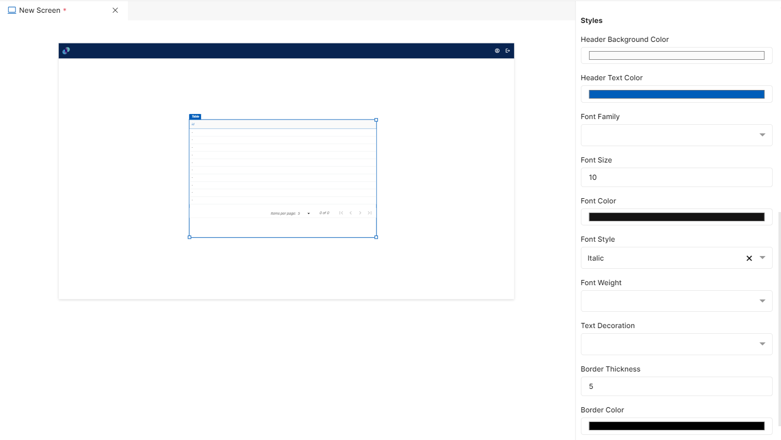
Fig 35: Table Styles Section
Events
You can find Events right below the style section, that helps you to select the right type of event for table.
When you click on + symbol next to Event, a Configure Event pop up appears with Event Type and Select Event fields. There are 2 ways you could trigger an event.
On Click - On click implies that an event will be triggered on clicking the table
On Hover - On hover implies that an event will be triggered when hovered over table
When you select any of the above fields, you are expected to select an event to be triggered from the list of events in Select Event dropdown. Click on Configure Parameters button if you have any parameters to configure for the event. You can add parameter value in the text box and click on Add Event. The Event will be configured successfully Note: There could be events without any parameters added to it.
Fig 36: Configure event
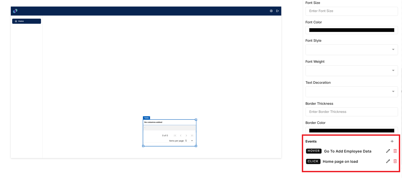
Fig 37: Events Configured
Table - Properties, Styles & Events
Form
You can create a user interface by using Form element to capture user inputs. To create a user interface using Form element, drag the element and place it at the desired location in screen canvas.
Configuration of form element is as below.
Properties
Form element configuration is done through Properties panel. Below are the attributes under properties panel that can be configured as desired:
Element ID - This is a unique id given to each element. This id will be used to identify the screen elements when used in other modules like events. By default, element id will be the element type. When more than one element of its type is placed in canvas, element type will be suffixed by unique identifier.
X-Coordinate- Instead of aligning the element in canvas, you can also change the x coordinate value in X-Coordinate field to adjust x axis
Y-Coordinate- Instead of aligning the element in canvas, you can also change y coordinate value in Y-Coordinate field to adjust y axis.
Height-You can modify height of the element using cursor in canvas or by changing value in Height field.
Width-You can modify the width of element using cursor in canvas or by changing value in Width field.
Select Data Table - This is a dropdown field with list of all tables including system generated tables from data model. When you place other screen elements inside form to capture user input, you will only be able to assign database fields to the screen elements if you have associated a database table to the Form. The Form is treated as a Parent element and various other elements placed within it are its child elements. This association helps in associating database fields with the form fields.
Hidden - When hidden checkbox is checked, form will be hidden by default when the screen loads. This box is unchecked by default. You can modify the configuration if desired.
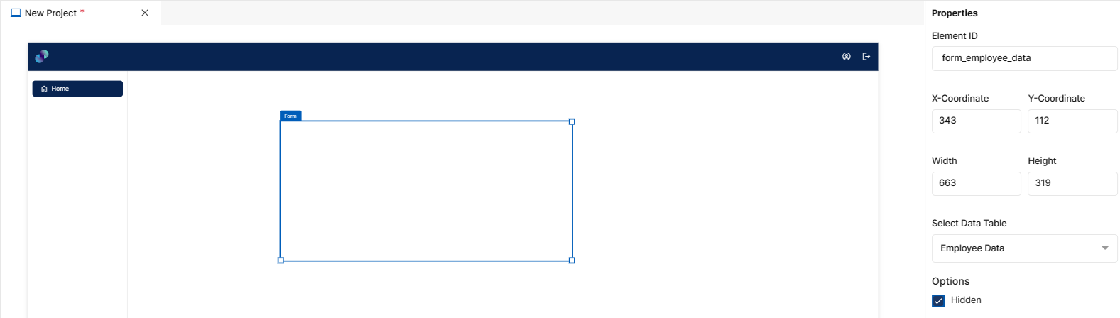
Fig 38: Form Properties Section
Styles
You will see Styles right below the Properties section, which helps in formatting your Form in different ways.
Following style properties are applicable for form. These are optional attributes.
Background Color - Click on background color to choose a color from color palette to change background color of form
Border Thickness - You can add thickness to the form border by manually entering a value in this field
Border Color - A desired border color for the form’s border can be selected using border color field. Click on border color & choose a desired color of your choice to change existing color.
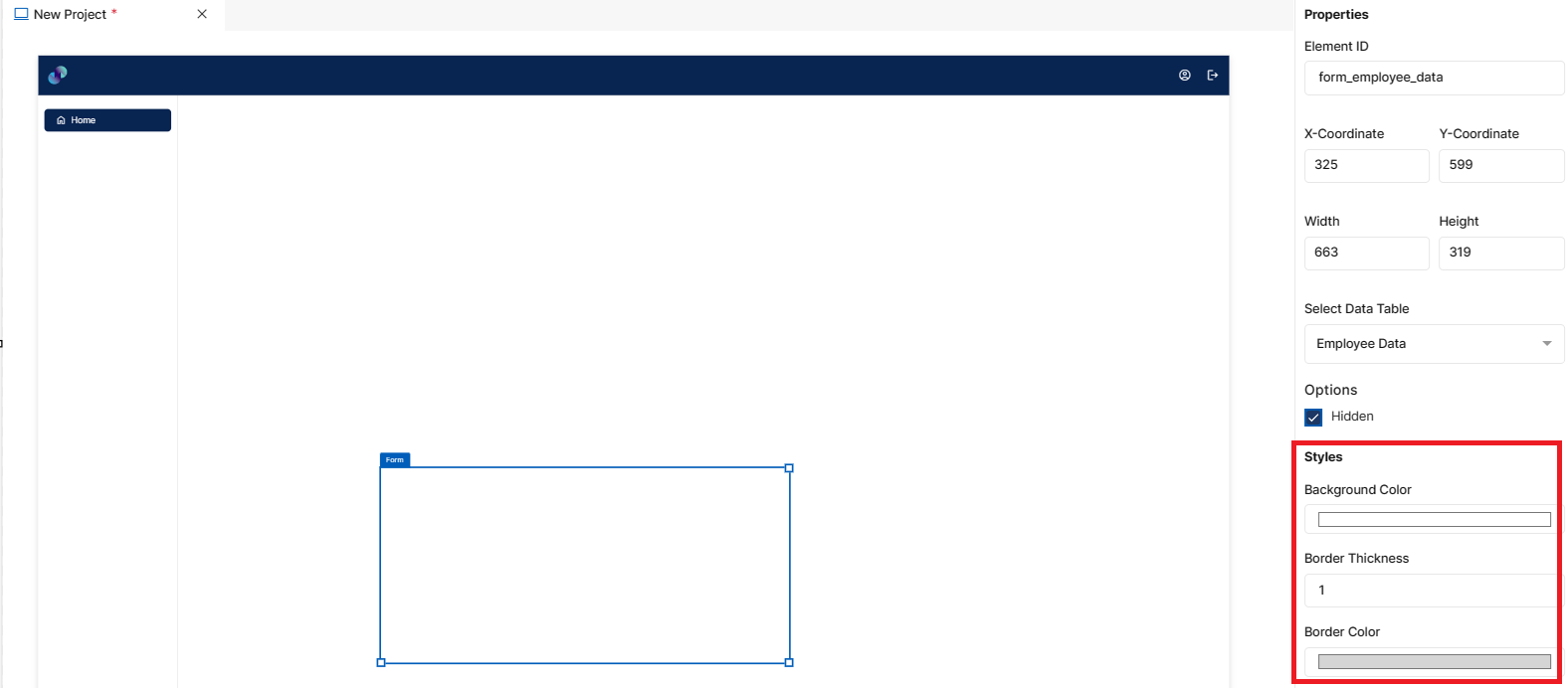
Fig 39: Form Styles Section
Events
You can find Events right below the style section, that helps you to select the right type of event for form.
When you click on + symbol next to Event, a Configure Event pop up appears with Event Type and Select Event fields. There are 2 ways you could trigger an event.
On Click - On click implies that an event will be triggered on clicking the form
On Hover - On hover implies that an event will be triggered when hovered over form
When you select any of the above fields, you are expected to select an event to be triggered from the list of events in Select Event dropdown. Click on Configure Parameters button if you have any parameters to configure for the event. You can add parameter value in the text box and click on Add Event. The Event will be configured successfully Note: There could be events without any parameters added to it.
Fig 40: Configure Event
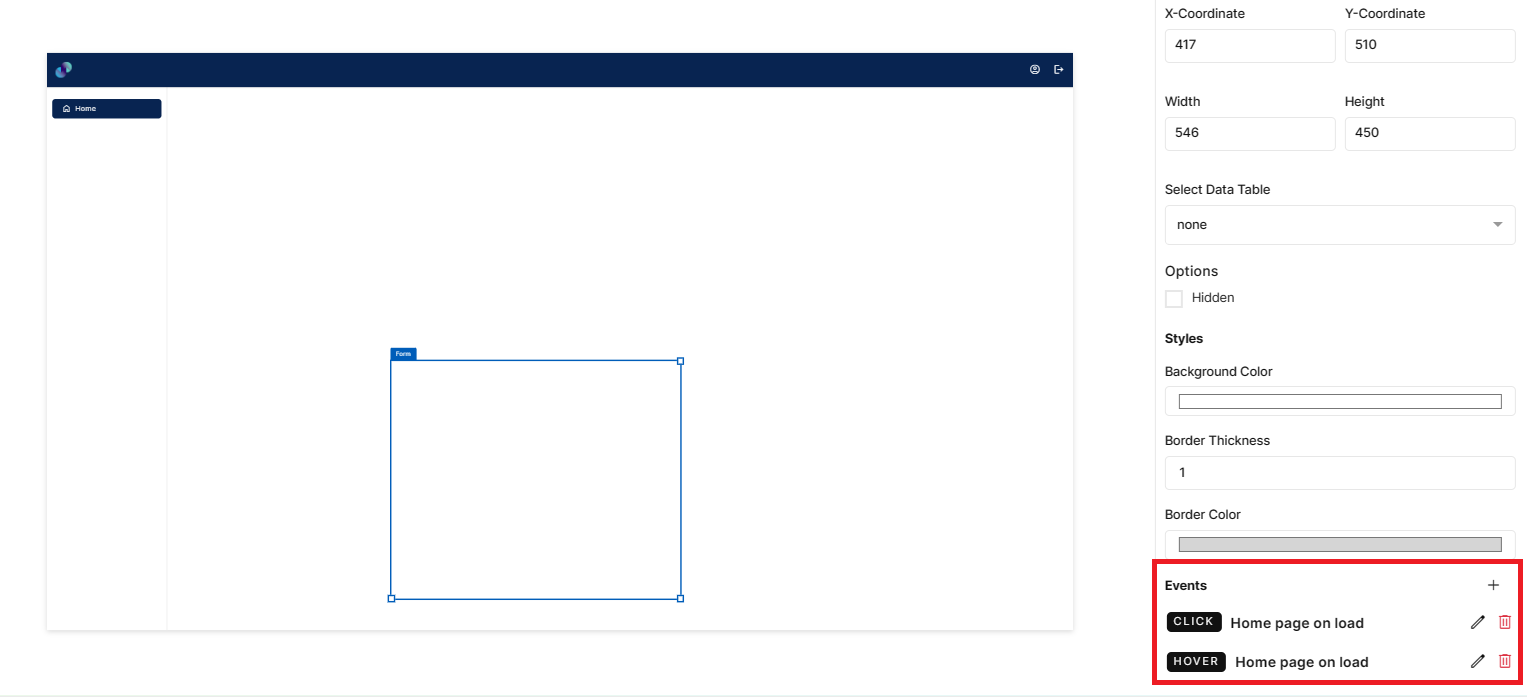
Fig 41: Events Configured
Form - Properties, Styles & Events
Tab Group
Tab group element can be used to display more content in a fixed space or hide certain content until end users need to access it. To create a user interface using Tab element, drag the element and place it at the desired location in screen canvas.
Configuration of tab element is as below.
Properties
Tab element configuration is done through Properties panel. Below are the attributes under properties panel that can be configured as desired:
Element ID - This is a unique id given to each element. This id will be used to identify the screen elements when used in other modules like events. By default, element id will be the element type. When more than one element of its type is placed in canvas, element type will be suffixed by unique identifier.
X-Coordinate- Instead of aligning the element in canvas, you can also change the x coordinate value in X-Coordinate field to adjust x axis
Y-Coordinate- Instead of aligning the element in canvas, you can also change y coordinate value in Y-Coordinate field to adjust y axis.
Height-You can modify height of the element using cursor in canvas or by changing value in Height field.
Width-You can modify the width of element using cursor in canvas or by changing value in Width field. When user clicks on + icon next to Active Tabs a pop up appears with following fields:-
Active Tabs: When you click on + icon next to Active Tabs, a pop up will appear consisting of below fields:
Tab Type - This is a dropdown field which lets users choose the type of tab in UI. We support three types at the moment, Text, Icon and Icon & Text. When Text type is chosen, tab header will only have text as label. When Icon type is chosen, tab header will only have icon. When Icon & Text is chosen, tab header will have both icon & text as label.
Label - When Text or Icon & Text tab type is selected, users will get this label field to provide a label text to tab header
Background Color - Click on background color to choose a color from color palette to change background color of current tab. Color will be applied to the current tab after clicking Add Tab button
Select Icon - When Icon or Icon & Text tab type is selected, users will get this icon field to select an icon for tab header. When clicked on Home, you will get a popup to choose from the list of available material & font awesome icons. Here, you can also search for desired icons & select the same. Once selected, you can see the selected icon under icon field
Icon Size - When Icon or Icon & Text tab type is selected, users will get this input field to manually enter a size to the icon. By default, icon size will be 18 which can be modified as desired.
Visibility - Show/Hide - This is a radio button input field and Show is selected by default. You can modify the configuration if desired. When Hide is selected, the tabs will be hidden when the screen loads.
Default- Disabled/enabled - This is a radio button input field and enabled is selected by default. You can modify the configuration if desired. When disabled is selected, end users will not be able to provide any input in this field.
Active Tabs - Added tabs will be displayed here in this section. As and when tab element is dropped in canvas, there will be a dummy placeholder tab called Tab1. Users can either edit and reuse this tab or delete & start adding tabs from scratch. To edit an added tab, click on pencil icon & you can change any of the existing configuration and click Save Tab to proceed or click Cancel to close the pop up. If you wish to delete an added tab, you can click on delete icon against desired tab. This action cannot be undone.
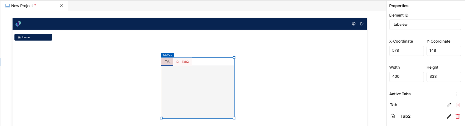
Fig 42: Tab Group Properties Section
Styles
You will see Styles right below the Properties section, which helps in formatting your Tab Group in different ways.
Following style properties are applicable for tab. These are optional attributes.
Active Tab Background Color - Click on active tab background color to choose a color from color palette to change background color of current/active tab
Active Tab Font Color - Click on active tab font color to choose a color from color palette to change font color of current/active tab
Inactive Tab Background Color - Click on inactive tab background color to choose a color from color palette to change background color of all the other tabs apart from current/active tab
Inactive Tab Font Color - Click on inactive tab font color to choose a color from color palette to change font color of all the other tabs apart from current/active tab
Indicator Color - Click on indicator color to choose a color from color palette to change the color of current tab indicator
Font Family - Here, you will get a list of various font options to choose from. Chosen font will be applied to tab header
Font Size - Change font size of tab header text by manually entering a value in this input field
Font Style - Click on this dropdown field to change font style of tab header text from normal to italic
Font Weight - Click on this dropdown to change font of tab header text from normal to bold
Text Decoration - You can underline the tab header text by selecting underline from this dropdown field
Border Thickness - You can add thickness to the tab element’s border by manually entering a value in this field
Border Color - A desired border color for the tab’s border can be selected using border color field. Click on border color & choose a desired color of your choice to change existing color.
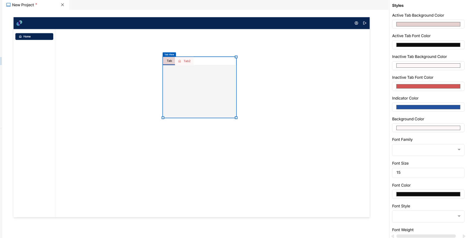
Fig 43: Tab Group Styles Section
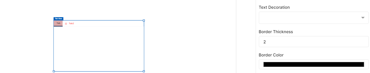
Fig 44: Tab Group Styles Section
Events
You can find Events right below the style section, that helps you to select the right type of event for tab group.
When you click on + symbol next to Event, a Configure Event pop up appears with Event Type and Select Event fields. There are 2 ways you could trigger an event.
On Click - On click implies that an event will be triggered on clicking the tab
On Hover - On hover implies that an event will be triggered when hovered over tab
When you select any of the above fields, you are expected to select an event to be triggered from the list of events in Select Event dropdown. Click on Configure Parameters button if you have any parameters to configure for the event. You can add parameter value in the text box and click on Add Event. The Event will be configured successfully Note: There could be events without any parameters added to it.
Fig 45: Configure event
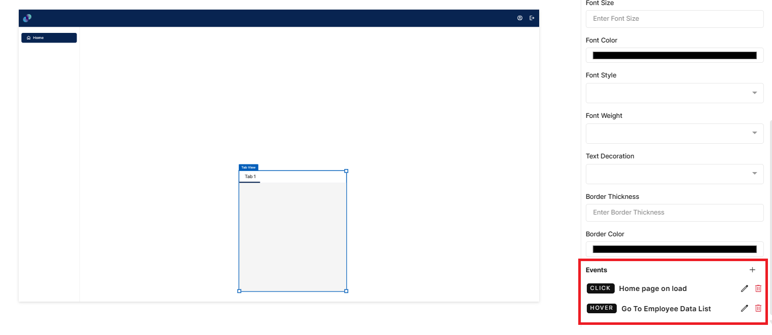
Fig 46: Events Configured
Tab Group - Properties, Styles & Events
Visualization
Elements under visualization section can be used to create a dashboard or to prepare data visualization report. Elements under this section include:
Count Card
Bar Chart
Line Chart
Pie Chart
Count Card
This element is used to get the summary of desired fields from the data model table. It performs various functions on the data table to measure performance. To create a user interface using count card element, drag the element and place it at the desired location in screen canvas.
Configuration of count card is as below.
Properties
Count Card element configuration is done through Properties panel. Below are the attributes under properties panel that can be configured as desired:
Element ID - This is a unique id given to each element. This id will be used to identify the screen elements when used in other modules like events. By default, element id will be the element type. When more than one element of its type is placed in canvas, element type will be suffixed by unique identifier.
X-Coordinate- Instead of aligning the element in canvas, you can also change the x coordinate value in X-Coordinate field to adjust x axis
Y-Coordinate- Instead of aligning the element in canvas, you can also change y coordinate value in Y-Coordinate field to adjust y axis.
Height-You can modify height of the element using cursor in canvas or by changing value in Height field.
Width-You can modify the width of element using cursor in canvas or by changing value in Width field.
Data Table Source - This is a mandatory dropdown field. Here, you will see a list of all created tables including system generated tables. Choose relevant table depending on what data you need to display in count card
Data Model Column - This is a dropdown field, where you will get a list of all columns from Data Table Source. You have to choose the columns based on what data you need to display in count card. Selected function (explained below) gets applied to the field chosen here.
Icon - This is a checkbox field to add on icon to the count card. When this checkbox is checked, users will get Select Icon field to select an icon for count card. When clicked on Info, you will get a popup to choose from the list of available material & font awesome icons. Here, you can also search for desired icons & select the same. Once selected, you can see the selected icon under select icon field. If this checkbox is unchecked, count card will only have label & count.
Description - This is an input field to provide label to the count card. By default, description will be label which can be modified based on the data you display.
Refresh Data Every - This is an input field to enter data refresh time in minutes. i.e. run time data in deployed application will be refresh every x minute entered here. Default refresh time will be set to 5 minutes. Developers can leave the default refresh time as is or change if needed. The minimum time should be 1 minute and there is no maximum time limit for this field.
Function - A dropdown field to select a function that you’d like to apply to the selected data model column. As of now, Count, Sum, Min, Max & Average functions are allowed. Sum, Min, Max & Average functions are applicable only for data model columns with numeric values. When count is selected from dropdown, count of selected column data will be displayed in count card. When max function is selected, largest value from the chosen field will be returned. When max function is selected, smallest value from the chosen field will be returned. When sum function is selected, system adds the sum of all numbers in the chosen field & returns the output. When average function is selected, system adds the numeric values in chosen field and divides it by the total number of numeric values & returns the output.
Decimal Precision - This is an input field to provide number of digits/decimal numbers after the whole number/count. Developers can manually enter a number of use increment or decrement arrows to modify
Thousand Separator - A checkbox field to change representation of a number i.e. by dividing numbers with many digits into groups using comma. Enabling this feature scales a number by multiples of 1,000 & separates by comma
Prefix - An input field to enter a value to be added to the beginning of count value in deployed application. For example, prefixing a currency field with dollar sign is possible by providing $ in the prefix field.
Suffix - An input field to enter a value to be added to the end of count value in deployed application.
Filter: This section is used to apply filter to the overall data based on which, count will be calculated. Data Model Column - A dropdown field with the list of all columns from selected Data Table Source. Filter will be applied to the column you choose here.
Operators - Dropdown field with a list of below relational & comparison operators to apply filter.
Contains: When developer selects ‘contains’ from the dropdown and enters desired value in the value field, data which contain the value entered will be filtered and displayed in the count card.
Does not Contain: When developer selects ‘does not contain’ from the dropdown and enters desired value in the value field, data which do not contain the value entered will be filtered and displayed in the count card.
Starts with: When developer selects ‘starts with’ from the dropdown and enters desired value in the value field, data that starts with the value entered will be filtered and displayed.
Does not start with: When developer selects ‘does not start with’ from the dropdown and enters desired value in the value field, data that does not start with the value entered will be filtered and displayed.
Equal to: When developer selects ‘equal to’ from the dropdown and enters desired value in the value field, data that is exactly equal to the value entered will be filtered and displayed.
Not Equal to: When developer selects ‘not equal to’ from the dropdown and enters desired value in the value field, data that is not equal to the value entered will be filtered and displayed.
Less than - When developer selects ‘less than’ from the dropdown and enters desired value in the value field, data that is less than the entered value (excluding the entered value) will be filtered and displayed in the card.
Less than or equal to - When developer selects ‘less than or equal to’ from the dropdown and enters desired value in the value field, data that is less than the entered value or equals the entered value will be filtered and displayed in the card.
Greater than - When developer selects ‘greater than’ from the dropdown and enters desired value in the value field, data that is greater than the entered value (excluding the entered value) will be filtered and displayed in the card.
Greater than or equal to - When developer selects ‘greater than or equal to’ from the dropdown and enters desired value in the value field, data that is greater than the entered value or equals the entered value will be filtered and displayed in the card.
In - When developer selects ‘in’ from the dropdown, the Value field below Operators field, will accept multiple entries as input and these entries can be separated by a comma. When developer enters a single value, ‘equal to’ functionality will be applied to ‘In’ as well. When developer enters more than one value, the entries that are equal to the entered values will be returned and displayed in the card.
Not In - When developer selects ‘not in’ from the dropdown, the Value field below Operators field, will accept multiple entries as input and these entries can be separated by a comma. When developer enters a single value, ‘not equal to’ functionality will be applied to ‘Not In’ as well. When developer enters more than one value, the entries that are not equal to the entered values will be returned and displayed in the card.
Is Null - When developer selects ‘is null’ from the dropdown, count of blank records will be filtered and displayed in the card. The Value input field will be disabled when you select this option.
Is Not Null - When developer selects ‘is not null’ from the dropdown, count of all the records that are not blank will be filtered and displayed in the card. The Value input field will be disabled when you select this option.
Value - A mandatory input field to enter a value for the filter to be applied to count card.
Add Filter - This is a button. Once you have provided above information, you can click this button to apply respective filter to the count card. Default logical operator for now will be ‘AND’. You can repeat the above process to apply multiple filters. Note: Actual count will be visible only in the deployed application. Count displayed in screen canvas is a dummy value.
Added filters can be seen just below Add Filter button. This section includes Column, Operator, Value & Action fields. Column, Operator & Value will be fetched form Filter section and Action field will contain a ‘Delete’ icon. If you click on delete icon against a filter, the corresponding filter will be removed from the count card.
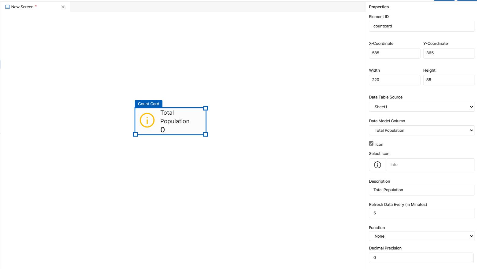
Fig 47: Count Card Properties Section
Fig 48: Count Card Properties Section
Styles
You will see Styles right below the Properties section, which helps in formatting your Card Count in different ways.
Following style properties are applicable for count card. These are optional attributes.
Label Color - Click on label color to choose a color from color palette to change text/label color of count card
Count Color - Click on count color to choose a color from color palette to change count color of count card
Icon Color - Click on icon color to choose a color from color palette to change icon color of count card. This field appears only if Icon field is checked in properties panel
Icon Size - Change icon size of count card by manually entering a value in this input field. This field appears only if Icon field is checked in properties panel
Label Size - Change the label/text size of count card by manually entering a value in this input field
Count Size - Change the count/value size of count card by manually entering a value in this input field
Font Family - Here, you will get a list of various font options to choose from. Chosen font will be applied to label text
Background Color - Click on background color to choose a color from color palette to change background color of count card
Border Thickness - You can add thickness to the count card’s border by manually entering a value in this field
Border Color - A desired border color for the count card’s border can be selected using border color field. Click on border color & choose a desired color of your choice to change existing color.
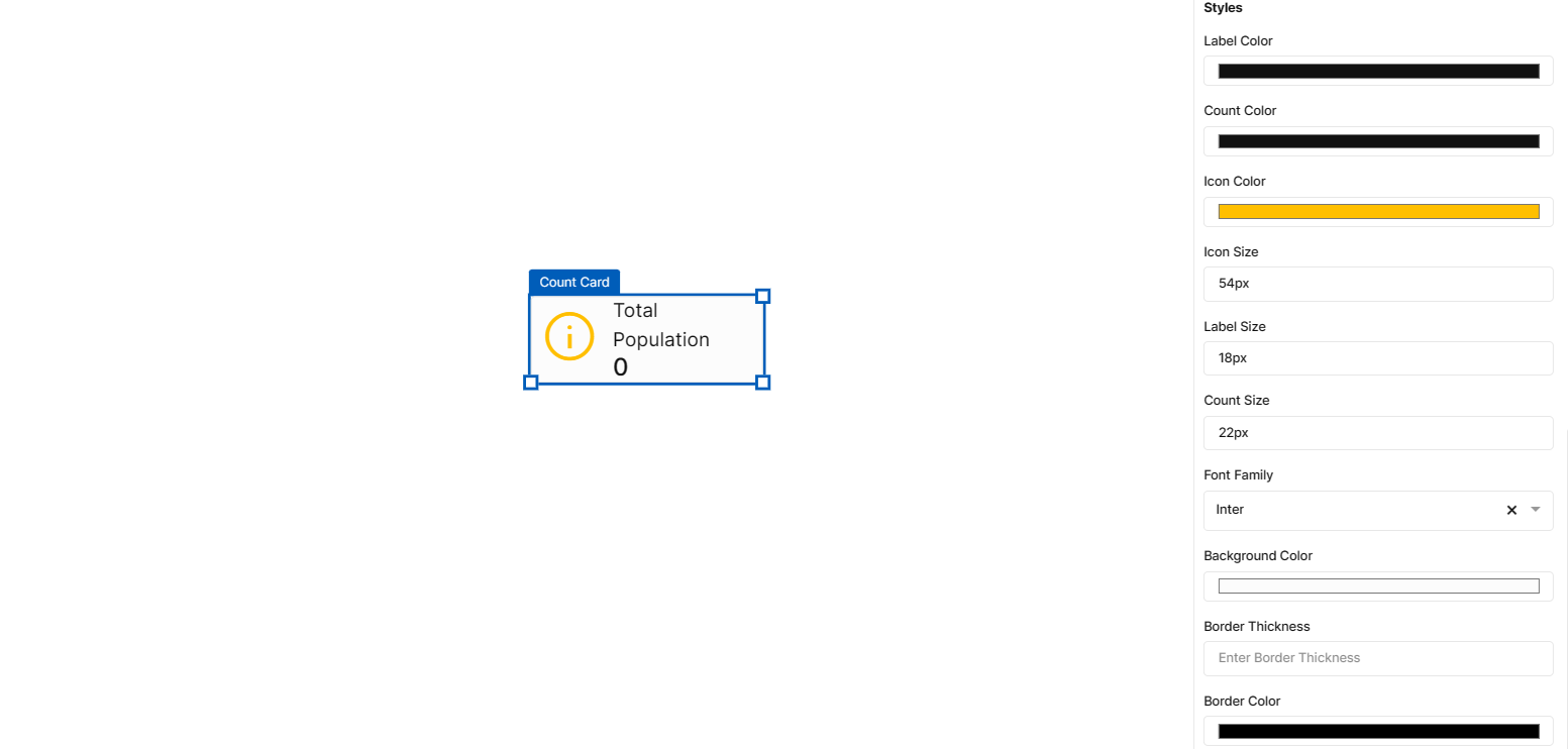
Fig 49: Count Card Styles Section
Events
You can find Events right below the style section, that helps you to select the right type of event for Count card.
When you click on + symbol next to Event, a Configure Event pop up appears with Event Type and Select Event fields. There are 2 ways you could trigger an event.
On Click - On click implies that an event will be triggered on clicking the Count card.
On Hover - On hover implies that an event will be triggered when hovered over Count card.
When you select any of the above fields, you are expected to select an event to be triggered from the list of events in Select Event dropdown. Click on Configure Parameters button if you have any parameters to configure for the event. You can add parameter value in the text box and click on Add Event. The Event will be configured successfully Note: There could be events without any parameters added to it.
Fig 50: Configure event
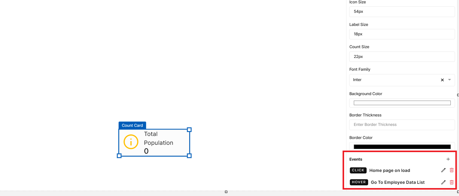
Fig 51: Events Configured
Count Card
Bar Chart
This element is used to display data in the form of rectangular vertical bars. The heights of bars are proportional to the values they represent. To create a user interface using bar chart element, drag the element and place it at the desired location in screen canvas.
Configuration of bar chart is as below.
Properties
Bar Chart element configuration is done through Properties panel. Below are the attributes under properties panel that can be configured as desired:
Element ID - This is a unique id given to each element. This id will be used to identify the screen elements when used in other modules like events. By default, element id will be the element type. When more than one element of its type is placed in canvas, element type will be suffixed by unique identifier.
X-Coordinate- Instead of aligning the element in canvas, you can also change the x coordinate value in X-Coordinate field to adjust x axis
Y-Coordinate- Instead of aligning the element in canvas, you can also change y coordinate value in Y-Coordinate field to adjust y axis.
Height-You can modify height of the element using cursor in canvas or by changing value in Height field.
Width-You can modify the width of element using cursor in canvas or by changing value in Width field.
Chart Type - This is a dropdown field with two types of chart - Grouped & Stacked. When ‘Grouped’ is selected, bars in bar chart will be placed next to each other & dummy representation will be visible in screen canvas. When you select ‘Stacked’, bars will be placed on top of each other & dummy representation will be visible in screen canvas.
Title - This is an input field to provide title to the bar chart. By default, title will be Bar Chart which can be modified based on the data you display.
Refresh Data Every - This is an input field to enter data refresh time in minutes. i.e. run time data in deployed application will be refresh every x minute entered here. Default refresh time will be set to 5 minutes. Developers can leave the default refresh time as is or change if needed. The minimum time should be 1 minute and there is no maximum time limit for this field.
Data Table Source - This is a mandatory dropdown field. Here, you will see a list of all created tables including system generated tables. Choose relevant table depending on what data you need to display in bar chart. Once you have added X and Y axis, data table source field will be disabled. So, as of now users can only create a bar chart using one data table source.
X-Axis: Column - This is a dropdown field, where you will get a list of all columns from Data Table Source. You have to choose the columns based on what data you need to display in X axis of your bar chart.
Show X-Axis - This is a checkbox field for developers to choose whether they want to have X Axis in bar chart or have only the Y Axis. If this checkbox is checked, bar chart will only have Y Axis displayed in UI.
Label Angle - An input field to provide angle to X Axis label. By default, angle of X Axis label text will be 45 degrees which can be modified as desired.
Dynamic Range - A checkbox field which allows users to set minimum, maximum values to X Axis & also set interval between X Axis values. This field is applicable only if your X Axis has numeric data.
Min - An input field to enter a minimum value for X Axis. Bar chart will have this value as the starting X Axis value.
Max - An input field to enter a maximum value for X Axis. Bar chart will have this value as the ending X Axis value.
Interval - An input field to set interval between X Axis values. Values in X Axis will be placed based on the input provided here. For example, if the min value is 0, max value is 20 and interval is 5, then X Axis values in bar chart will look like this, 0,5,10,15,20.
Y-Axis - This is a dropdown field, where you will get a list of all columns from Data Table Source. You have to choose the columns based on what data you need to display in Y axis of your bar chart.
Bar Color - Click on bar color to choose a color from color palette to add a color to the bars.
Bar Thickness - You can add thickness to the bar by manually entering a value in this field. Default thickness is 15 which can be changed as desired.
Function - A dropdown field to select a function that you’d like to apply to the selected data model column. As of now, Count, Sum, Min, Max & Average functions are allowed. Sum, Min, Max & Average functions are applicable only for Y Axis fields with numeric values. When count is selected from dropdown, count of selected column data will be displayed in each bar. When max function is selected, largest value from the chosen field will be returned. When max function is selected, smallest value from the chosen field will be returned. When sum function is selected, system adds the sum of all numbers in the chosen field & returns the output. When average function is selected, system adds the numeric values in chosen field and divides it by the total number of numeric values & returns the output.
Decimal Precision - This is an input field to provide number of digits/decimal numbers after the whole number/bar value. Developers can manually enter a number of use increment or decrement arrows to modify
Thousand Separator - A checkbox field to change representation of a number i.e. by dividing numbers with many digits into groups using comma. Enabling this feature scales a number by multiples of 1,000 & separates by comma
Prefix - An input field to enter a value to be added to the beginning of bar value in deployed application. For example, prefixing a currency field with dollar sign is possible by providing $ in the prefix field.
Suffix - An input field to enter a value to be added to the end of bar value in deployed application.
Filter: This section is used to apply filter to the overall data based on which, count function will be applied. Data Model Column - A dropdown field with the list of all columns from selected Data Table Source. Filter will be applied to the column you choose here.
Operators - Dropdown field with a list of below relational & comparison operators to apply filter.
Contains: When developer selects ‘contains’ from the dropdown and enters desired value in the value field, data which contain the value entered will be filtered and displayed in the bar chart.
Does not Contain: When developer selects ‘does not contain’ from the dropdown and enters desired value in the value field, data which do not contain the value entered will be filtered and displayed in the bar chart.
Starts with: When developer selects ‘starts with’ from the dropdown and enters desired value in the value field, data that starts with the value entered will be filtered and displayed.
Does not start with: When developer selects ‘does not start with’ from the dropdown and enters desired value in the value field, data that does not start with the value entered will be filtered and displayed.
Equal to: When developer selects ‘equal to’ from the dropdown and enters desired value in the value field, data that is exactly equal to the value entered will be filtered and displayed.
Not Equal to: When developer selects ‘not equal to’ from the dropdown and enters desired value in the value field, data that is not equal to the value entered will be filtered and displayed.
Less than - When developer selects ‘less than’ from the dropdown and enters desired value in the value field, data that is less than the entered value (excluding the entered value) will be filtered and displayed in the bar chart.
Less than or equal to - When developer selects ‘less than or equal to’ from the dropdown and enters desired value in the value field, data that is less than the entered value or equals the entered value will be filtered and displayed in the bar chart.
Greater than - When developer selects ‘greater than’ from the dropdown and enters desired value in the value field, data that is greater than the entered value (excluding the entered value) will be filtered and displayed in the bar chart.
Greater than or equal to - When developer selects ‘greater than or equal to’ from the dropdown and enters desired value in the value field, data that is greater than the entered value or equals the entered value will be filtered and displayed in the bar chart.
In - When developer selects ‘in’ from the dropdown, the Value field below Operators field, will accept multiple entries as input and these entries can be separated by a comma. When developer enters a single value, ‘equal to’ functionality will be applied to ‘In’ as well. When developer enters more than one value, the entries that are equal to the entered values will be returned and displayed in the bar chart.
Not In - When developer selects ‘not in’ from the dropdown, the Value field below Operators field, will accept multiple entries as input and these entries can be separated by a comma. When developer enters a single value, ‘not equal to’ functionality will be applied to ‘Not In’ as well. When developer enters more than one value, the entries that are not equal to the entered values will be returned and displayed in the bar chart.
Is Null - When developer selects ‘is null’ from the dropdown, count of blank records will be filtered and displayed in the bar chart. The Value input field will be disabled when you select this option.
Is Not Null - When developer selects ‘is not null’ from the dropdown, count of all the records that are not blank will be filtered and displayed in the bar chart. The Value input field will be disabled when you select this option.
Value - A mandatory input field to enter a value for the filter to be applied to bar chart.
Add Filter - This is a button. Once you have provided above information, you can click this button to apply respective filter to the bar chart. Default logical operator for now will be ‘AND’. You can repeat the above process to apply multiple filters. Note: Actual count will be visible only in the deployed application. Count displayed in screen canvas is a dummy value.
Added filters can be seen just below Add Filter button. This section includes Column, Operator, Value & Action fields. Column, Operator & Value will be fetched form Filter section and Action field will contain a ‘Delete’ icon. If you click on delete icon against a filter, the corresponding filter will be removed from the bar chart.
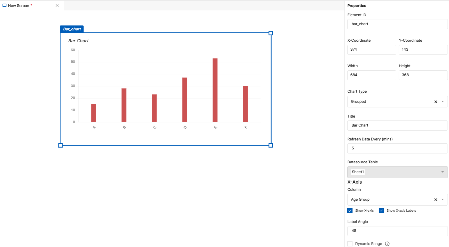
Fig 52: Bar Chart Properties Section
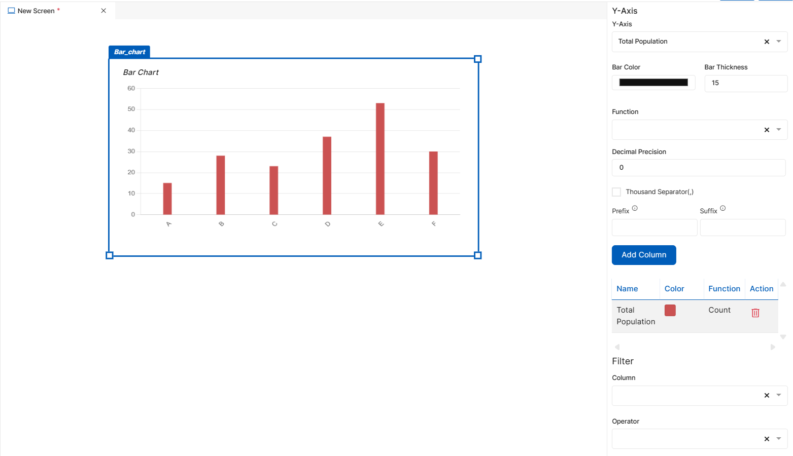
Fig 53: Bar Chart Properties Section
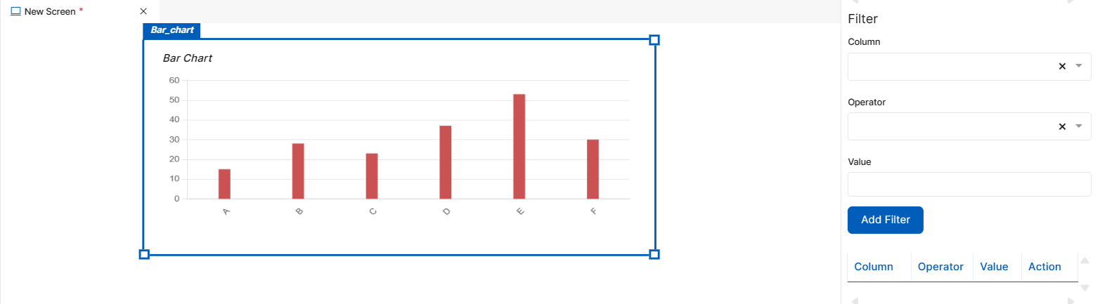
Fig 54: Bar Chart Properties Section
Styles
You will see Styles right below the Properties section, which helps in formatting your Bar Chart in different ways.
Following style properties are applicable for bar chart. These are optional attributes.
Background Color - Click on background color to choose a color from color palette to change background color of bar chart
Font Family - Here, you will get a list of various font options to choose from. Chosen font will be applied to title & axis labels
Font Size - Change font size of title & axis labels by manually entering a value in this input field
Font Color - Click on font color & choose a desired color to change the default black font color of table title & axis labels
Font Style - Click on this dropdown field to change font style of title & axis labels from normal to italic
Font Weight - Click on this dropdown to change font of title & axis labels from normal to bold
Text Decoration - You can underline the title & axis labels by selecting underline from this dropdown field
Border Thickness - You can add thickness to bar chart’s border by manually entering a value in this field
Border Color - A desired border color for the bar chart’s border can be selected using border color field. Click on border color & choose a desired color of your choice to change existing color.
Vertical Grid - An optional checkbox field for users to add vertical grid to the bar chart.
Horizontal Grid - An optional checkbox field for users to add horizontal grid to the bar chart.
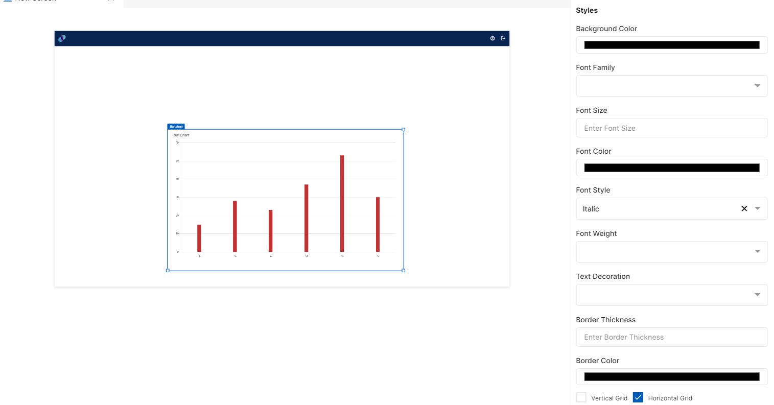
Fig 55: Bar Chart Styles Section
Events
You can find Events right below the style section, that helps you to select the right type of event for bar graph.
When you click on + symbol next to Event, a Configure Event pop up appears with Event Type and Select Event fields. There are 2 ways you could trigger an event.
On Click - On click implies that an event will be triggered on clicking the bar graph
On Hover - On hover implies that an event will be triggered when hovered over bar graph
On Bar Click - On Bar click implies that an event will be triggered on clicking any of the bars in the graph
When you select any of the above fields, you are expected to select an event to be triggered from the list of events in Select Event dropdown. Click on Configure Parameters button if you have any parameters to configure for the event. You can add parameter value in the text box and click on Add Event. The Event will be configured successfully Note: There could be events without any parameters added to it.
Fig 56: Configure event
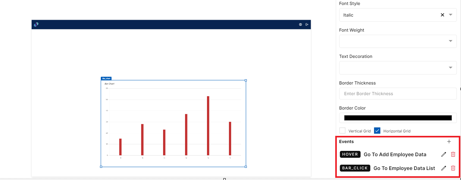
Fig 57: Events Configured
Line Chart
This element is used to display data in the form of data points/dots connected by a line. i.e. A line graph connects individual data points that typically display quantitative values over a specified time interval. To create a user interface using line chart element, drag the element and place it at the desired location in screen canvas.
Configuration of line chart is as below.
Properties
Line Chart element configuration is done through Properties panel. Below are the attributes under properties panel that can be configured as desired:
Element ID - This is a unique id given to each element. This id will be used to identify the screen elements when used in other modules like events. By default, element id will be the element type. When more than one element of its type is placed in canvas, element type will be suffixed by unique identifier.
X-Coordinate- Instead of aligning the element in canvas, you can also change the x coordinate value in X-Coordinate field to adjust x axis
Y-Coordinate- Instead of aligning the element in canvas, you can also change y coordinate value in Y-Coordinate field to adjust y axis.
Height-You can modify height of the element using cursor in canvas or by changing value in Height field.
Width-You can modify the width of element using cursor in canvas or by changing value in Width field.
Title - This is an input field to provide title to the line chart. By default, title will be Line Chart which can be modified based on the data you display.
Refresh Data Every - This is an input field to enter data refresh time in minutes. i.e. run time data in deployed application will be refresh every x minute entered here. Default refresh time will be set to 5 minutes. Developers can leave the default refresh time as is or change if needed. The minimum time should be 1 minute and there is no maximum time limit for this field.
Source Table - This is a mandatory dropdown field. Here, you will see a list of all created tables including system generated tables. Choose relevant table depending on what data you need to display in line chart. Once you have added X and Y axis, data table source field will be disabled. So, as of now users can only create a line chart using one data table source.
X-Axis: Column - This is a dropdown field, where you will get a list of all columns from Data Table Source. You have to choose the columns based on what data you need to display in X axis of your line chart.
Show X-Axis - This is a checkbox field for developers to choose whether they want to have X Axis in line chart or have only the Y Axis. If this checkbox is checked, line chart will only have Y Axis displayed in UI.
Label Angle - An input field to provide angle to X Axis label. By default, angle of X Axis label text will be 45 degrees which can be modified as desired.
Dynamic Range - A checkbox field which allows users to set minimum, maximum values to X Axis & also set interval between X Axis values. This field is applicable only if your X Axis has numeric data.
Min - An input field to enter a minimum value for X Axis. Line chart will have this value as the starting X Axis value.
Max - An input field to enter a maximum value for X Axis. Line chart will have this value as the ending X Axis value.
Interval - An input field to set interval between X Axis values. Values in X Axis will be placed based on the input provided here. For example, if the min value is 0, max value is 20 and interval is 5, then X Axis values in line chart will look like this, 0,5,10,15,20.
Y-Axis - This is a dropdown field, where you will get a list of all columns from Data Table Source. You have to choose the columns based on what data you need to display in Y axis of your line chart.
Line Color - Click on line color to choose a color from color palette to add a color to the line that is connecting the data points.
Chart Type - This is a dropdown field with two types of chart - Line & Area. When ‘Line’ is selected, data points will be connected by a single line. When you select ‘Area’, data points will still be connected by lines, but the space between line and X-axis will be filled with a specific color.
Stepped - An optional checkbox field which allows users to create a chart similar to line graph, but with the line forming a series of steps between data points.
Line Touch Data - An optional checkbox field which allows users to view data points in the line. When you check it, you'll get data points in the line. If its unchecked, you will just get a plain solid line.
Function - A dropdown field to select a function that you’d like to apply to the selected data model column. As of now, Count, Sum, Min, Max & Average functions are allowed. Sum, Min, Max & Average functions are applicable only for Y Axis fields with numeric values. When count is selected from dropdown, count of selected column data will be displayed in each data point. When max function is selected, largest value from the chosen field will be returned. When max function is selected, smallest value from the chosen field will be returned. When sum function is selected, system adds the sum of all numbers in the chosen field & returns the output. When average function is selected, system adds the numeric values in chosen field and divides it by the total number of numeric values & returns the output.
Decimal Precision - This is an input field to provide number of digits/decimal numbers after the whole number/data point value. Developers can manually enter a number of use increment or decrement arrows to modify
Thousand Separator - A checkbox field to change representation of a number i.e. by dividing numbers with many digits into groups using comma. Enabling this feature scales a number by multiples of 1,000 & separates by comma
Prefix - An input field to enter a value to be added to the beginning of data point value in deployed application. For example, prefixing a currency field with dollar sign is possible by providing $ in the prefix field.
Suffix - An input field to enter a value to be added to the end of data point value in deployed application.
Filter: This section is used to apply filter to the overall data based on which, count function will be applied. Data Model Column - A dropdown field with the list of all columns from selected Data Table Source. Filter will be applied to the column you choose here.
Operators - Dropdown field with a list of below relational & comparison operators to apply filter.
Contains: When developer selects ‘contains’ from the dropdown and enters desired value in the value field, data which contain the value entered will be filtered and displayed in the line chart.
Does not Contain: When developer selects ‘does not contain’ from the dropdown and enters desired value in the value field, data which do not contain the value entered will be filtered and displayed in the line chart.
Starts with: When developer selects ‘starts with’ from the dropdown and enters desired value in the value field, data that starts with the value entered will be filtered and displayed.
Does not start with: When developer selects ‘does not start with’ from the dropdown and enters desired value in the value field, data that does not start with the value entered will be filtered and displayed.
Equal to: When developer selects ‘equal to’ from the dropdown and enters desired value in the value field, data that is exactly equal to the value entered will be filtered and displayed.
Not Equal to: When developer selects ‘not equal to’ from the dropdown and enters desired value in the value field, data that is not equal to the value entered will be filtered and displayed.
Less than - When developer selects ‘less than’ from the dropdown and enters desired value in the value field, data that is less than the entered value (excluding the entered value) will be filtered and displayed in the line chart.
Less than or equal to - When developer selects ‘less than or equal to’ from the dropdown and enters desired value in the value field, data that is less than the entered value or equals the entered value will be filtered and displayed in the line chart.
Greater than - When developer selects ‘greater than’ from the dropdown and enters desired value in the value field, data that is greater than the entered value (excluding the entered value) will be filtered and displayed in the line chart.
Greater than or equal to - When developer selects ‘greater than or equal to’ from the dropdown and enters desired value in the value field, data that is greater than the entered value or equals the entered value will be filtered and displayed in the line chart.
In - When developer selects ‘in’ from the dropdown, the Value field below Operators field, will accept multiple entries as input and these entries can be separated by a comma. When developer enters a single value, ‘equal to’ functionality will be applied to ‘In’ as well. When developer enters more than one value, the entries that are equal to the entered values will be returned and displayed in the line chart.
Not In - When developer selects ‘not in’ from the dropdown, the Value field below Operators field, will accept multiple entries as input and these entries can be separated by a comma. When developer enters a single value, ‘not equal to’ functionality will be applied to ‘Not In’ as well. When developer enters more than one value, the entries that are not equal to the entered values will be returned and displayed in the line chart.
Is Null - When developer selects ‘is null’ from the dropdown, count of blank records will be filtered and displayed in the line chart. The Value input field will be disabled when you select this option.
Is Not Null - When developer selects ‘is not null’ from the dropdown, count of all the records that are not blank will be filtered and displayed in the line chart. The Value input field will be disabled when you select this option.
Value - A mandatory input field to enter a value for the filter to be applied to line chart.
Add Filter - This is a button. Once you have provided above information, you can click this button to apply respective filter to the line chart. Default logical operator for now will be ‘AND’. You can repeat the above process to apply multiple filters. Note: Actual count will be visible only in the deployed application. Count displayed in screen canvas is a dummy value.
Added filters can be seen just below Add Filter button. This section includes Column, Operator, Value & Action fields. Column, Operator & Value will be fetched form Filter section and Action field will contain a ‘Delete’ icon. If you click on delete icon against a filter, the corresponding filter will be removed from the line chart.
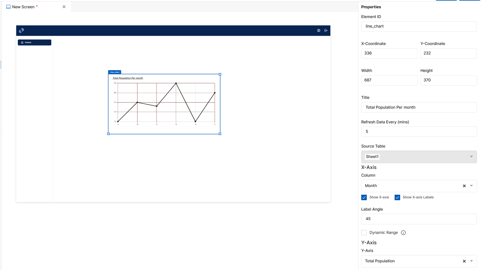
Fig 58: Line Chart Properties Section
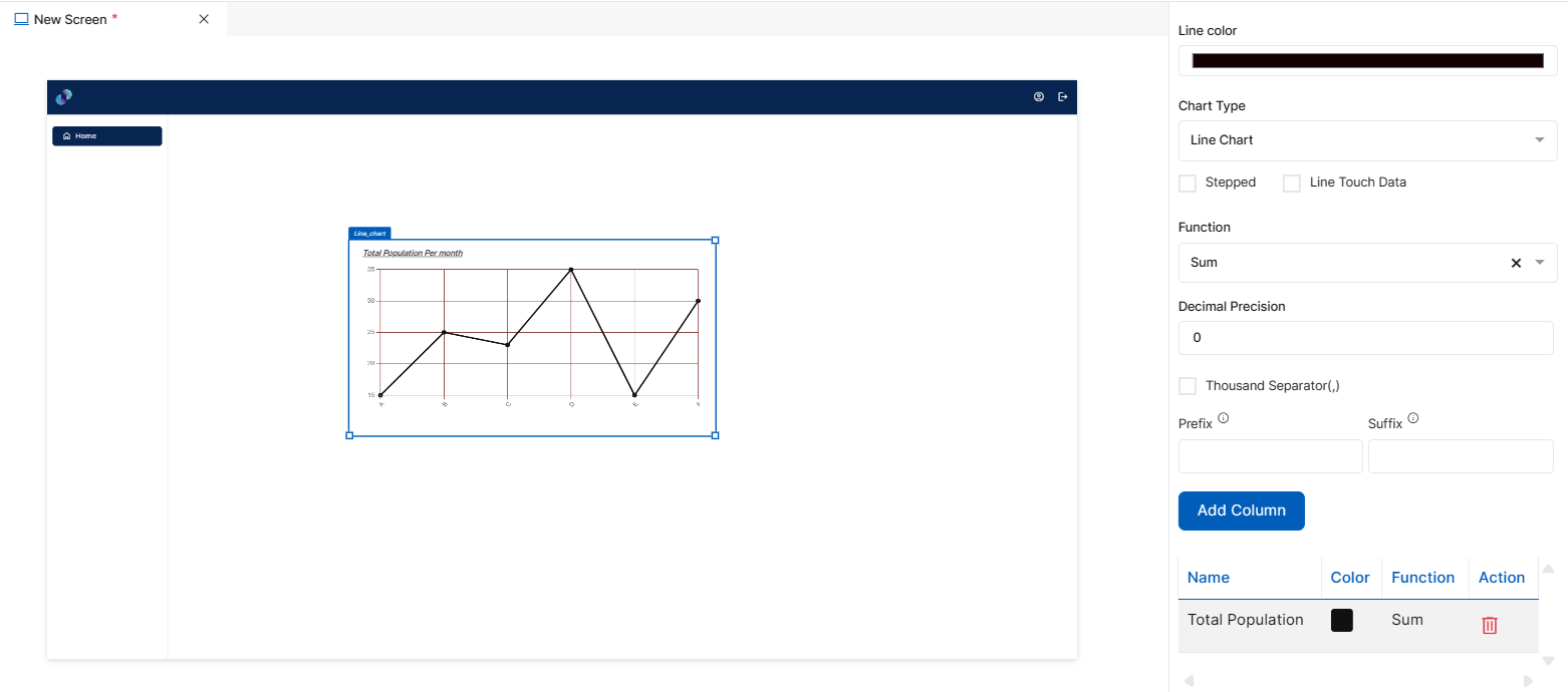
Fig 59: Line Chart Properties Section
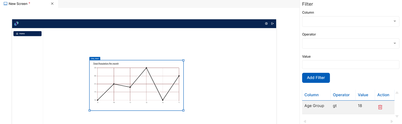
Fig 60: Line Chart Properties Section
Styles
You will see Styles right below the Properties section, which helps in formatting your Line Chart in different ways.
Following style properties are applicable for line chart. These are optional attributes.
Line Style - A dropdown field to choose the type of line you want in your line graph. There are two options to choose - Solid & Dash. If you choose Solid, graph will be represented as a straight line. If you choose Dash, graph will be represented in the form of dotted lines/dashes.
Line Thickness - An input field to enter a thickness to the line that is connecting the dots
Background Color - Click on background color to choose a color from color palette to change background color of line chart
Font Family - Here, you will get a list of various font options to choose from. Chosen font will be applied to title & axis labels
Font Size - Change font size of title & axis labels by manually entering a value in this input field
Font Color - Click on font color & choose a desired color to change the default black font color of table title & axis labels
Font Style - Click on this dropdown field to change font style of title & axis labels from normal to italic
Font Weight - Click on this dropdown to change font of title & axis labels from normal to bold
Text Decoration - You can underline the title & axis labels by selecting underline from this dropdown field
Border Thickness - You can add thickness to line chart’s border by manually entering a value in this field
Border Color - A desired border color for the line chart’s border can be selected using border color field. Click on border color & choose a desired color of your choice to change existing color.
Vertical Grid - An optional checkbox field for users to add vertical grid to the line chart.
Horizontal Grid - An optional checkbox field for users to add horizontal grid to the line chart.
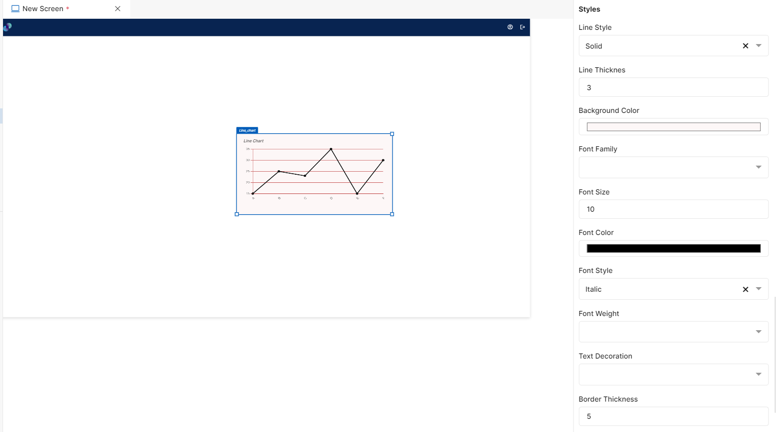
Fig 61: Line Chart Styles Section
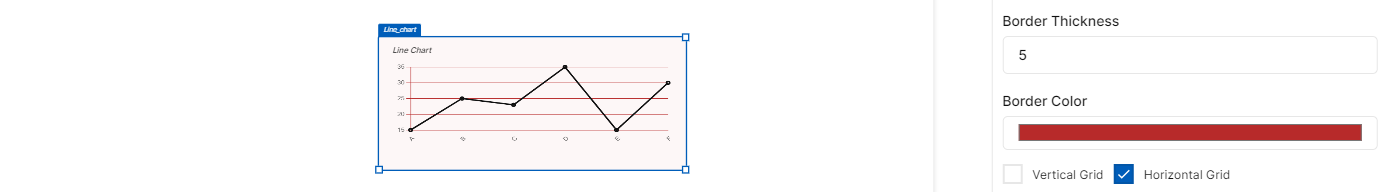
Fig 62: Line Chart Styles Section
Events
You can find Events right below the style section, that helps you to select the right type of event for Line chart.
When you click on + symbol next to Event, a Configure Event pop up appears with Event Type and Select Event fields. There are 2 ways you could trigger an event.
On Click - On click implies that an event will be triggered on clicking the line chart
On Hover - On hover implies that an event will be triggered when hovered over line chart
On Line Click - On click implies that an event will be triggered on clicking any of the lines in the chart
When you select any of the above fields, you are expected to select an event to be triggered from the list of events in Select Event dropdown. Click on Configure Parameters button if you have any parameters to configure for the event. You can add parameter value in the text box and click on Add Event. The Event will be configured successfully Note: There could be events without any parameters added to it.
Fig 63: Configure event
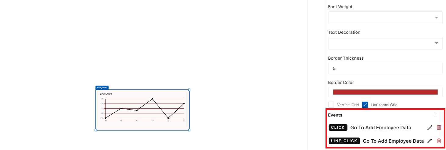
Fig 64: Events Configured
Pie Chart
This element is used to display data in a circular form. Each slice of the pie will be relative to the size of a particular category in a group as a whole. To create a user interface using pie chart element, drag the element and place it at the desired location in screen canvas.
Configuration of pie chart is as below.
Properties
Pie Chart element configuration is done through Properties panel. Below are the attributes under properties panel that can be configured as desired:
Element ID - This is a unique id given to each element. This id will be used to identify the screen elements when used in other modules like events. By default, element id will be the element type. When more than one element of its type is placed in canvas, element type will be suffixed by unique identifier.
X-Coordinate- Instead of aligning the element in canvas, you can also change the x coordinate value in X-Coordinate field to adjust x axis
Y-Coordinate- Instead of aligning the element in canvas, you can also change y coordinate value in Y-Coordinate field to adjust y axis.
Height-You can modify height of the element using cursor in canvas or by changing value in Height field.
Width-You can modify the width of element using cursor in canvas or by changing value in Width field.
Chart Type - This is a dropdown field with two types of chart - Pie & Doughnut. When ‘Pie’ is selected, the inner circle diameter size will be zero and data will be displayed as slices. When ‘doughnut’ is selected, the inner circle diameter size will be greater than and therefore, it displays data as arcs instead of slices.
Title - This is an input field to provide title to the pie chart. By default, title will be Pie Chart which can be modified based on the data you display.
Refresh Data Every - This is an input field to enter data refresh time in minutes. i.e. run time data in deployed application will be refresh every x minute entered here. Default refresh time will be set to 5 minutes. Developers can leave the default refresh time as is or change if needed. The minimum time should be 1 minute and there is no maximum time limit for this field.
Legend - A checkbox for the users to choose if they want to have Legend or skip. When pie chart is dropped in canvas, legend will not be added. When users check this checkbox, a legend based on chosen table & columns will be automatically added in deployed application. In development phase, a dummy legend will be displayed in screen canvas for reference.
Labels - A checkbox for users to choose to display values for each slice. When pie chart is dropped in canvas, label will not be added. When users check this checkbox, each slice will have it’s value displayed outside the slice, based on selected table & column in deployed application. In development phase, a dummy label will be displayed in screen canvas for reference.
Datasource Table - This is a mandatory dropdown field. Here, you will see a list of all created tables including system generated tables. Choose relevant table depending on what data you need to display in pie chart.
Column - This is a single select dropdown field, where you will get a list of all columns from selected Data Table Source. You have to choose the column based on what data you need to display as slices in your pie chart.
Function Column: This is a single select dropdown field, where you will get a list of all columns from selected Data Table Source. You have to choose a column based on which you would like to apply the function to the table (explained below).
Function - A dropdown field to select a function that you’d like to apply to the selected data model column. As of now, Count, Sum, Min, Max & Average functions are allowed. Sum, Min, Max & Average functions are applicable only for function columns with numeric values. When count is selected from dropdown, count of selected column data will be displayed in each slice. When max function is selected, largest value from the chosen field will be returned. When max function is selected, smallest value from the chosen field will be returned. When sum function is selected, system adds the sum of all numbers in the chosen field & returns the output. When average function is selected, system adds the numeric values in chosen field and divides it by the total number of numeric values & returns the output.
Decimal Precision - This is an input field to provide number of digits/decimal numbers after the whole number/data point value. Developers can manually enter a number of use increment or decrement arrows to modify
Thousand Separator - A checkbox field to change representation of a number i.e. by dividing numbers with many digits into groups using comma. Enabling this feature scales a number by multiples of 1,000 & separates by comma
Prefix - An input field to enter a value to be added to the beginning of data value in deployed application. For example, prefixing a currency field with dollar sign is possible by providing $ in the prefix field.
Suffix - An input field to enter a value to be added to the end of data value in deployed application.
Color Palette - A collection of color palettes for the users to choose from. You can enter any number of colors from 1 to 100. When you enter 100 in color palette input field, a few color palette options with a maximum of 100 different colors will be provided for you to choose from and colors from selected palette will be applied to each individual slice in pie chart. Selected palette can be found under Selected Palette field.
Filter: This section is used to apply filter to the overall data based on which, count function will be applied.
Column - A dropdown field with the list of all columns from selected Data Table Source. Filter will be applied to the column you choose here.
Operators - Dropdown field with a list of below relational & comparison operators to apply filter.
Contains: When developer selects ‘contains’ from the dropdown and enters desired value in the value field, data which contain the value entered will be filtered and displayed in the pie chart.
Does not Contain: When developer selects ‘does not contain’ from the dropdown and enters desired value in the value field, data which do not contain the value entered will be filtered and displayed in the pie chart.
Starts with: When developer selects ‘starts with’ from the dropdown and enters desired value in the value field, data that starts with the value entered will be filtered and displayed.
Does not start with: When developer selects ‘does not start with’ from the dropdown and enters desired value in the value field, data that does not start with the value entered will be filtered and displayed.
Equal to: When developer selects ‘equal to’ from the dropdown and enters desired value in the value field, data that is exactly equal to the value entered will be filtered and displayed.
Not Equal to: When developer selects ‘not equal to’ from the dropdown and enters desired value in the value field, data that is not equal to the value entered will be filtered and displayed.
Less than - When developer selects ‘less than’ from the dropdown and enters desired value in the value field, data that is less than the entered value (excluding the entered value) will be filtered and displayed in the pie chart.
Less than or equal to - When developer selects ‘less than or equal to’ from the dropdown and enters desired value in the value field, data that is less than the entered value or equals the entered value will be filtered and displayed in the line chart.
Greater than - When developer selects ‘greater than’ from the dropdown and enters desired value in the value field, data that is greater than the entered value (excluding the entered value) will be filtered and displayed in the pie chart.
Greater than or equal to - When developer selects ‘greater than or equal to’ from the dropdown and enters desired value in the value field, data that is greater than the entered value or equals the entered value will be filtered and displayed in the pie chart.
Is Null - When developer selects ‘is null’ from the dropdown, count of blank records will be filtered and displayed in the pie chart. The Value input field will be disabled when you select this option.
Is Not Null - When developer selects ‘is not null’ from the dropdown, count of all the records that are not blank will be filtered and displayed in the pie chart. The Value input field will be disabled when you select this option.
Value - A mandatory input field to enter a value for the filter to be applied to pie chart.
Add Filter - This is a button. Once you have provided above information, you can click this button to apply respective filter to the pie chart. Default logical operator for now will be ‘AND’. You can repeat the above process to apply multiple filters. Note: Actual count will be visible only in the deployed application. Count displayed in screen canvas is a dummy value.
Added filters can be seen just below Add Filter button. This section includes Column, Operator, Value & Action fields. Column, Operator & Value will be fetched form Filter section and Action field will contain a ‘Delete’ icon. If you click on delete icon against a filter, the corresponding filter will be removed from the pie chart.
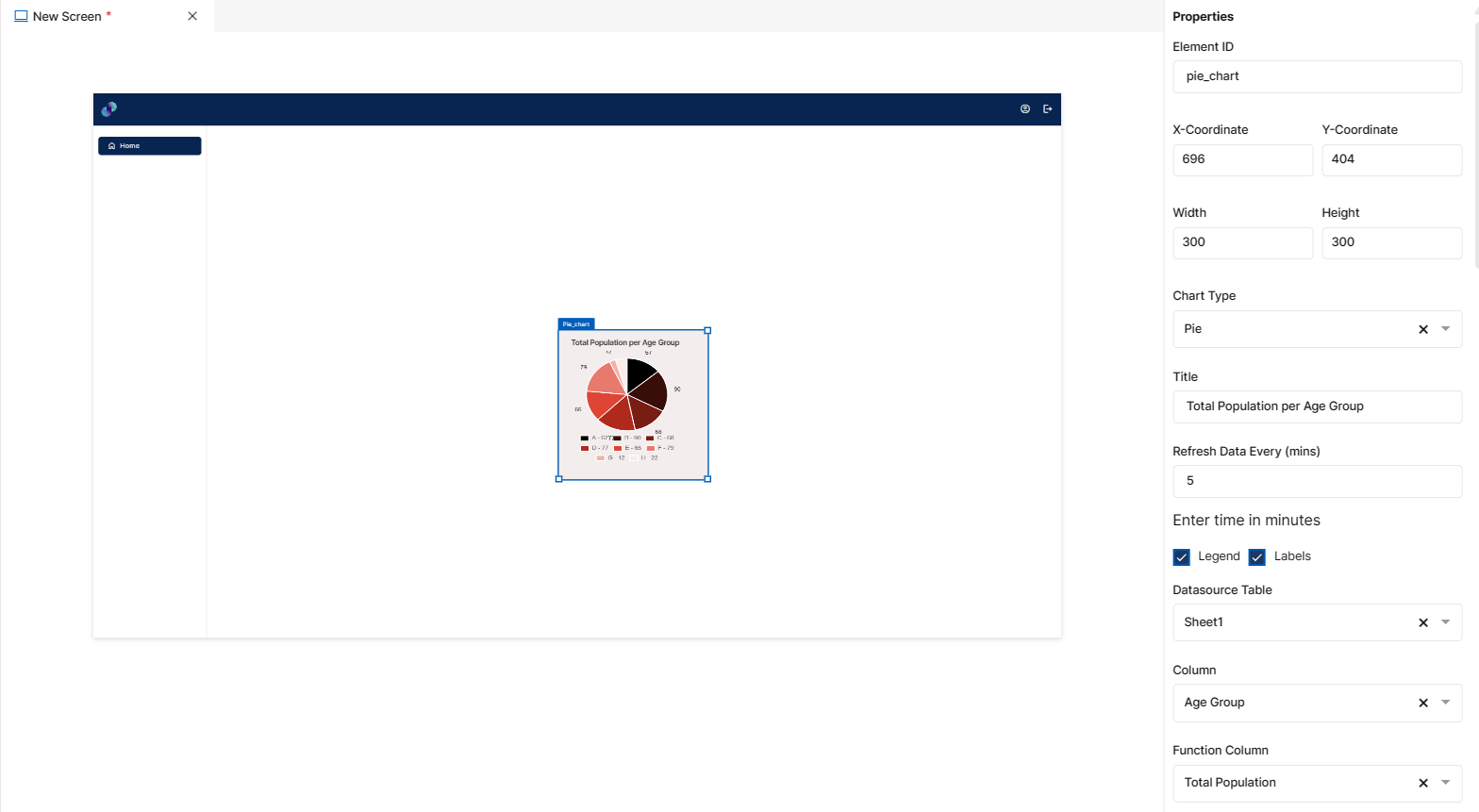
Fig 65: Pie Chart Properties Section
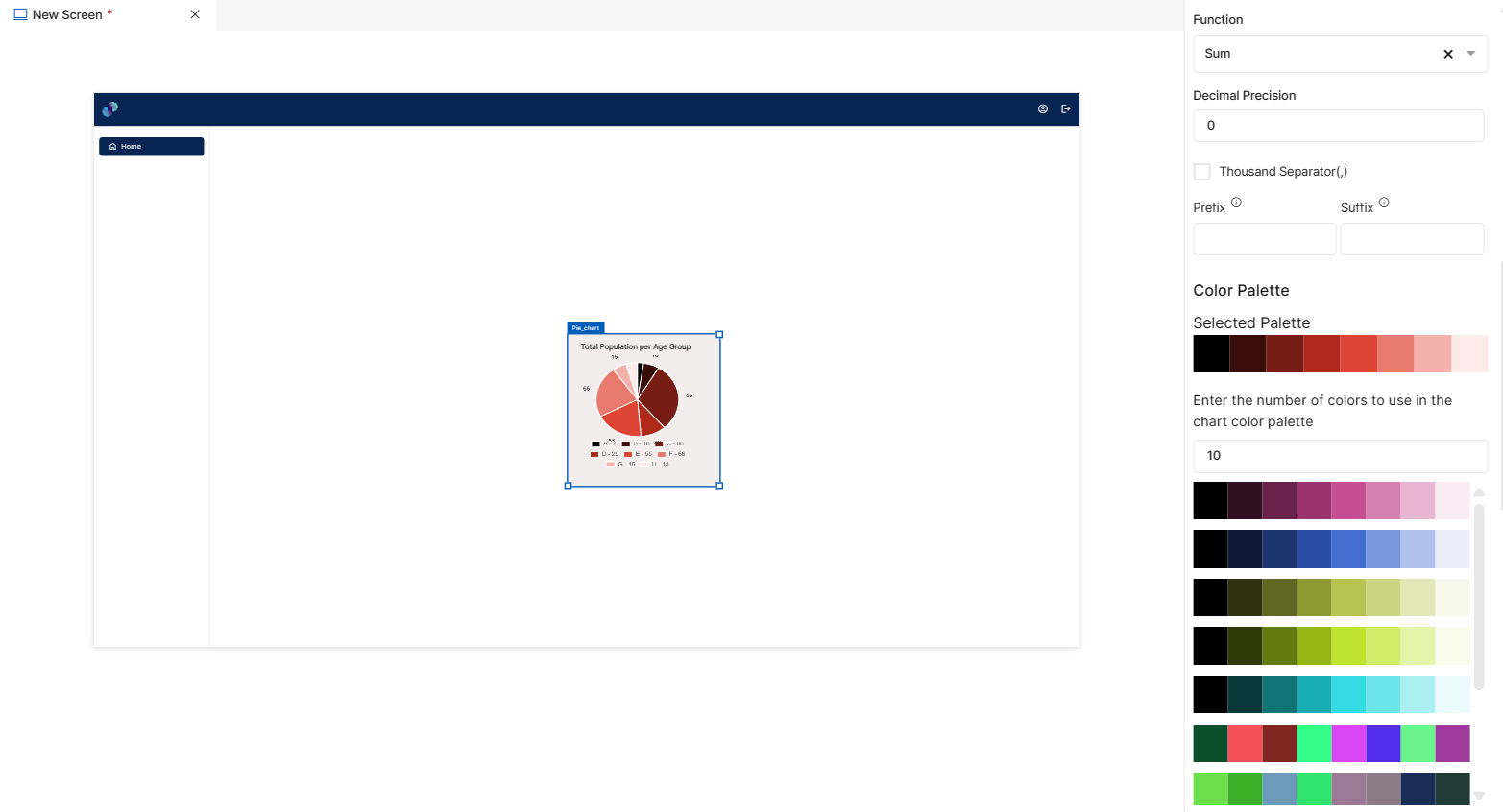
Fig 66: Pie Chart Properties Section
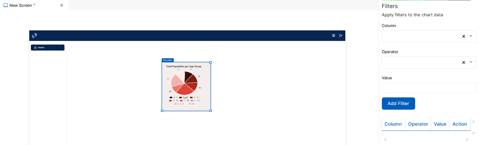
Fig 67: Pie Chart Properties Section
Styles
You will see Styles right below the Properties section, which helps in formatting your Pie Chart in different ways.
Following style properties are applicable for pie chart. These are optional attributes.
Background Color - Click on background color to choose a color from color palette to change background color of pie chart
Font Family - Here, you will get a list of various font options to choose from. Chosen font will be applied to title
Font Size - Change font size of title by manually entering a value in this input field
Font Color - Click on font color & choose a desired color to change the default black font color of table title
Font Style - Click on this dropdown field to change font style of title from normal to italic
Font Weight - Click on this dropdown to change font of title from normal to bold
Text Decoration - You can underline the title by selecting underline from this dropdown field
Border Thickness - You can add thickness to pie chart’s border by manually entering a value in this field
Border Color - A desired border color for the pie chart’s border can be selected using border color field. Click on border color & choose a desired color of your choice to change existing color.
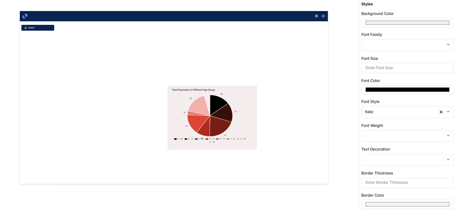
Fig 68: Pie Chart Styles Section
Events
You can find Events right below the style section, that helps you to select the right type of event for Pie chart.
When you click on + symbol next to Event, a Configure Event pop up appears with Event Type and Select Event fields. There are 2 ways you could trigger an event.
On Click - On click implies that an event will be triggered on clicking the pie chart.
On Hover - On hover implies that an event will be triggered when hovered over pie chart.
On Slice Click - On click implies that an event will be triggered on clicking any of the slices of the pie chart.
When you select any of the above fields, you are expected to select an event to be triggered from the list of events in Select Event dropdown. Click on Configure Parameters button if you have any parameters to configure for the event. You can add parameter value in the text box and click on Add Event. The Event will be configured successfully Note: There could be events without any parameters added to it.
Fig 69: Configure event
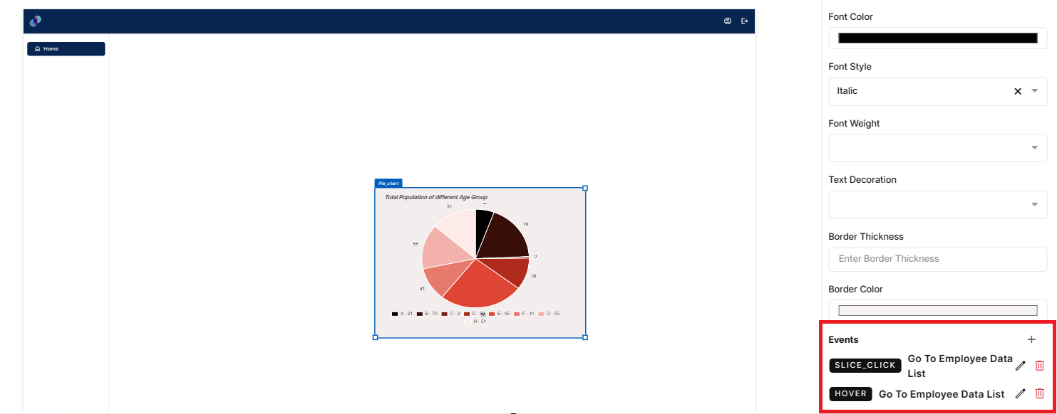
Fig 70: Events Configured
Visual Elements
Visual elements section is where you can add videos, images, links, text to the UI. There are 5 different elements in this section. You can drag and place them inside a form or directly in screen canvas like any other element.
Text
This element is used to write content for your screen. Text element could be used as a label for other screen elements like input field.
Configuration for text element is as below.
Properties
Text element configuration is done through Properties panel. Below are the attributes under properties panel that can be configured as desired:
Element ID - This is a unique id given to each element. This id will be used to identify the screen elements when used in other modules like events. By default, element id will be the element type. When more than one element of its type is placed in canvas, element type will be suffixed by unique identifier.
X-Coordinate- Instead of aligning the element in canvas, you can also change the x coordinate value in X-Coordinate field to adjust x axis
Y-Coordinate- Instead of aligning the element in canvas, you can also change y coordinate value in Y-Coordinate field to adjust y axis.
Height-You can modify height of the element using cursor in canvas or by changing value in Height field.
Width-You can modify the width of element using cursor in canvas or by changing value in Width field.
Content - This field is used to enter content for the text element. It can be either a title, description or help text based on your requirement.
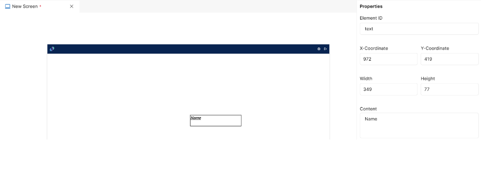
Fig 71: Text Properties Section
Styles
You will see Styles right below the Properties section, which helps in formatting your Text in different ways.
Following style properties are applicable for text element. These are optional attributes.
Background Color - Click on background color to choose a color from color palette to change background color for text element
Font Family - Here, you will get a list of various font options to choose from. Chosen font will be applied to the text
Font Size - Change font size of text manually by entering a value in this input field
Font Color - Click on font color & choose a desired color to change the default black font color of text
Font Style - Click on this dropdown field to change font style from normal to italic
Font Weight - Click on this dropdown to change font from normal to bold
Text Decoration - You can underline the text by selecting underline from this dropdown field
Border Thickness - You can add border thickness to the text element by manually entering a value in this field
Border Color - A desired border color for the text can be selected using border color field. Click on border color & choose a desired color of your choice to change existing color.
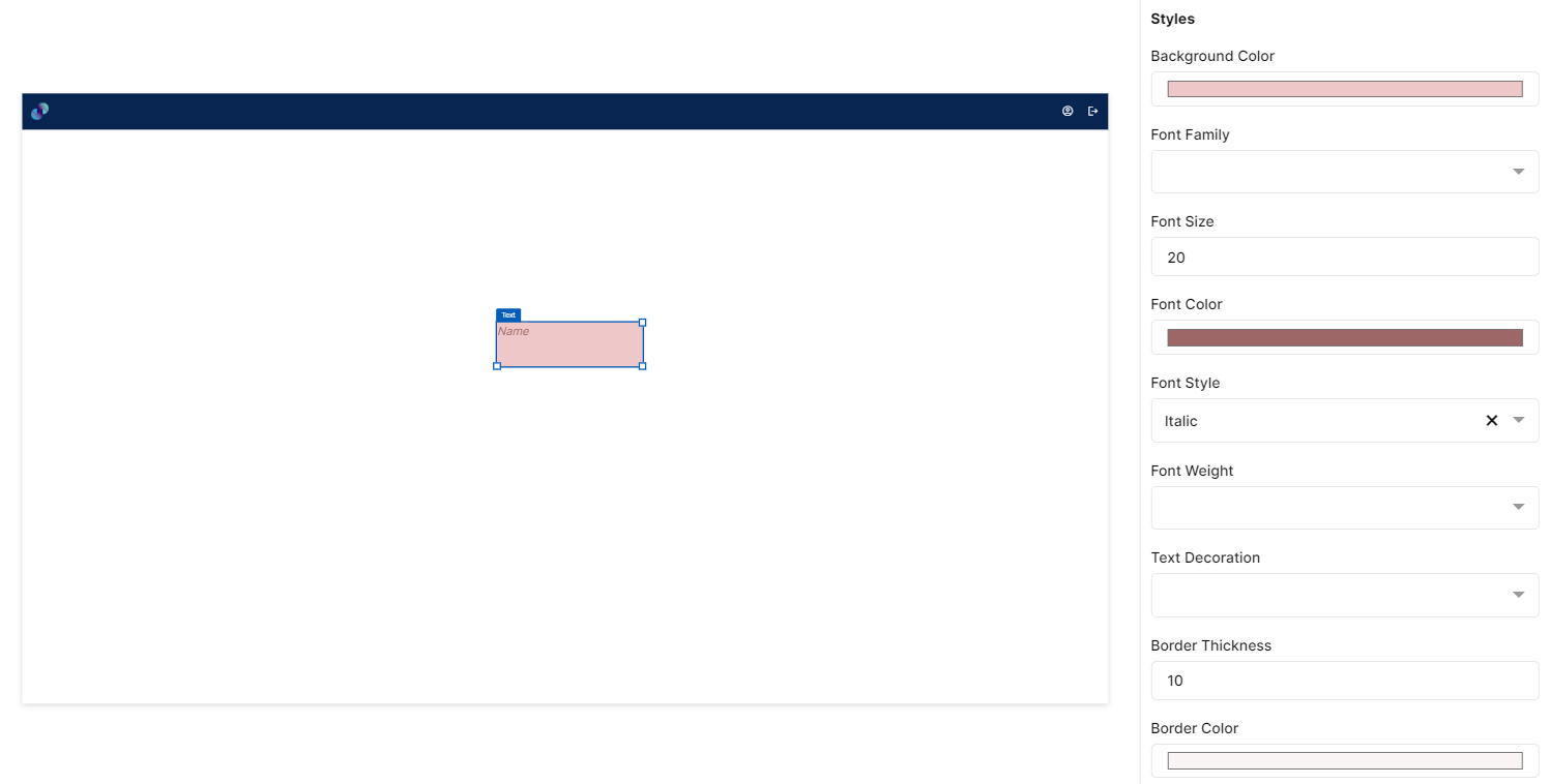
Fig 72: Text Styles Section
Events
You can find Events right below the style section, that helps you to select the right type of event for Text.
When you click on + symbol next to Event, a Configure Event pop up appears with Event Type and Select Event fields. There are 2 ways you could trigger an event.
On Click - On click implies that an event will be triggered on clicking the Text.
On Hover - On hover implies that an event will be triggered when hovered over Text.
When you select any of the above fields, you are expected to select an event to be triggered from the list of events in Select Event dropdown. Click on Configure Parameters button if you have any parameters to configure for the event. You can add parameter value in the text box and click on Add Event. The Event will be configured successfully Note: There could be events without any parameters added to it.
Fig 73: Configure event
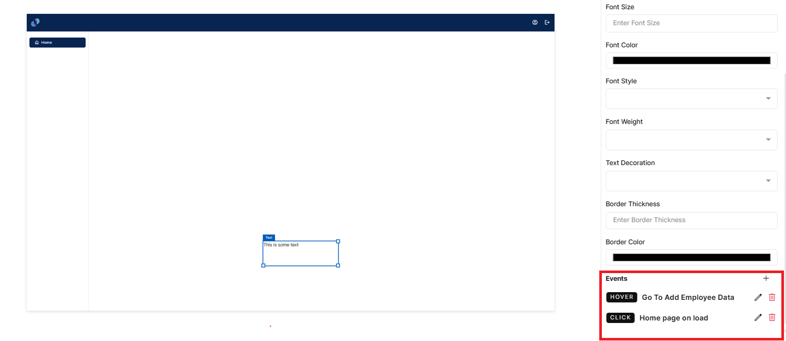
Fig 74: Events Configured
Icon
This element is used to add an icon to your application’s UI. Configuration for icon element is as below.
Properties
Icon element configuration is done through Properties panel. Below are the attributes under properties panel that can be configured as desired:
Element ID - This is a unique id given to each element. This id will be used to identify the screen elements when used in other modules like events. By default, element id will be the element type. When more than one element of its type is placed in canvas, element type will be suffixed by unique identifier.
·X-Coordinate- Instead of aligning the element in canvas, you can also change the x coordinate value in X-Coordinate field to adjust x axis
Y-Coordinate- Instead of aligning the element in canvas, you can also change y coordinate value in Y-Coordinate field to adjust y axis.
Height-You can modify height of the element using cursor in canvas or by changing value in Height field.
Width-You can modify the width of element using cursor in canvas or by changing value in Width field.
Select Icon - When clicked on Home, you will get a popup to choose from the list of available material & font awesome icons. Here, you can also search for desired icons & select the same. Once selected, you can see the selected icon under select icon field & also in screen canvas.
Size - This is an input field to enter the size of icon in pixels. Users can either manually type the pixel value or use increment & decrement arrow to modify the same. 24 is selected as the default size.
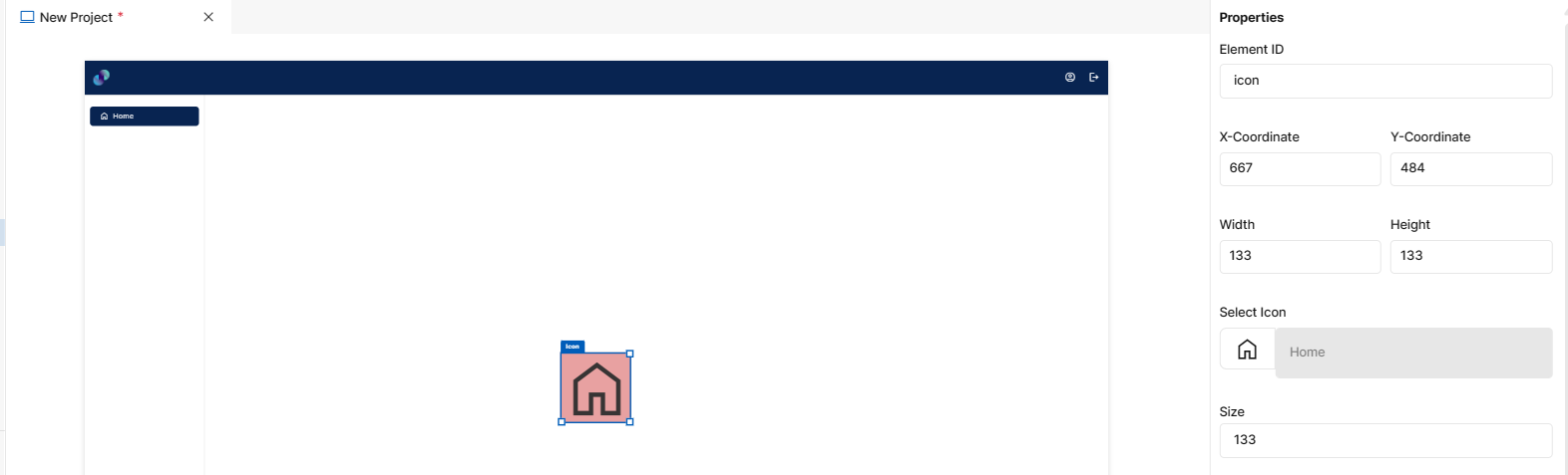
Fig 75: Icon Properties Section
Styles
You will see Styles right below the Properties section, which helps in formatting your icon in different ways.
Following style properties are applicable for icon element. These are optional attributes.
Icon Color - Click on icon color to choose a color from color palette to change icon color.
Background Color - Click on background color to choose a color from color palette to change background color of icon
Font Weight - Click on this dropdown to change font from normal to bold
Text Decoration - You can underline the text by selecting underline from this dropdown field
Border Thickness - You can add border thickness to the icon element by manually entering a value in this field
Border Color - A desired border color for the icon can be selected using border color field. Click on border color & choose a desired color of your choice to change existing color.
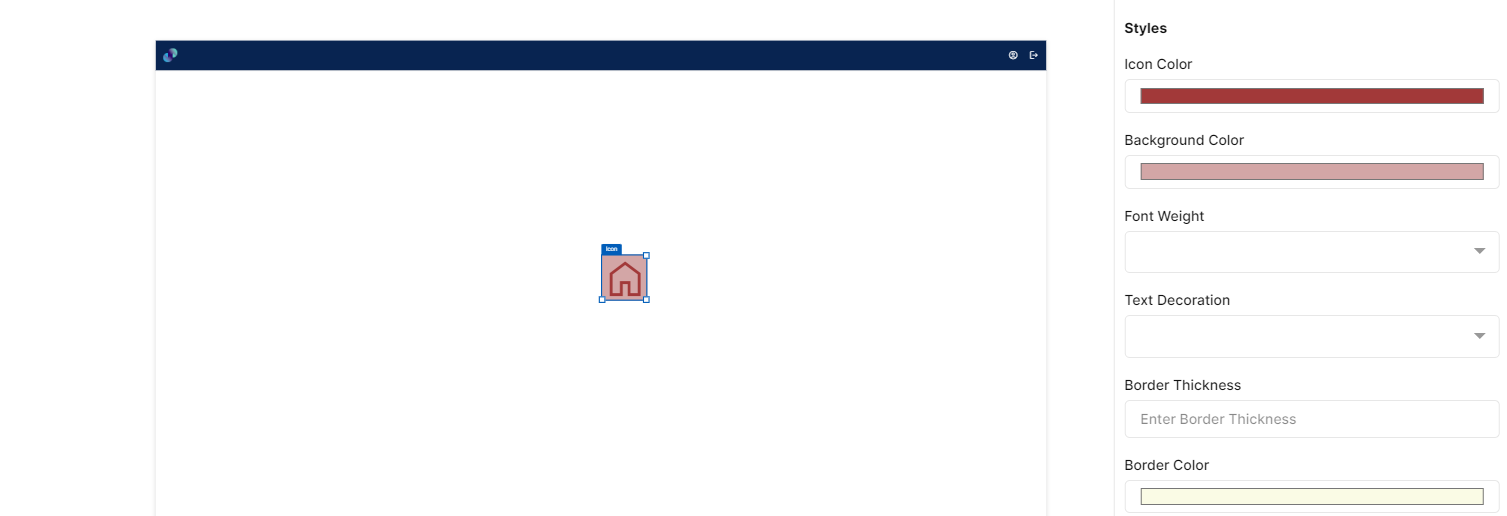
Fig 76: Icon Styles Section
Events
You can find Events right below the style section, that helps you to select the right type of event for icon.
When you click on + symbol next to Event, a Configure Event pop up appears with Event Type and Select Event fields. There are 2 ways you could trigger an event.
On Click - On click implies that an event will be triggered on clicking the icon.
On Hover - On hover implies that an event will be triggered when hovered over icon.
When you select any of the above fields, you are expected to select an event to be triggered from the list of events in Select Event dropdown. Click on Configure Parameters button if you have any parameters to configure for the event. You can add parameter value in the text box and click on Add Event. The Event will be configured successfully Note: There could be events without any parameters added to it.
Fig 77: Configure event
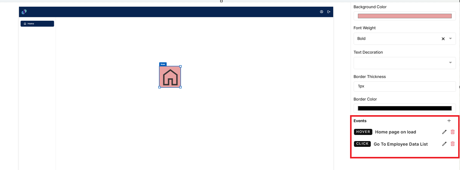
Fig 78: Events Configured
Image
This element allows you to add pictures/images to your application UI. Configuration for image element is as below.
Properties
Image element configuration is done through Properties panel. Below are the attributes under properties panel that can be configured as desired:
Element ID - This is a unique id given to each element. This id will be used to identify the screen elements when used in other modules like events. By default, element id will be the element type. When more than one element of its type is placed in canvas, element type will be suffixed by unique identifier.
·X-Coordinate- Instead of aligning the element in canvas, you can also change the x coordinate value in X-Coordinate field to adjust x axis
Y-Coordinate- Instead of aligning the element in canvas, you can also change y coordinate value in Y-Coordinate field to adjust y axis.
Height-You can modify height of the element using cursor in canvas or by changing value in Height field.
Width-You can modify the width of element using cursor in canvas or by changing value in Width field.
Type - This is a dropdown element with two types of image source - File & URL. When File is chosen, you will get an additional field called Select the File, to choose file from your local device. When URL is chosen, you will get an additional field called URL, to enter the image URL. To get the image URL, you need to go to image source, right click on the image and select copy link address or copy link URL. Paste the copied address in URL field. Selected image will be displayed in screen canvas. Note: Only JPG & PNG images are allowed.
Tooltip - This is an input field to provide input/title to be displayed when hovered over the image as tooltip.
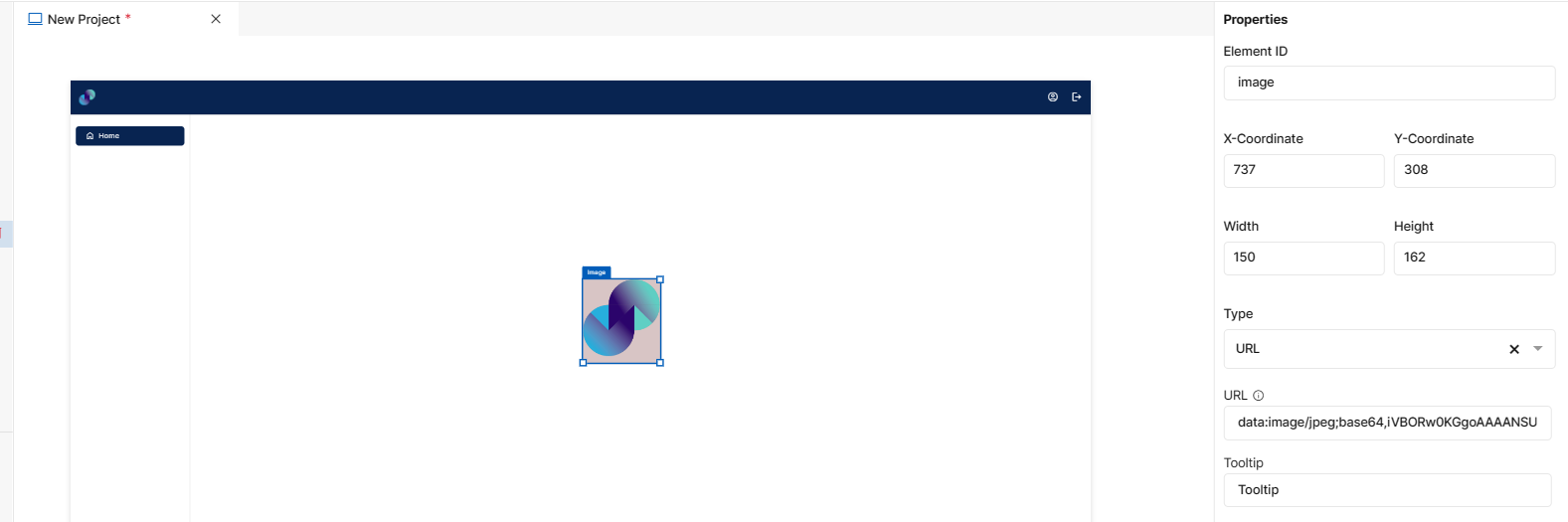
Fig 79: Image Properties Section
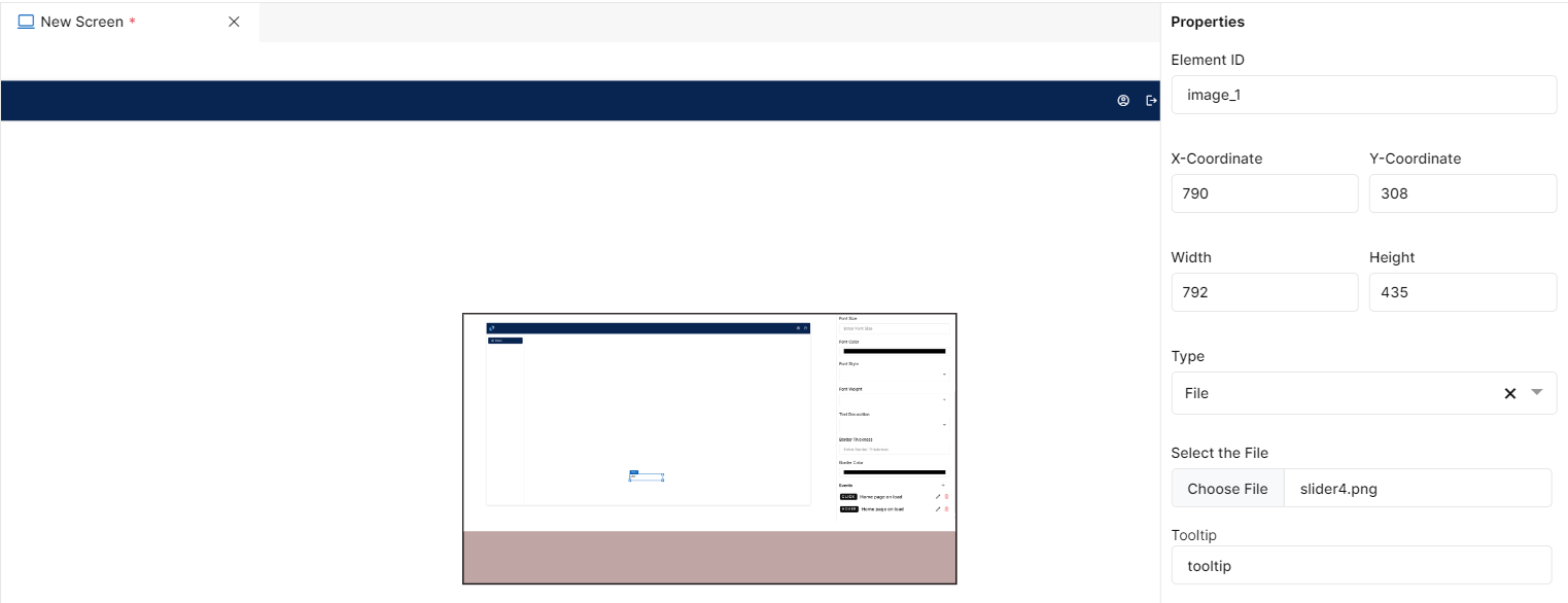
Fig 80: Image Properties Section
Styles
You will see Styles right below the Properties section, which helps in formatting your image in different ways.
Following style properties are applicable for image element. These are optional attributes.
Background Color - Click on background color to choose a color from color palette to change background color of added image
Border Color - A desired border color for the image element can be selected using border color field. Click on border color & choose a desired color of your choice to change existing color.
Border Thickness - You can add border thickness to the image element by manually entering a value in this field
Roundness - This is an input field to add roundness to the image border. You can enter a value manually or use increment/decrement arrows.
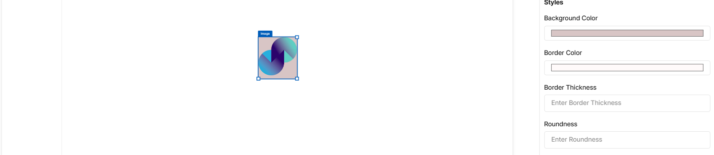
Fig 81: Image Styles Section
Events
You can find Events right below the style section, that helps you to select the right type of event for image.
When you click on + symbol next to Event, a Configure Event pop up appears with Event Type and Select Event fields. There are 2 ways you could trigger an event.
On Click - On click implies that an event will be triggered on clicking the image
On Hover - On hover implies that an event will be triggered when hovered over image
When you select any of the above fields, you are expected to select an event to be triggered from the list of events in Select Event dropdown. Click on Configure Parameters button if you have any parameters to configure for the event. You can add parameter value in the text box and click on Add Event. The Event will be configured successfully Note: There could be events without any parameters added to it.
Fig 82: Configure event
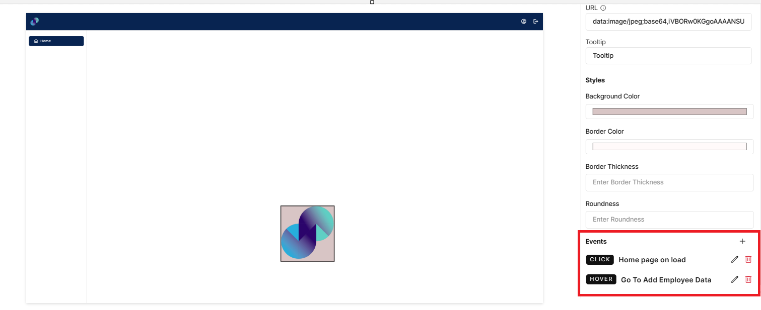
Fig 83: Events Configured
Video
You can upload/add videos to your UI through this element.
The uploaded video will only be visible once the app is deployed.
Configuration for video element is as below.
Properties
Video element configuration is done through Properties panel. Below are the attributes under properties panel that can be configured as desired:
Element ID - This is a unique id given to each element. This id will be used to identify the screen elements when used in other modules like events. By default, element id will be the element type. When more than one element of its type is placed in canvas, element type will be suffixed by unique identifier.
X-Coordinate- Instead of aligning the element in canvas, you can also change the x coordinate value in X-Coordinate field to adjust x axis
Y-Coordinate- Instead of aligning the element in canvas, you can also change y coordinate value in Y-Coordinate field to adjust y axis.
Height-You can modify height of the element using cursor in canvas or by changing value in Height field.
Width-You can modify the width of element using cursor in canvas or by changing value in Width field.
Source - This attribute is used to enter the appropriate video source. To insert a video source:
Go to source location & right-click on the video
Click copy video URL/copy video address and paste that into the Source textbox.
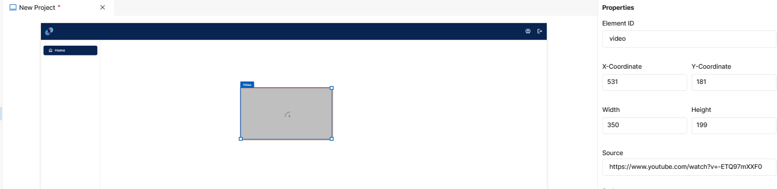
Fig 84: Video Properties Section
Styles
You will see Styles right below the Properties section, which helps in formatting your Video in different ways.
Following style properties are applicable for video element. These are optional attributes.
Font Weight - Click on this dropdown to change font from normal to bold
Text Decoration - You can underline the text by selecting underline from this dropdown field
Border Thickness - You can add border thickness to the video element by manually entering a value in this field
Border Color - A desired border color for the text can be selected using border color field. Click on border color & choose a desired color of your choice to change existing color.
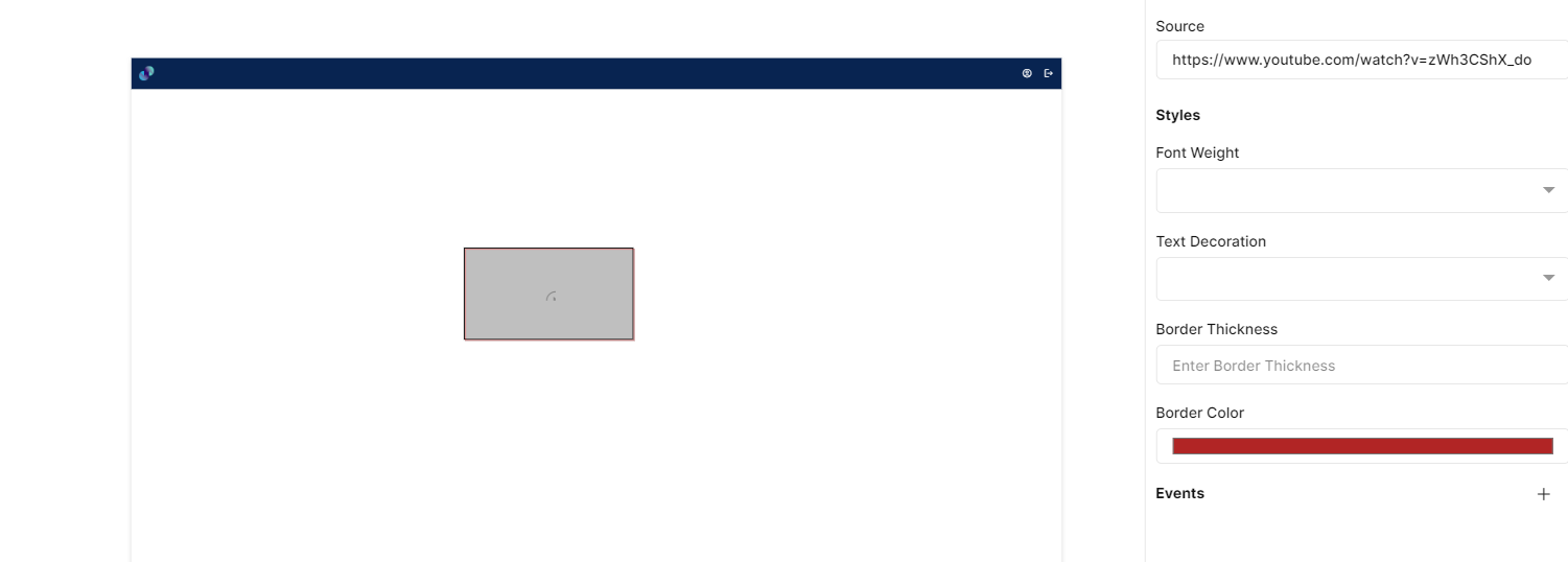
Fig 85: Video Styles Section
Events
You can find Events right below the style section, that helps you to select the right type of event for Video.
When you click on + symbol next to Event, a Configure Event pop up appears with Event Type and Select Event fields. There are 2 ways you could trigger an event.
On Click - On click implies that an event will be triggered on clicking the Video
On Hover - On hover implies that an event will be triggered when hovered over Video
When you select any of the above fields, you are expected to select an event to be triggered from the list of events in Select Event dropdown. Click on Configure Parameters button if you have any parameters to configure for the event. You can add parameter value in the text box and click on Add Event. The Event will be configured successfully Note: There could be events without any parameters added to it.
Fig 86: Configure event
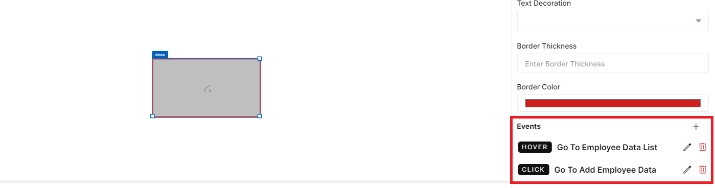
Fig 87: Events Configured
Link
This element allows you to add necessary web links to your application UI. Configuration for link element is as below.
Properties
Link element configuration is done through Properties panel. Below are the attributes under properties panel that can be configured as desired:
Element ID - This is a unique id given to each element. This id will be used to identify the screen elements when used in other modules like events. By default, element id will be the element type. When more than one element of its type is placed in canvas, element type will be suffixed by unique identifier.
·X-Coordinate- Instead of aligning the element in canvas, you can also change the x coordinate value in X-Coordinate field to adjust x axis
Y-Coordinate- Instead of aligning the element in canvas, you can also change y coordinate value in Y-Coordinate field to adjust y axis.
Height-You can modify height of the element using cursor in canvas or by changing value in Height field.
Width-You can modify the width of element using cursor in canvas or by changing value in Width field.
Label - This is an input field to provide a name/label to the URL. Input provided here will be displayed in place of added link.
URL - This is an input field to enter the actual URL to the link. The URL entered here will not be displayed in canvas, however when clicked on Label, end users will be redirected to the URL entered here.
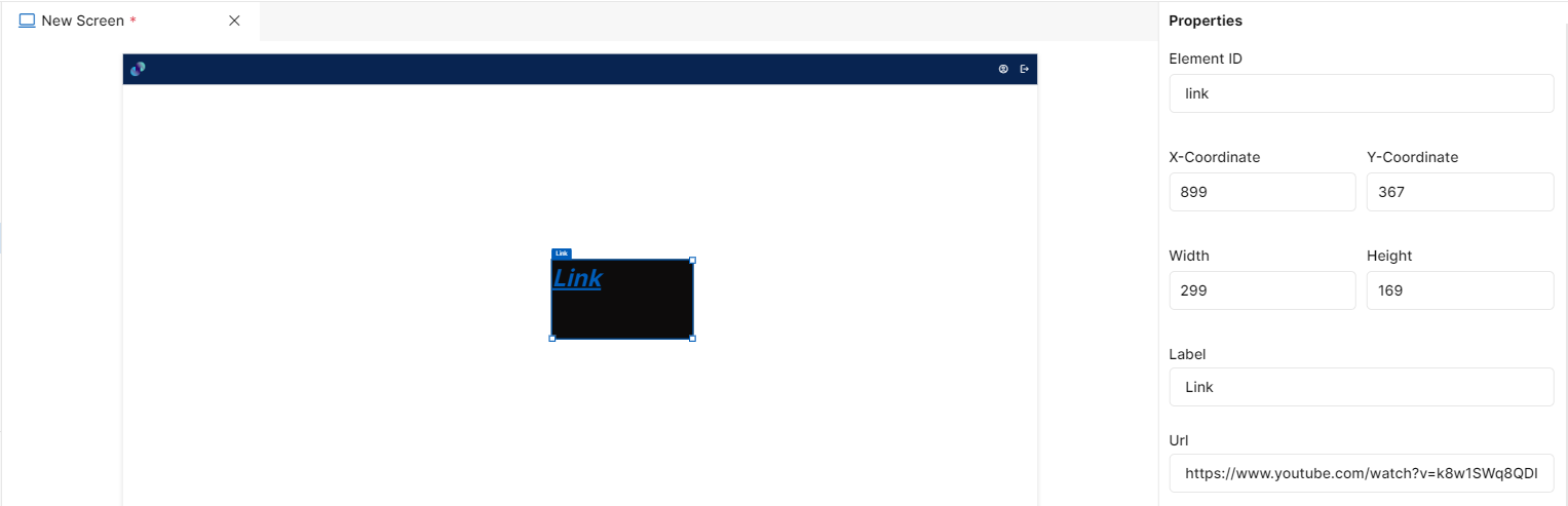
Fig 88: Link Properties Section
Styles
You will see Styles right below the Properties section, which helps in formatting your link in different ways.
Following style properties are applicable for link element. These are optional attributes.
Background Color - Click on background color to choose a color from color palette to change background color of attached link
Font Family - Here, you will get a list of various font options to choose from. Chosen font will be applied to the label text
Font Size - Change font size of label text manually by entering a value in this input field
Font Color - Click on font color & choose a desired color to change the default black font color of label text
Font Style - Click on this dropdown field to change font style from normal to italic
Font Weight - Click on this dropdown to change font from normal to bold
Text Decoration - You can underline the label text by selecting underline from this dropdown field
Border Thickness - You can add border thickness to the link element by manually entering a value in this field
Border Color - A desired border color for the link can be selected using border color field. Click on border color & choose a desired color of your choice to change existing color.
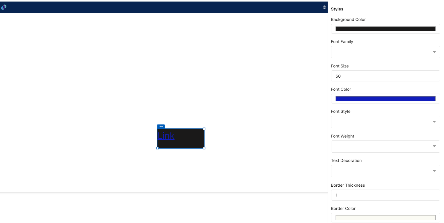
Fig 89: Link Style Section
Events
You can find Events right below the style section, that helps you to select the right type of event for Link.
When you click on + symbol next to Event, a Configure Event pop up appears with Event Type and Select Event fields. There are 2 ways you could trigger an event.
On Click - On click implies that an event will be triggered on clicking the Link
On Hover - On hover implies that an event will be triggered when hovered over Link
When you select any of the above fields, you are expected to select an event to be triggered from the list of events in Select Event dropdown. Click on Configure Parameters button if you have any parameters to configure for the event. You can add parameter value in the text box and click on Add Event. The Event will be configured successfully Note: There could be events without any parameters added to it.
Fig 90: Configure event
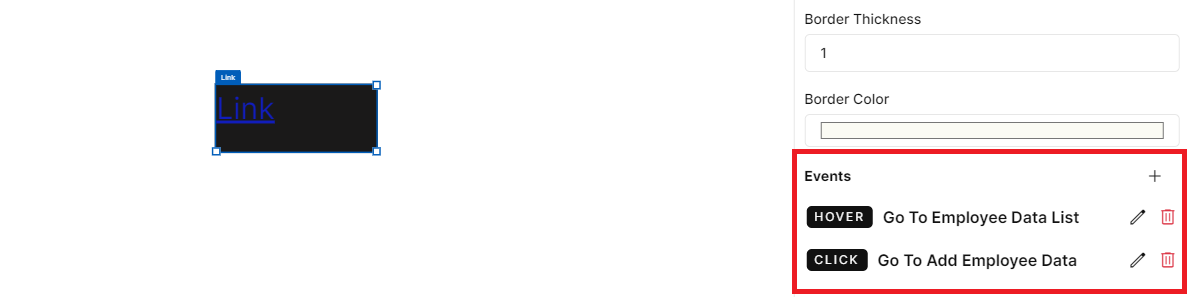
Fig 91: Events Configured
Shapes
Line
This element is used to add lines across the screen as desired. Configuration for line element is as below.
Properties
Line element configuration is done through Properties panel. Below are the attributes under properties panel that can be configured as desired:
Element ID - This is a unique id given to each element. This id will be used to identify the screen elements when used in other modules like events. By default, element id will be the element type. When more than one element of its type is placed in canvas, element type will be suffixed by unique identifier.
·X-Coordinate- Instead of aligning the element in canvas, you can also change the x coordinate value in X-Coordinate field to adjust x axis
Y-Coordinate- Instead of aligning the element in canvas, you can also change y coordinate value in Y-Coordinate field to adjust y axis.
Height-You can modify height of the element using cursor in canvas or by changing value in Height field.
Width-You can modify the width of element using cursor in canvas or by changing value in Width field.
Label - This is a checkbox field to provide a name/label to the line element. If user checks the External Label checkbox , a input text box appears to enter the label for text. Input provided here will be displayed as title on top of line. If this checkbox is left unchecked, just the line will be displayed in UI without a title.
Type - This is a dropdown field with four different line types such as - Solid, Dashed, Dotted, Rounded. If Solid is selected, a solid line with straight edges will be added to the UI. If Dashed is selected, line will be added to UI in the form of continuous dashes. If Dotted is selected, line will be added to UI in the form of continuous dots. If Rounded line is selected, a solid line with round edges will be added to the UI.
Length - This is an input field to enter length of the line. Default length is 200, which can be modified manually or by using increment/decrement arrows as per requirement.
Thickness - This is an input field to provide thickness to the line element. Default thickness is 1, which can be modified manually or by using increment/decrement arrows as per requirement.
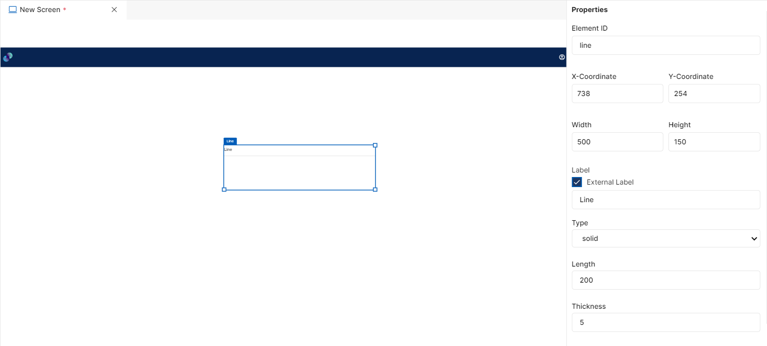
Fig 92: Line Properties Section
Styles
You will see Styles right below the Properties section, which helps in formatting your line in different ways.
Following style properties are applicable for line element. These are optional attributes.
Line Color - Click on line color to choose a color from color palette to change the color of line
Line Style - Click on this dropdown field to change line style between solid & dash. If Solid is selected, a solid line with straight edges will be added to the UI. If Dash is selected, line will be added to UI in the form of continuous dashes.
Font Family - Here, you will get a list of various font options to choose from. Chosen font will be applied to the external label
Font Size - Change font size of external label manually by entering a value in this input field
Font Color - Click on font color & choose a desired color to change the default black font color of external label
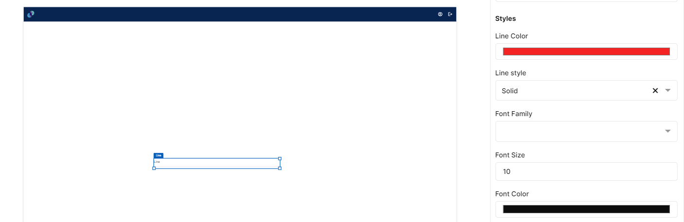
Fig 93: Line Styles Section
Events
You can find Events right below the style section, that helps you to select the right type of event for Line.
When you click on + symbol next to Event, a Configure Event pop up appears with Event Type and Select Event fields. There are 2 ways you could trigger an event.
On Click - On click implies that an event will be triggered on clicking the Line
On Hover - On hover implies that an event will be triggered when hovered over Line
When you select any of the above fields, you are expected to select an event to be triggered from the list of events in Select Event dropdown. Click on Configure Parameters button if you have any parameters to configure for the event. You can add parameter value in the text box and click on Add Event. The Event will be configured successfully Note: There could be events without any parameters added to it.
Fig 94: Configure event
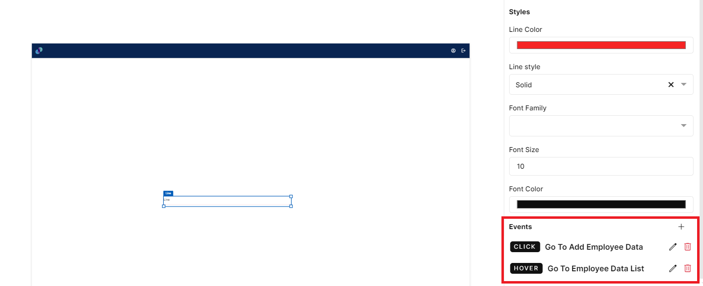
Fig 95: Events Configured
EVENTS
Events Overview
An event can be defined as changing the state or behavior of an object by performing certain actions. Actions can be a button click, cursor movement, keypress through the keyboard, or page scrolling.
Event Lifecycle
There are five ways of managing events in PIES Studio: creating, editing, duplicating, switching, and deleting.
New Event
"New Event" is a feature that allows users to generate new events within the platform.
Events created are visible within the Interfaces section on the Explorer panel. There are four ways to create a new event. Here are the steps to create an event, along with explanations for each step:
Hovering over the Interfaces section or any folder within the Interfaces section, on the Explorer panel reveals a new event icon (
). Clicking on this icon opens a text field in the Interfaces section. Here you need to type the name of the event. After entering the event name, you must hit the “Enter“ key on the Keyboard. The changes can be saved by using the “Save changes” button under File.
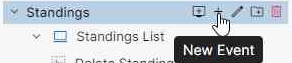
Fig 1: Create a New Event via Interface
Hovering over any screen reveals a new event icon (
). Clicking on this icon opens a text field in the Interfaces section under selected screen. Here you need to type the name of the event. After entering the event name, you must hit the “Enter“ key on the Keyboard. The changes can be saved by using the “Save changes” button under File.
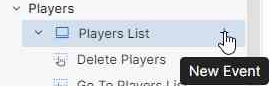
Fig 2: Create a New Event via Screen
Creating an event from the File dropdown on the top left side of the screen. In this dropdown clicking on “New Event“ opens a popup, which asks for the Event name. After entering the event name click on “Create Event“.
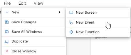
Fig 3: Create Event via File
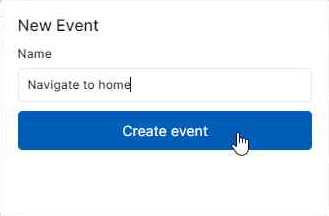
Fig 4: New Event Popup
Events can be created using the Automate feature as well. You will learn more about this feature in the explorer Overview.
Create Event
Edit Event Name
Events created using a certain name can also be edited later. To use this feature, click on the event on the explorer panel which reveals an icon (). Clicking on this icon makes the event name editable, after renaming the event, click on the “Enter“ key on the keyboard. The changes can also be saved by clicking the “Save changes” button under File.
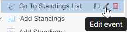
Fig 5: Edit Event Icon
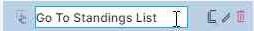
Fig 6: Enabled Text Field to Edit Event Name
Duplicate Event
"Duplicate Event" is a feature that allows users to create a replica or copy of an existing event within the application. This functionality is useful when you need to create a new event that shares similarities with the existing one. Instead of manually entering all the event details again, you can duplicate the existing event, thereby saving time and effort. To use this feature, click on the Duplicate event icon () . Duplicated Event will be created under the original event and will be opened in another tab with the same name suffixed with the word “copy”.
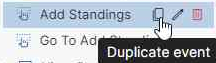
Fig 7: Duplicate event Icon
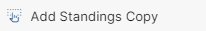
Fig 8: Duplicated event
After duplicating the event, you can also make changes to the duplicated event details. This includes changing the event's name, description, or any other event properties to suit the new event's requirements.
Duplicate Event
Delete Event
"Delete Event" is a feature that permits users to remove or eliminate an existing event from the system. When you select "Delete Event," it initiates a process that permanently removes the selected event from your event management system. To use this feature, click on the Delete event icon against the desired event.()
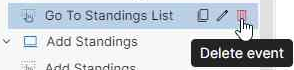
Fig 9: Click on the Delete event Icon
Deleting an event is typically irreversible. Once an event is deleted, it cannot be recovered, and all associated data and information related to that event will be permanently erased. Therefore, exercise caution when using this feature to avoid accidental deletions. The system will ask for confirmation before proceeding with the deletion. This is an additional precautionary step to prevent accidental deletions.
Delete Event
Switch Events
This feature allows you to seamlessly transition from one event to another, enabling you to efficiently manage multiple events based on your needs. You can easily switch between them by selecting their respective names from the explorer panel.
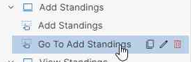
Fig 10: Switching using explorer pane
It is also possible to switch between events using tabs on top of the canvas like in the below screenshots
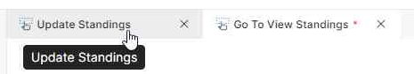
Fig 11: Switching using tab
Saving Changes
This functionality allows you to preserve the current state or progress of an event within the system. When you use the "Save Changes" feature, it records and stores all the data, changes or modifications made to the event up to that point.
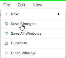
Fig 12: Save Changes
Switching Tabs and Saving
Event Details
On creating an event, the event workflow will be visible on the right canvas. Clicking anywhere on the canvas will reveal Event Details which will appear on the right side of the screen canvas. Here, you can see the Event Name, Description, Parameters and Settings required.
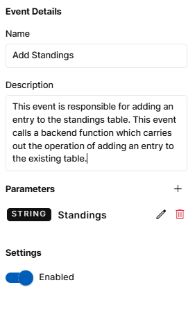
Fig 13: Event Details
Event Name and Description can be changed from the text fields provided. After the changes are made it is mandatory to save the changes made.
Parameters are inputs that are required for the event. These parameters can be used in the Event Steps on the canvas. To add a new parameter, click on the “+” icon. This opens a popup with fields to enter the name of the parameter and its type. After providing the necessary details, click on “Save” to add the parameter to the event.
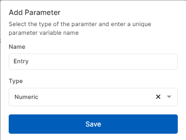
Fig 14: Add Parameter Popup
Settings - This feature allows users to temporarily deactivate an event within PIES studio. All the events will be enabled by default and you can disable the event if required. When you disable an event, that particular event will not be considered during application build or while deploying your application. This functionality is valuable when you want to pause or temporarily halt an event for various reasons. For instance, if you want to debug the created event, you can try disabling events one after the other to conclude on the event that’s causing issues in development. Unlike deleting an event, disabling does not result in permanent data loss. Event details and settings will be retained, making it easy to reactivate the event, when necessary, without re-entering all the information.
For your application to run as expected, you need to make sure all necessary events are enabled.
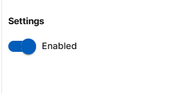
Settings Section
Event Details
Event Steps
Below are the different types of events in PIES studio:
Call Actions
The "Call Actions" section in the event editor allows you to trigger a frontend event within another frontend event or call backend functions when an event is triggered. These backend functions are created in the "Function Editor" and perform server-side processing, including database operations such as saving, updating, and deleting data. The goal is to link user-initiated actions in the front end with another user-initiated event or backend function.
Let's break down the steps and components involved in "Call Actions" in detail:
Sub Event
The "Sub Event" step is used to call or execute an event within another event. This allows you to create modular and reusable workflows by breaking them into smaller, more manageable events. The "Sub Event" step can be configured to call a specific event and can also capture the output from that event to use in the current workflow.
PROPERTIES
When you drag this element to the canvas, you will get the properties list to select the event name. The following items are available in the properties panel:
Event: A dropdown menu that allows you to select an appropriate event. You can choose from the list of events that were already created under the “Interfaces” section of the Explorer pane.
Parameters: If the selected event in the dropdown has any defined input parameters, an input field called ‘Value’ will appear for each parameter. This field allows you to provide necessary input values. The parameter used in the selected event will also be visible just above the “Value” field to verify before providing input. If the selected event has no parameters, you will see a message indicating "The selected event has no parameters associated with it." and no input field will appear.
Output: This option allows you to save the output of the sub-event step to a variable, which can be used in the succeeding steps of the event flow. Output variables are used to capture and store the results, data, or values generated by an event during its execution. They provide a way for an event to capture & communicate its output to the calling code or other parts of the application.
USAGE
Let us say you have a workflow for a website that displays the standings of clubs in a table, and you have an event called "Update Standings" that updates the record and then navigates to desired screen. You want to call this sub-event within your main workflow. In the "Event” field of Sub Event properties, you can choose "Update Standings" as the event to be executed.
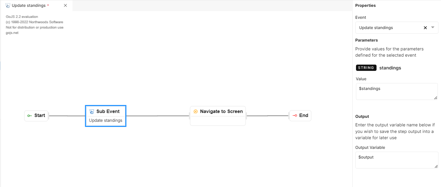
Fig 15: Sub Event
Sub Event
Call Function
The "Call Function" step in the event editor enables developers to invoke backend functions that are defined in the "Function Editor." These functions are typically backend processing functions that do not have visual outputs. The purpose is to link frontend events triggered by users with backend processing and database operations.
PROPERTIES
When you drop the "Call Function" step to the event editor canvas, a properties panel appears on the right side of the event editor to configure the step. The following fields are available in the Properties panel:
Function
:A dropdown menu that allows you to select an appropriate backend function for the event. You can choose from the list of functions that have been created under the “Functions” section of the Explorer pane.Parameters: If the selected function in the dropdown has any defined input parameters, an input field called ‘Value’ will appear for each parameter. This field allows you to provide necessary input values. The parameter used in the selected function will also be visible just above the “Value” field to verify before providing input. If the selected function has no parameters, you will see a message indicating "The selected function has no parameters associated with it." and no input field will appear.
Output: This option allows you to save the output of the call function step to a variable, which can be used in the succeeding steps of event flow. Output variables are used to capture and store the results, data, or values generated by an event during its execution. They provide a way for an event to capture & communicate its output to the calling code or other parts of the application.
NOTE: You can add multiple inputs to the event by clicking the “+” icon. If necessary, you can also delete an added input using the delete icon against the desired input.
In summary, the “Call Function” feature facilitates the connection between frontend UI events and backend functions, enabling you to perform server-side processing and database operations in response to user actions. It enhances the modularity, data processing capabilities, and flexibility of your application.
USAGE
Let us say you have a workflow where you need to call the “Update Standings“ function on click of a button by linking this event to desired button in application UI. In such a work flow add the Call Function step as in the below screenshot and call the required function from the Function dropdown. If the function takes in any parameter passed it in the Value field. To save the output on a variable add a variable name in the Output field.
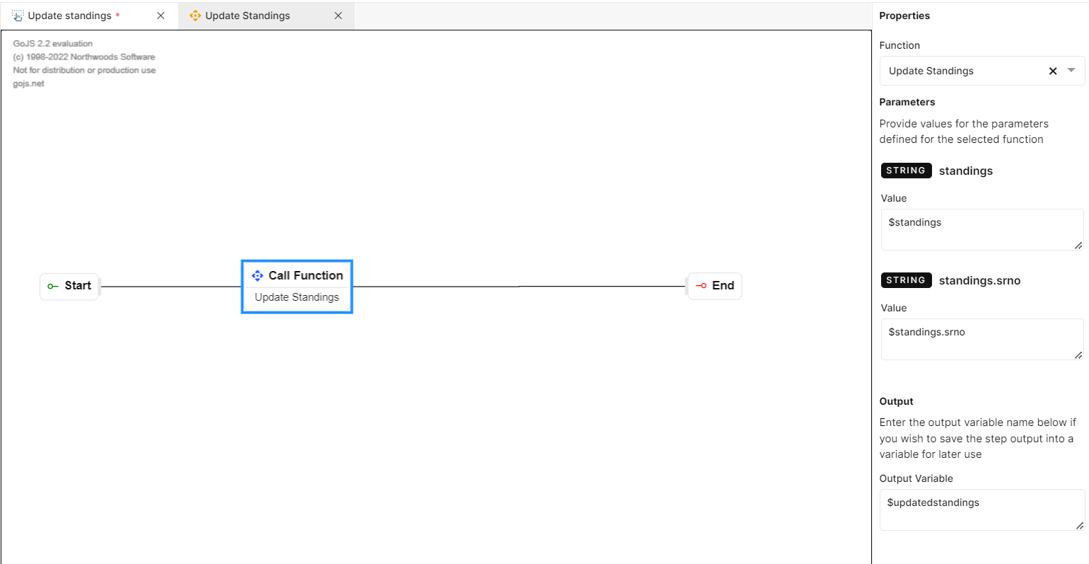
Fig 16: Call Function
Call Function
Control Actions
Control actions involve the use of conditional statements like "if" and "else" to determine how the software should respond to a particular user interaction or event.
Let’s explore the steps involved in this section below,
If
The "If" step allows you to define a logical condition that determines the flow of your application. The flow of your application will be determined based on the condition of the if step. When linking an “If” step to your workflow, there are two outcomes to it. Based on the “Condition Expression” of your “If” step either the upper link will be executed or the lower link. Steps that are connected to the upper link will be executed if the condition returns True. The lower link will be executed when the condition returns False.
PROPERTIES
When you drag this step to the canvas, you will get the properties panel to configure. The following item will be available in the properties panel:
Condition Expression: In the “Condition Expression” field, you can provide the logical condition that the system will evaluate. This condition is typically written as an expression that results in a Boolean (true or false) value. If the condition expression evaluates to True, the first link will be executed. On the contrary, if the condition expression evaluates to False the second link will be executed.
USAGE
Let's say while building an application, you want to display a pop-up alert when a certain condition is met. Specifically, you want to show the alert when a variable named "newAlert" has a value of False. Here's how you would use the "If" step to achieve this:
You create an "If" step as part of your workflow.
In the "Condition Expression" field, you specify the condition: $newAlert == True. This condition checks whether the value of the "newAlert" variable is equal to true. If it is, the condition evaluates to true and the workflow of your application will be connected through the first link.
However, if the $newAlert == False, the workflow of your application will be connected through the second link.
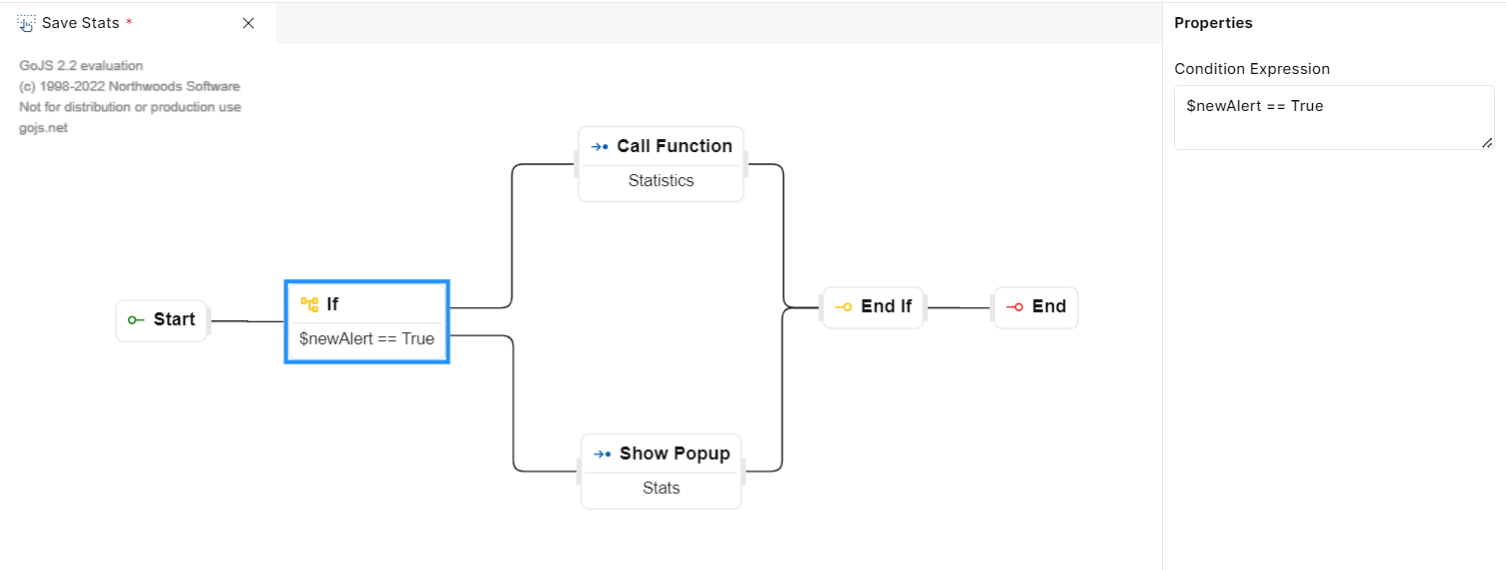
Fig 17: If
If
End If
Before an "End If" step, there is typically an "If" step where a condition is evaluated. The condition is based on data or variables within the workflow. The "End If" step serves to cleanly terminate a conditional branch within a workflow, ensuring that only the appropriate steps are executed based on the condition's outcome. There is no configuration required for this step.
USAGE
Let's say while building an application, you want to display a pop-up alert when a certain condition is met. Specifically, you want to show the alert when a variable named "newAlert" has a value of true. Here's how you would use the "End If" step to achieve this:
You create an "If" step as part of your workflow.
In the "Condition Expression" field, you specify the condition: $newAlert == true. This condition checks whether the value of the "newAlert" variable is equal to true. If it is, the condition evaluates to true; otherwise, it evaluates as false.
After the evaluation of the “If” step we need to use the “End If “step to stop the execution of the “If” step.
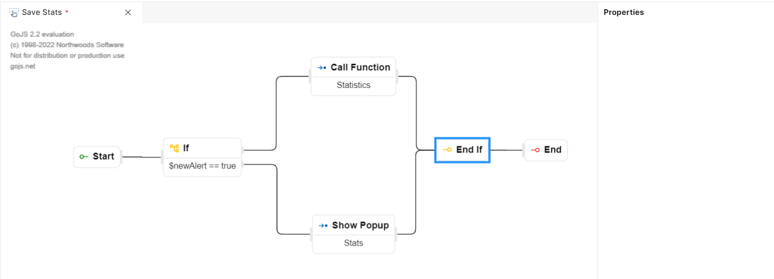
Fig 18: End If
End If
Loop
This event step is used to execute a particular set of actions within 'Loop' and 'End Loop' actions for the defined number of times. The user should specify the input for executing the loop and input can be a constant, a variable, or an expression. Looping will stop after the specified number of iterations.
PROPERTIES
When you drag this step to the canvas, you will get the properties panel to configure. The following items will be available in the properties panel:
·Input: This field is used to provide a condition for the loop step to be executed. The loop will continue to run until the end case is met.
·Loop Variable: This variable is used to reference the current iteration in the list during loop action.
USAGE
Let's say while building an application, you want to display a numbering system from 1 to 10:
You create a "Loop" step as part of your workflow.
In the "Input" field, you specify the condition: $standings. This will cause the loop to run as per the number of $standings.
The loop variable refers to a single iteration of the loop. Suppose, you are passing a variable $standings. You can name the loop variable as $standing referring to each standing within the loop. For every loop call function step will be called. After the iteration over each $standing the loop will end. We can place the end loop step after the call function.
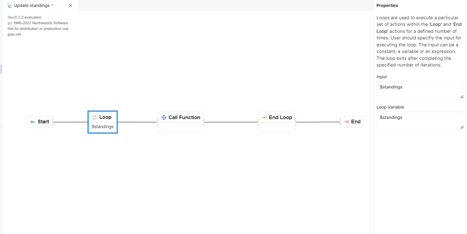
Fig 19: Loop
Loop
While
Use the while loop to execute a particular set of actions till a certain condition is met. Loops can be used to execute a particular set of actions within the 'While' and 'End Loop' actions. The user should specify the input for executing the loop. The input can be a boolean constant, a variable, or an expression. The loop exits after completing the specified number of iterations.
PROPERTIES
When you drag this step to the canvas, you will get the properties panel to configure. The following items will be available in the properties panel:
·Loop Condition: In this field, you can provide a condition for loop execution. The loop will execute until the condition returns True and it will stop as soon as the condition returns False.
USAGE
Suppose, you have a workflow to run a loop to print a particular line on every step. The while loop step can be used in this case as below:
Drag and drop a while step from the palette to the canvas.
The properties panel will open on the right side of the screen canvas.
In the loop condition input field, you can provide a desired condition. Based on the set condition, the loop's execution will be decided. For example: Let’s say the condition is $numbers <= 10. If the value of $numbers on the first iteration is Zero, the loop will be executed. However, the loop execution will stop if the values of $numbers reach 11, as it is not smaller or equal to 10.
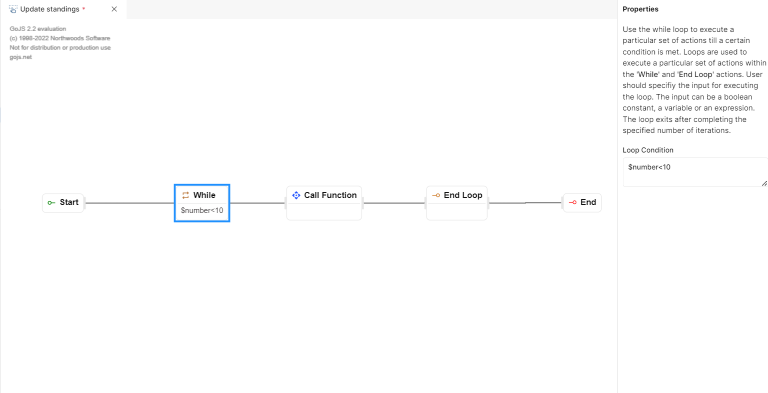
Fig 20: While
While
End Loop
As the name suggests the end loop event step stops the loop execution. To make use of this event you should drag and drop this step on the canvas right after a while or loop event. There is no configuration required for this step.
USAGE
To make use of this event step, simply place it after the loop or while step in the workflow. This will stop the execution of the loop.
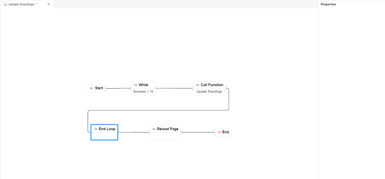
Fig 21: End Loop
Set Variable
The “Set Variable” is used to define a new variable and can be used in loop constructs. These variables serve as containers to store data, values, or information that you can use later in your workflow.
PROPERTIES
When you drag this step to the canvas, you will get the properties panel to configure. The following items will be available in the properties panel:
Type: In this Type dropdown section, you need to select the data type of variable you would like to create. For example: string, numeric, date, Boolean, etc. This ensures that the variable holds the correct type of data.
Name: In this field, you can provide a name for the variable you are creating. For example: $myname, $myAge, $newEntry, etc.
Value: In this field, you can provide a value to your variable. For example: If the type of your variable is string, you can enter “Anthony”. For numeric, it could be “12”.
USAGE
This step can be used to create a variable, which can be later used in the following steps. As in the below example we are creating a variable $number and assigning a value to it. This variable is used in the following steps to loop a certain number of times and perform a certain operation.
Fig 22: Set Variable
Return Data
The "Return Data" step allows you to send specific information or values from one part of your workflow to another.
PROPERTIES
When you drag this step to the canvas, you will get the properties panel to configure. The following items will be available in the properties panel:
Data: In this section, you specify what data or values you want to send from the previous step as a variable e.g., “$result”. So, here is where you define what information is being transferred.
USAGE
Let's say you have a workflow for an e-commerce website and you want to calculate the cart total which is stored in variable called $cartTotal. In such a workflow you can call a function that calculates the cart total by taking the necessary parameters.
Now, you want to send this "$cartTotal" value to another part of your workflow. Data: In this section, you specify what data or values you want to send. In this case, you want to send the cart total, so you set it as "$cartTotal".
Fig 23: Return Data
Sleep
This event step allows you to disable the desired activity of your application and put it in sleep mode.
PROPERTIES
When you drag this step to the canvas, you will get the properties panel to configure. The following items will be available in the properties panel:
Type: In this input field you will be able to choose the time format. For example: Milliseconds, Seconds, Minutes, and Hours.
Duration: In this field, you can provide an integer value. This will be the duration during which your application will be in sleep mode.
USAGE
Let's say while building an application, you want to put the application to sleep after updating a record.
You create the desired function & event workflow for updating records.
In the event workflow, you can drop the sleep event step after the update workflow.
As in the below screenshot, the application will be put into sleep mode for 10 seconds after the call function step.
Fig 24: Sleep
Element Actions
Set Element Data
This is used to add data to an element of the screen. It allows you to dynamically populate elements, such as text fields, labels, or any other data-displaying components, with relevant information.
PROPERTIES
When you drag this element to the canvas, you will get the properties list to select the function name. The following item is available in the properties panel:
Screen: In this dropdown list, you can select the appropriate screen within your application to which you want to add data. This step will affect the chosen screen, and the available options for the "Element" dropdown will be based on the selected screen.
Element The "Element" dropdown lists all the elements or components present on the selected screen. You can choose the specific element to which you want to add data. This dropdown will be enabled once you've selected a screen from the "Screen" dropdown.
Data: In this field, you can specify the variable that you want to add to the selected element. Depending on the element type (e.g., text field, label, object), the data value can be text, a number, a variable, or any other relevant data.
Note: Element dropdown will display “No Results Found” if the screen is not selected or the screen has no elements.
USAGE
Imagine you're working on a mobile application, and you have a Home page having count cards. On this Home page, you want to display data from an event parameter with a variable named "$number". Here's how you would use the "Set Element Data" step:
You create a "Set Element Data" step.
In the "Screen" dropdown, you choose the page "Home Page" because that's where count is present.
In the "Element" dropdown, you select "countcard" i.e. the element ID, as you want to populate the countcard with data.
In the "Data" input field, you specify that you want to set the value “0“.
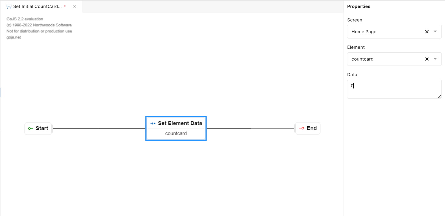
Fig 25: Set Element Data
Set Element Visibility
The "Set Element Visibility" step is used to control the visibility of elements on a screen within an application. It allows you to show or hide specific elements based on certain conditions or actions, providing a dynamic user interface.
PROPERTIES
When you drag this element to the canvas, you will get the properties list to select the function name. The following item is available in the properties panel:
Screen: This dropdown list allows you to select the screen to which the element belongs. You need to choose the appropriate screen where the element whose visibility you want to control is located.
Element: In this dropdown, you can see a list of elements present on the selected screen. You should choose the specific element whose visibility you want to control.
Action: This dropdown has two options, Show or Hide. Here, you specify whether you want to show or hide the selected element based on your workflow's logic. Choose "Show" to make the element visible and "Hide" to make it invisible.
USAGE
Imagine you have a mobile application with count cards and some count cards should only be visible if the user selects a specific option. You can use the "Set Element Visibility" step to achieve this:
Select the screen containing the count card as in this case, it’s Home Page.
Choose the element you want to control, like a count card.
In the third step set its Action, whether to Hide it or Show it.
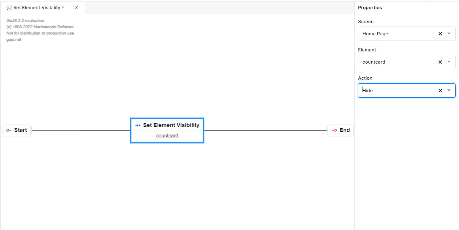
Fig 26: Set Element Visibility
Enable/Disable Element Data
The "Enable/Disable Element Data" step is used to control the interactivity of elements on a screen within an application. It allows you to enable or disable specific elements based on certain conditions or actions, ensuring that users can or cannot interact with them.
PROPERTIES
When you drag this element to the canvas, you will get the properties list to select the function name. The following item is available in the properties panel:
Screen: This dropdown list allows you to select the screen to which the element belongs. You need to choose the appropriate screen where the element you want to control is located.
Element: In this dropdown, you can see a list of elements present on the selected screen. You should choose the specific element you want to enable or disable.
Action: Here, you specify whether you want to enable or disable the selected element based on your workflow's logic. Choose "Enable" to allow user interaction with the element, and choose "Disable" to restrict user interaction.
USAGE
Suppose you have a web application with a form, and you want to disable certain form fields until the user selects a specific option. You can use the "Enable/Disable Element" step to achieve this:
Select the screen containing the form, from the Screen dropdown.
The second step is to select the element you want to disable or enable.
Select whether to enable or disable the element from the third step from the Actions dropdown.
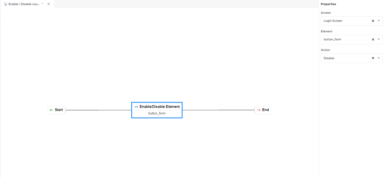
Fig 27: Enable/Disable
Set Element Focus
The "Set Element Focus" step is used to set the focus on a specific element within a screen in your application. This can be helpful for user interactions and navigation within your application.
PROPERTIES
When you drag this element to the canvas, you will get the properties list to select the function name. The following item is available in the properties panel:
Screen: Choose the screen where the element you want to set focus to is located.
Element: Select the specific element on the chosen screen to which you want to set the focus.
When you specify the screen and element using these properties, the workflow will direct the user's attention or input focus to the selected element on the specified screen. This can be useful for forms, input fields, or interactive elements that you want the user to start typing or interacting with immediately.
USAGE
Suppose you have a login screen where users need to enter their username and password. In such cases, it is easier for the user if the username or password text field is already in focus so that they can directly start typing without using the cursor to select the text field. In the below screenshot, we are setting the focus for the text field.
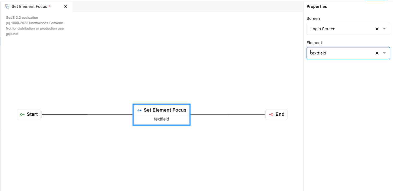
Fig 28: Set Element Focus
Set Element Style
The "Set Element Style" step allows you to dynamically change the style properties of an element on a screen. Here's how you can use it:
PROPERTIES
When you drag this element to the canvas, you will get the properties list to select the function name. The following item is available in the properties panel:
Screen: Choose the screen that contains the element you want to style.
Element: Select the specific element on the chosen screen that you want to style.
Styles: Here you will find a “+” icon. On clicking this icon a pop-up will open. Here you will find a style dropdown from which you can choose the style and in the below value field, you will have to provide the style value. Clicking the save button will save the changes to the selected element.
USAGE
Suppose you have a workflow where you want to set the color of a count card when a certain action is performed. In such cases, a Set Element Style step can be used in the workflow. Here in the below example, we have selected “Hope Page“ as the screen and “CountCard“ as the Element. We are then setting the count card background color as blue and the font color as black by configuring styles.
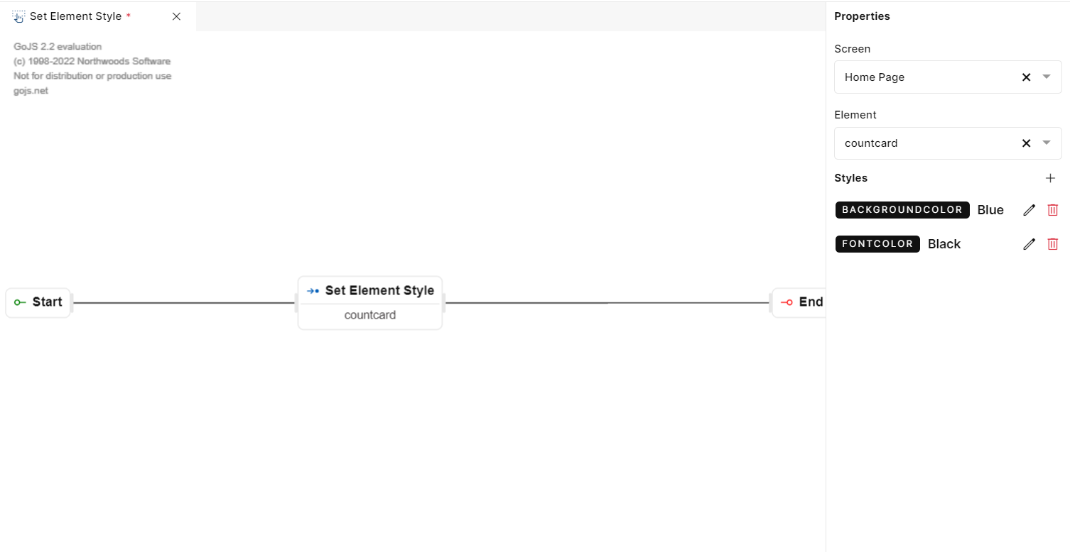
Fig 29: Set Element Style
Screen Actions
Screen Actions will allow you to route or navigate from one screen to another or reload an existing screen. Below are the steps under page events:
Reload Page
This event allows you to refresh/ reload the screen added by the developer before this step in the event flow. This event is typically integrated into the event flow by developers to provide users with the ability to update the displayed content without leaving the current page.
"Reload Page" ensures that users have access to the most up-to-date information, which is especially important in dynamic web applications or when dealing with real-time data.
It can be a handy tool for troubleshooting issues on a webpage. Reloading the page can help resolve minor glitches or errors.
USAGE
Suppose you have a workflow where you want to delete a player from the existing list. After deleting you want to show the updated list of players. In such cases “Reload Page“ event step can be of use. Placing this event after the Call Function will ensure that the current page reloads and shows the updated list of players.
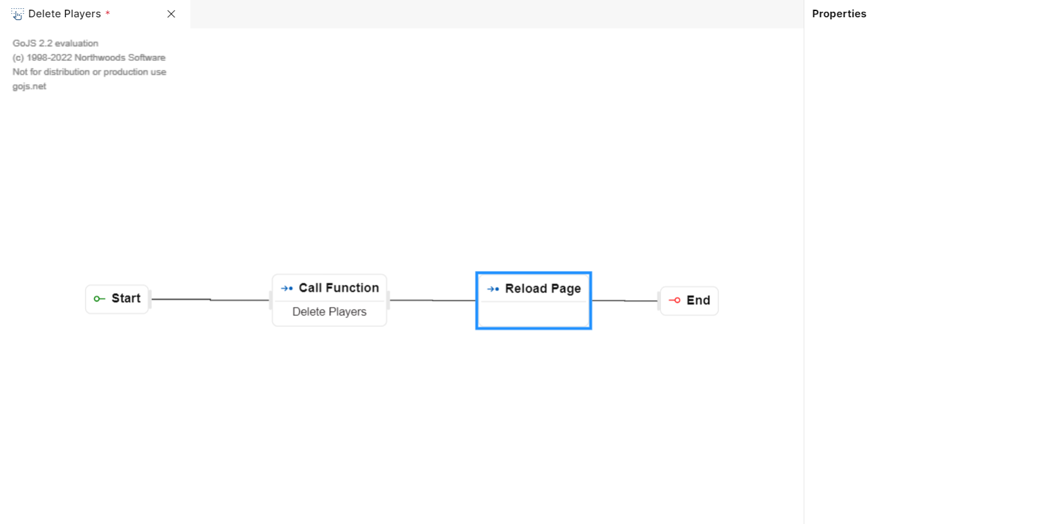
Fig 30: Reload Page
Reload Page
Navigate to Screen
"Navigate to Screen" is a step used in PIES Studio to transition or move from a current screen or page to another screen or page. This event is particularly valuable in user interfaces where there are multiple screens or sections.
The event is typically triggered by user interaction with a step on the current screen, such as a button, link, menu item, or any interactive component. For instance, clicking a "Go to Profile" button might trigger a navigation event that takes the user from the homepage to their profile page.
It provides a structured and organized way for users to move through an application, making it more user-friendly.
It facilitates seamless screen transitions, promotes a logical and intuitive user journey, and allows for the customization of destination screens based on context-specific data passed through route parameters.
PROPERTIES
When you drag this step to the canvas, you will get a properties panel on the right side.
The following fields are available in the properties panel:
Screen –This dropdown menu allows you to choose a destination screen to which you want to navigate the users when an associated event is triggered. You would typically select a target screen from the list of available screens within your application. This determines where the user will be taken when the navigation event is triggered.
Route Parameter - In this text field you can enter the route parameter. Route parameters are additional data that can be passed to the destination screen.
Note: To know more about Route Param refer Reserved Variable section.
Query Param - It consists of Key and Value.
Key: This is where you enter the name of the query parameter. It identifies the type of data you're passing.
Value: Here, you enter the value associated with the query parameter. It represents the actual data that's being sent.
Save: Clicking this button adds the specified key-value pair to the query parameters list.
USAGE
Let's say you have a button on your current screen labeled "Check Player Details." When a user clicks this button, you want to navigate to the "Player Details" screen and pass specific information about the player being viewed.
You would use the "Screen" dropdown to choose the "Players List" screen as the destination.
You add a "Route Parameter" if you want to pass additional data to the screen.
You then specify a query parameter, such as "PlayerID" as the Key and the unique player identifier as the Value.
Clicking "+" opens a dialog to add query parameters to the list.
In the "Players List" screen, you can access the "PlayerID" query parameter to display the details of the selected player.
In summary, these steps and options in the properties panel allow you to configure the "Navigate to Screen" event with specific destination screens and associated route parameters. This level of customization is valuable in creating dynamic and interactive user interfaces.
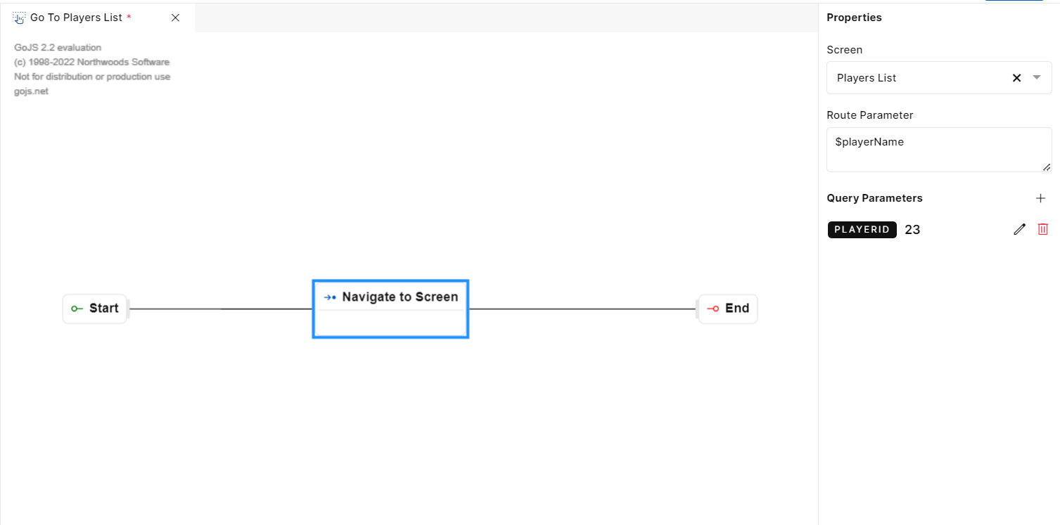
Fig 31: Navigate To Screen
Navigate to URL
The “Navigate to URL" step allows users to open a web page by specifying a URL (Uniform Resource Locator) that’s outside of the application.
The primary purpose of the "Navigate to URL" step is to enable users to open external web pages or websites directly from the application. This is especially useful for linking to online resources, external content, or any web-based information.
PROPERTIES
When you drag this step to the canvas, you will get the properties panel on the right side.
URL: In the properties section, you will find a text box labeled "Enter URL." This is where you input a specific web address or URL that you want the end users to navigate to. Enter the complete URL, including "http://" or "https://" prefix.
USAGE
Imagine you are using a web-based email application, and you have a button labeled "Visit Our Website" within the interface. You can create an event with the "Navigate to URL" step and the created event will be triggered when a user clicks this button.
In the "Enter URL" textbox in the properties panel, you would specify the URL of your organization's website, such as "https://www.arsenal.com/men/players ."
After confirming the URL, in the deployed app, clicking the “Visit Our Website” button executes the event, and the web browser opens the specified URL, taking them to the organization’s external website.
In summary, the "Navigate to URL" step is a vital feature that allows users to access external web content without leaving the application. It's commonly used for linking to websites, documents, online resources, or any web-based information, and it offers a convenient way to integrate external content into the user experience.
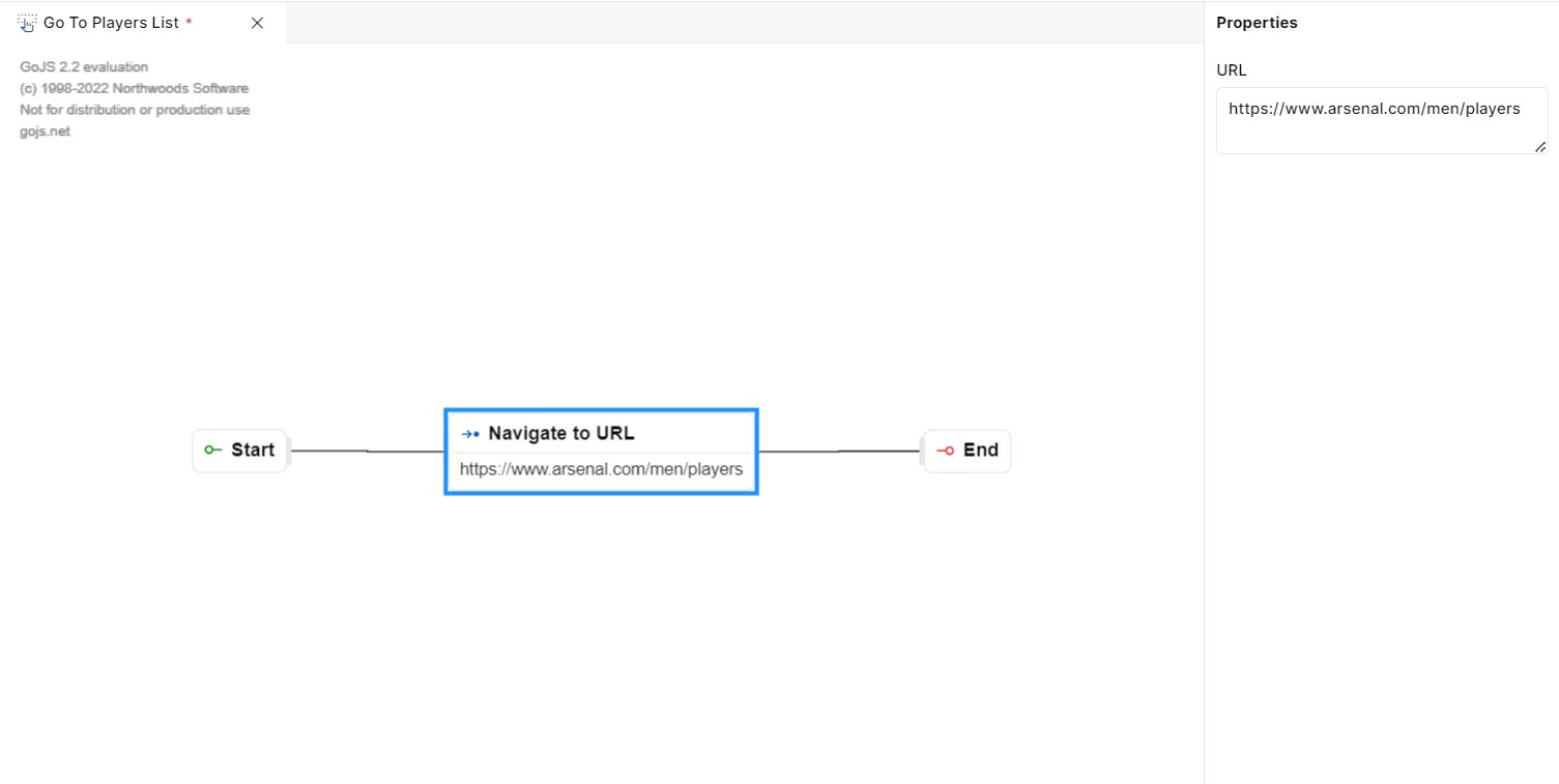
Fig 32: Navigate To URL
Navigate to Previous Screen
The "Navigate to Previous Page" step allows users to return to the previous page they were on within an application or website. This step is commonly used to provide users with a way to navigate backward in their browsing or interaction history. No configuration is needed for this step.
The primary purpose of the "Go to Previous Page" step is to enable users to navigate backward through their interaction history within the application. It allows them to return to the page they were on before their current location.
USAGE
Imagine in an application that you have created, end users want to navigate back to the previous screen after adding a player to the database or list. In such cases, we can place the “Navigate to Previous Page“ event step to navigate to the previous screen after adding the specific player.
In summary, the "Go to Previous Page" step provides a straightforward way for users to navigate backward within an application or website, improving the overall user experience by offering an easy method to return to the previous screen.
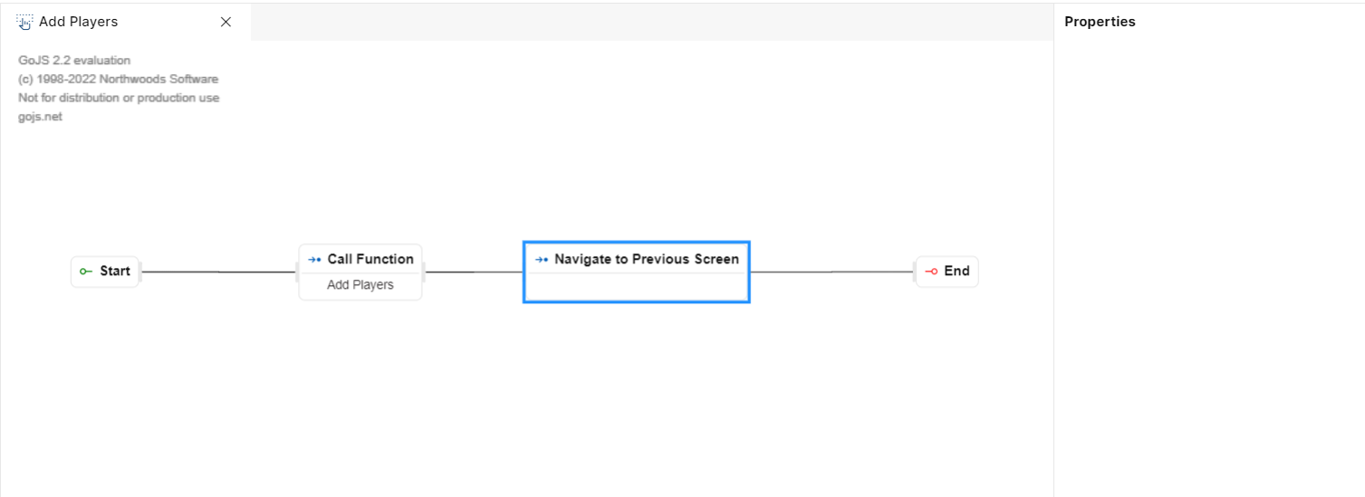
Fig 33: Navigate To Previous Screen
Navigate to Previous Screen
Show Confirmation
The "Show Confirmation" step is used in application development to confirm users after they've acted. It typically displays a message to inform the end user that a specific action has been completed or to seek their confirmation for an action.
The primary purpose of the "Show Confirmation" step is to provide feedback to users about an action they've taken in the application. It's used to communicate the outcome of the action or to seek user confirmation for certain critical actions.
PROPERTIES
When you drag this step to the canvas, you will get the properties panel on the right side.
Message: In the properties section of this step, you will find a text box labeled "Message." This is where you enter the confirmation message that you want to display to the end user.
USAGE
Suppose you are building an application that shows the players of all the teams in a league. In every transfer window, new players come into the team, or some leave. In a scenario, where the user wants to add a player a message can be shown that “Player added successfully“. This gives the user a confirmation of whether the operation of adding the players is carried out or not.
In such a scenario, the “Show Confirmation“ step can be used by adding a suitable message in the Message Input field.
In summary, the "Show Confirmation" step is a key component in user interface design and application development. It's used to communicate the results of user actions and to reassure users that their interactions with the application have been successfully executed. This helps improve user satisfaction and overall user experience.
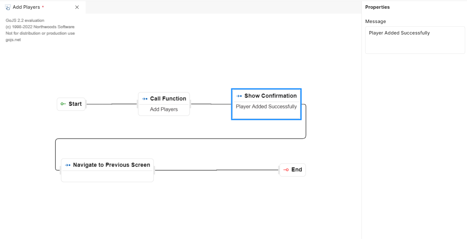
Fig 34: Show Confirmation
Show Popup
The "Show Popup" step is used to display a pop-up window or modal dialog to the user. This window typically contains additional information, options, or actions that are relevant to the user's current context.
The primary purpose of the "Show Popup" step is to provide users with additional information, options, or actions without navigating away from the current screen. It's often used for tasks like displaying detailed information, confirming an action, or presenting a form.
PROPERTIES
In your player list application. Imagine after adding a certain player to the database you want to show a confirmation message on the screen before navigating to the previous screen.
In such a case “Show Confirmation“ step can be used like in the below step. The Show Popup Event step asks for a few details such as width, height, screen, and data.
USAGE
Suppose you are building an application that shows the players of all the teams in a league. In every transfer window, new players come into the team or leave. In such a scenario, where the user wants to add a player, a popup with a message can be shown stating “Player added successfully“ as a confirmation message.
You need to specify certain properties for the popup such as its width, height, screen, and Data.
The width and height refer to the size of the popup.
The screen dropdown refers to the screen on which the popup will be shown.
Clicking the “+“ icon on the Data opens a popup that asks for “Key“ and “Value“. As a key, you can pass “Success“ or any desired key of your choice. In value, you can pass the message that you to show in the popup.
In summary, the "Show Popup" step is a versatile feature used to enhance user interfaces by presenting contextual information or actions in a non-disruptive manner. It allows for customization, providing users with relevant content and options within a pop-up window or modal dialog.
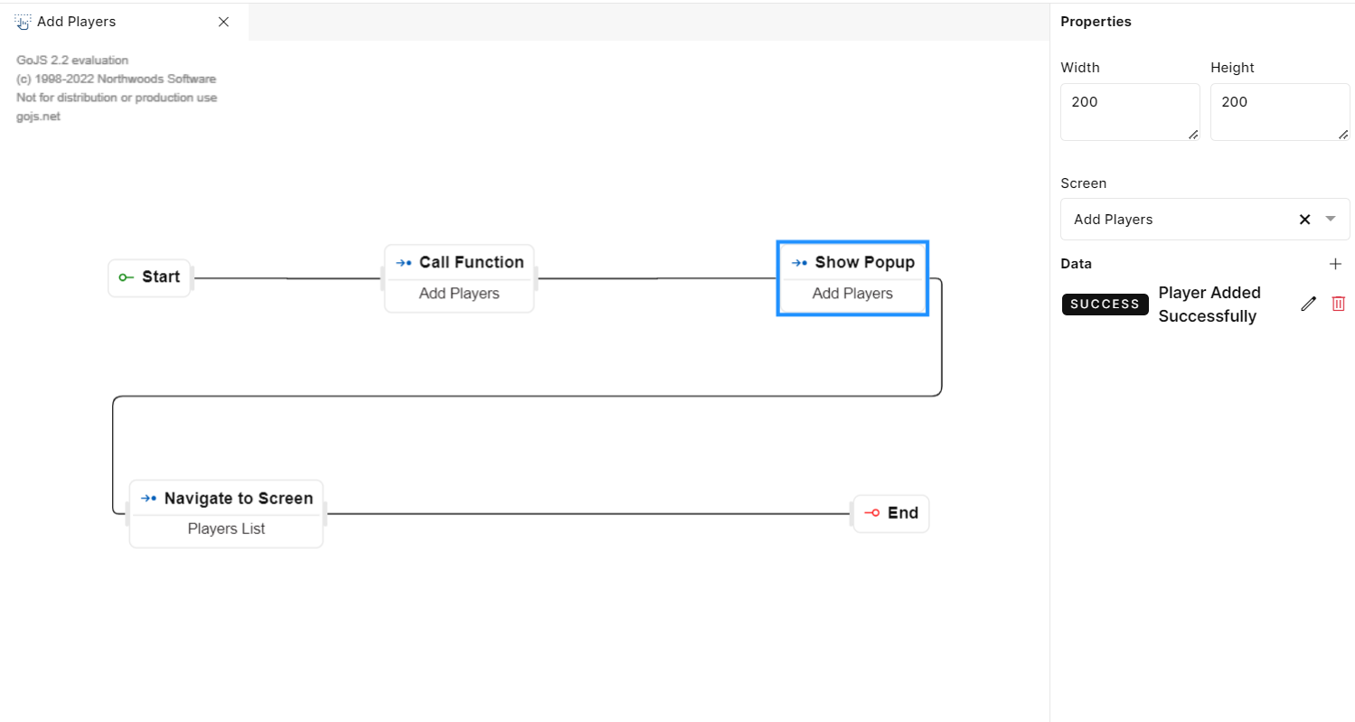
Fig 35: Show Pop-Up
Retrieve Actions
Retrieve Events are used to gather system details when the application is running. These details are typically critical parameters that may be required for various purposes such as generating an audit trail or complying with statutory or local regulations. Below are the event steps that fall under the retrieve events section.
IP Address
The "IP Address" step is designed to track and capture the IP address of the user’s device. This information can be valuable for various purposes including security, monitoring, and auditing.
PROPERTIES
When you drag this step to the canvas, you will get the properties panel on the right side.
·Output Variable: In this field, you can specify the name of a variable. This variable will capture the IP address of the user’s device and store the information.
USAGE
Imagine you have a web application where users log in to access their accounts. After a user successfully logs in, you may want to capture their device’s IP address for security and auditing purposes.
In this scenario, you can create an event with an IP address step in it to retrieve the user's IP address
You can also choose to set an output variable with a variable name like "deviceIPaddress" to store this information for future reference in the event flow.
Fig 36: IP Address
IP Address
Current Date
The "Current Date" step allows you to fetch the current date from the host server. This step is used for various purposes such as time-stamping events, displaying the current date to users, or performing date-based calculations.
PROPERTIES
When you drag this step to the canvas, you will get the properties panel on the right side.
Output Variable: In this field, you can specify the name of a variable. This variable will capture the current time on the user’s device and store the information. This information can be used for security, monitoring, and auditing.
USAGE
Imagine you are developing when you have an event to add players to the list of existing players of a club. When users create a new player, you want to automatically timestamp it with the current date and time.
In this scenario, you can create an event with the "Current Date" step to retrieve the current date and time from the host server.
You can also choose to set an output variable with a variable name like "PlayerCreationDate" to store the date information for every newly created Player.
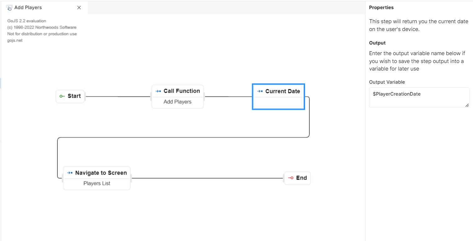
Fig 37: Current Date
Current Date
Current Time
The "Current Time" step allows you to fetch the current time from the host server. This step is used for various purposes such as timestamp events or performing time-based calculations.
PROPERTIES
When you drag this step to the canvas, you will get the properties panel on the right side.
Output variable: In this field, you can specify the name of a variable. This variable will store the current time from your user’s device and store the information. You can use this variable for further use in your application workflow.
USAGE
Imagine you are developing a public transportation application that provides real-time information about bus arrivals. When users use this application, let's say they want to see the current time to know how long it’s going to take for a bus to arrive.
In this scenario, you can create an event with the "Current Time" step to retrieve the current time from the host server.
You can also choose to set an output variable with a name like "BusArrivalTime" to store this timestamp information and display it to users.
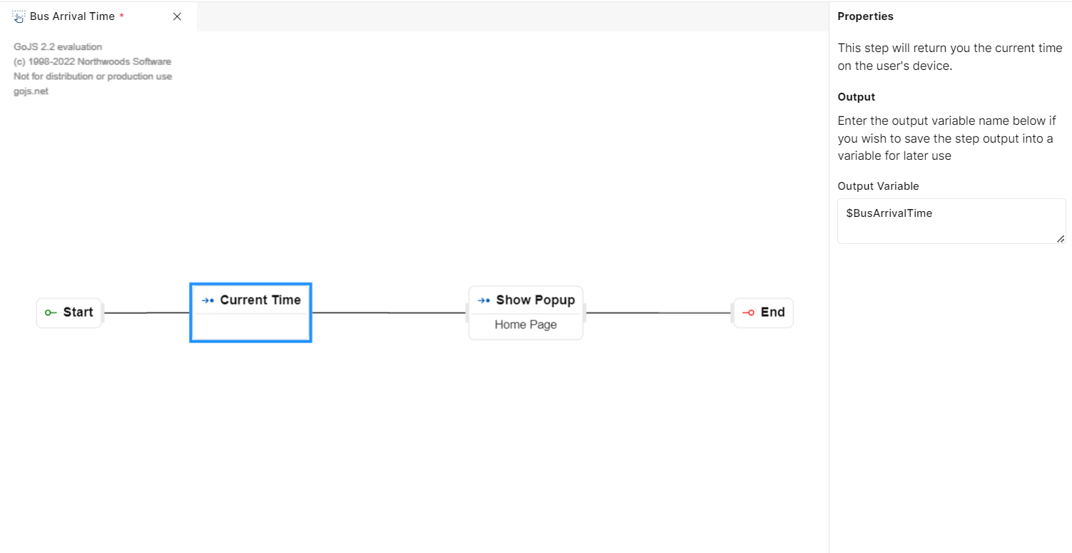
Fig 38: Current Time
Current Time
Get current URL
The "Get current URL" step allows you to fetch the current browser URL from the deployed application at run time.
PROPERTIES
When you drag this step to the canvas, you will get the properties panel on the right side.
Output variable: In this field, you can specify the name of a variable. This variable will capture the current browser URL from the deployed application and store the information. This information can be used for security, monitoring, and auditing.
USAGE
Imagine you are developing an application for Managers and you want the information of the current URL when the Home Page loads.
In such a scenario “Get Current URL“ step can be used.
As an output variable, we have passed “$CurrentURL“which will capture the information of the current URL the user is in.
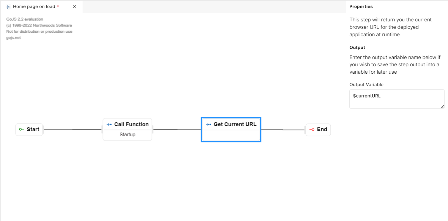
Fig 39: Get Current URL
Current URL
Device Details
The "Device Details" step allows you to fetch information about the device in which the created application is running. This information can include various hardware and software details about the device being used by the user such as Android or IOS, device info like device ID, model, etc.
The primary purpose of fetching device details is to gather information about the user's device, such as the device type, operating system, display size, or other relevant hardware and software characteristics. This information can be used for various purposes including optimizing the user experience, debugging, or enabling customization based on device-specific characteristics.
PROPERTIES
When you drag this step to the canvas, you will get the properties panel on the right side.
Output Variable: In this field, you can specify the name of a variable. This step will retrieve the width and height of the application viewport in pixels and store the information. This can be later used for your application workflow.
USAGE
Imagine you are developing a mobile application for a League. You want to provide users with a customized user experience based on their device type and display size.
In this scenario, you would use the "Device Details" functionality to retrieve information about the user's device.
You may choose to set an output variable with a name like "UserDeviceDetails" to store this information. Then, you can use this data to adjust the user interface or content for an optimal experience.
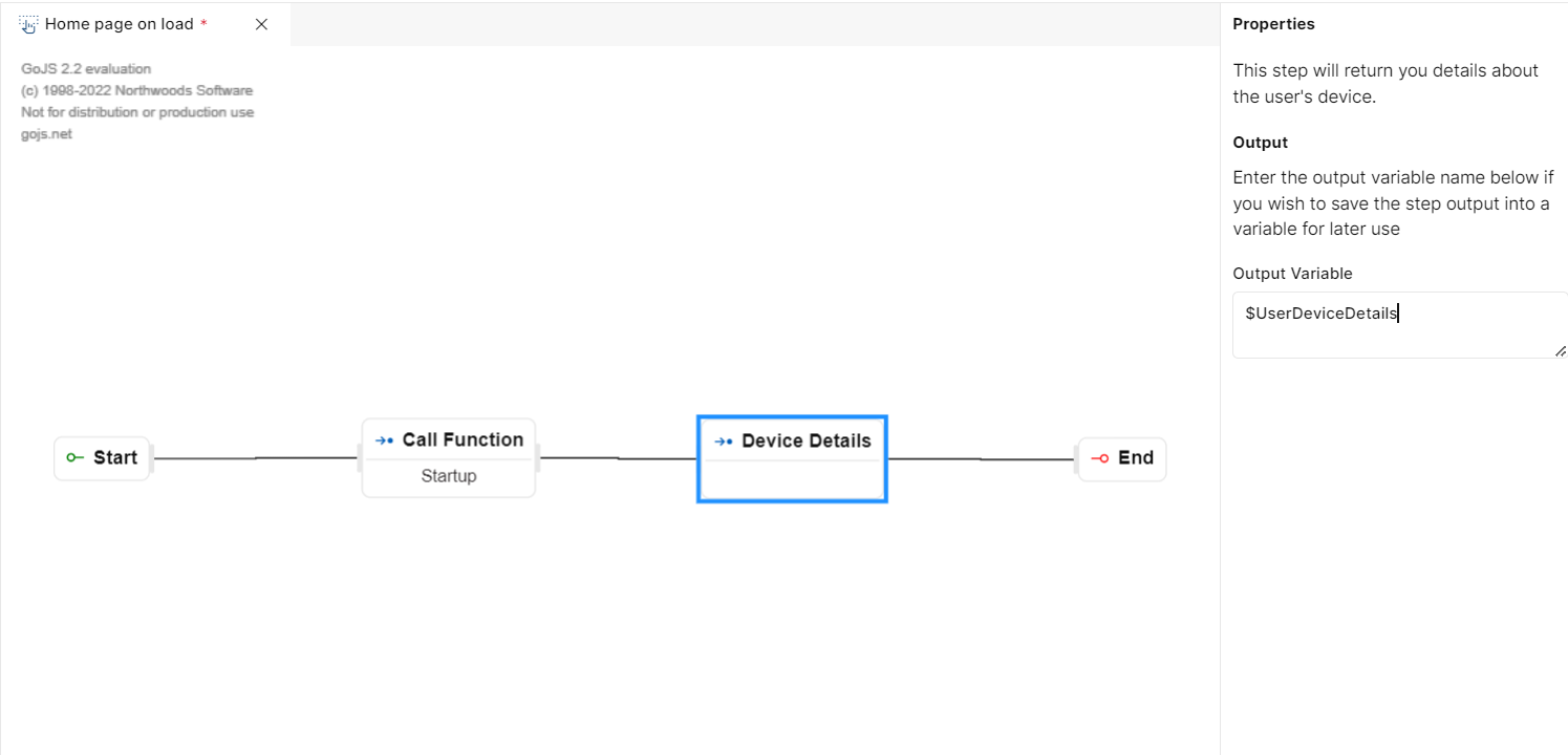
Fig 40: Device Details URL
Device Details
Screen Specs
The “Screen Specs" step allows you to fetch information about the screen in which the created application is running. This information can include Width and height of the application viewport in pixels.
PROPERTIES
When you drag this step to the canvas, you will get the properties panel on the right side.
Output Variable: In this field, you can specify the name of a variable. This step will retrieve the width and height of the application viewport in pixels and store the information. This can be later used for your application workflow.
USAGE
Imagine user has 2 screens and depending on the screen size he wants to navigate to screen A or screen B . So user can fetch the screen specs and using If condition he can either navigate to screen A or Screen B.
eg- For Web he wants Screen A and for mobile devices he wants to navigate to screen B. In such case we can use Screen Specs.