Application Configuration
Application Configuration consists of Top Panel & Explorer, which is required for building an application.
Top Panel
On the top left, we have File, Edit, View & Help and on the top right, we have Automate, Build & AgBI.

Fig 1: File, Edit & View
File
In this section, we have options to create new application modules, saving the configuration, duplicating modules & closing current module/window.
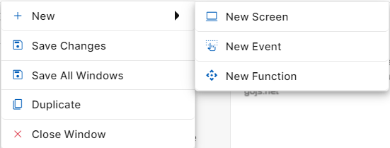
Fig 2. File Options
New
When you click on File, the first option will be New. When you hover over new, you will be able to see three options New Screen, New Event, and New Function.
New Screen: Clicking on “New Screen” will open a popup window to start creating a new screen. Here, you need to specify the name and description of the screen as per requirement. The created Screen will be visible on the Explorer Panel under Interfaces Section. A new screen can also be created by clicking on the “New Screen” icon against “Interfaces” section.
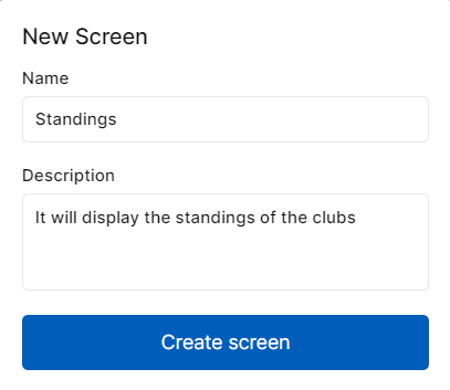
Fig 3. New Screen Pop-Up
New Event: Clicking on “New Event” will open a popup window to start creating a new event. Here, you need to provide a name to the event. The created event will be visible on the Explorer Panel under Interfaces Section. Events are front-end triggers that can be defined as changing the state or behavior of an object by performing certain actions. Actions can be a button click, cursor movement, keypress through the keyboard or page scrolling in your application’s UI. A new event can also be created by clicking on the “New Event” icon against “Interfaces” section.
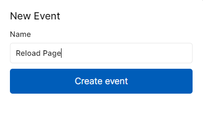
Fig 4. New Event Pop-Up
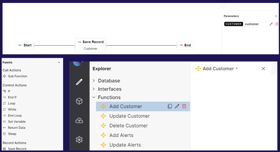
New Function: Clicking on “New Function” will open a popup window to start creating a new function. Here, you need to provide a name to the function. The created function will be visible on the Explorer Panel under the Functions Section. Functions help users to build backend processing logic that performs simple & complex tasks for the application. A new function can also be created by clicking on the New Function against “Functions” section.
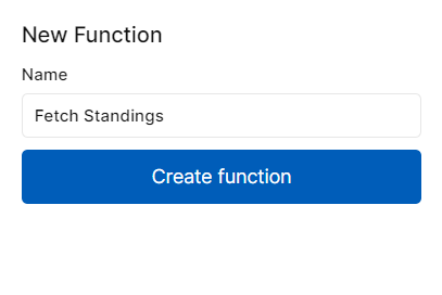
Fig 5. New Function Pop-Up
Save Changes
As the name suggests this option helps in saving all the changes you have made in your current canvas. It could be a data model, screen, event, function, application menu, access control, resources or code blocks. Once clicked, you will get a success message as “Saved“.
Save All Windows
This step helps in saving changes that have been made in all the windows/tabs in your application. Once clicked, you will get a success message as “Saved“.
Duplicate
Clicking this option will duplicate a screen, an event, or a function. This makes building an application easier by saving time for similar builds. You can also duplicate a module by using Duplicate Screen, Duplicate Event, or Duplicate Function icons against respective modules.
Close Window
Clicking on the close window will close the window that is open currently. You can also close a particular window by clicking on the “X” icon on the current tab.
Edit
In this section, we can perform actions like cut, copy, paste, and delete on elements/steps in application modules.
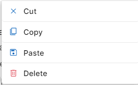
Fig 6: Edit Options
Cut
This feature is used to remove a selected step or content from its current location in the created screen, event or function
When you "cut" something, it's typically removed & placed into a temporary clipboard, allowing you to paste it elsewhere in the same screen, event or function or a different one.
Copy
This feature is used to duplicate or replicate a selected step or content of the screen, event or function
When you "copy" something, a duplicated version is placed into a temporary clipboard, leaving the original content in place. You can then "paste" the copied content elsewhere in the same screen, event or function or a different one.
Paste
This feature is used to insert the content from the clipboard into a new location
After "cutting" or "copying" something, you can use "paste" to place the content at the cursor's location or in the selected area
Delete
This feature is used to delete an event/function step or screen element from your workflow.
When working on a particular workflow or UI, if you wish to delete an event step or screen element due to any specific reason, just click on the event step or screen element and then click on Delete under the Edit section.
These basic editing functions are fundamental to manipulating and organizing content in application modules.
View
This section can be used to zoom in and out while building the application. There are four options you can choose from when you hover Zoom - 25%, 50%, 75% and 100%. The canvas size will change depending on the chosen zoom percentage. You can also zoom in and out using keyboard mouse scroll.
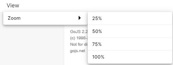
Fig 7: Zoom Options
Help
This section shows information on number of Tables, Screens, Events and Functions that currently exist in the application. When clicked on Help, there will be an option called About. When clicked on About, a popup window will open showing the number of tables, screens, events and functions that are currently present in the application.
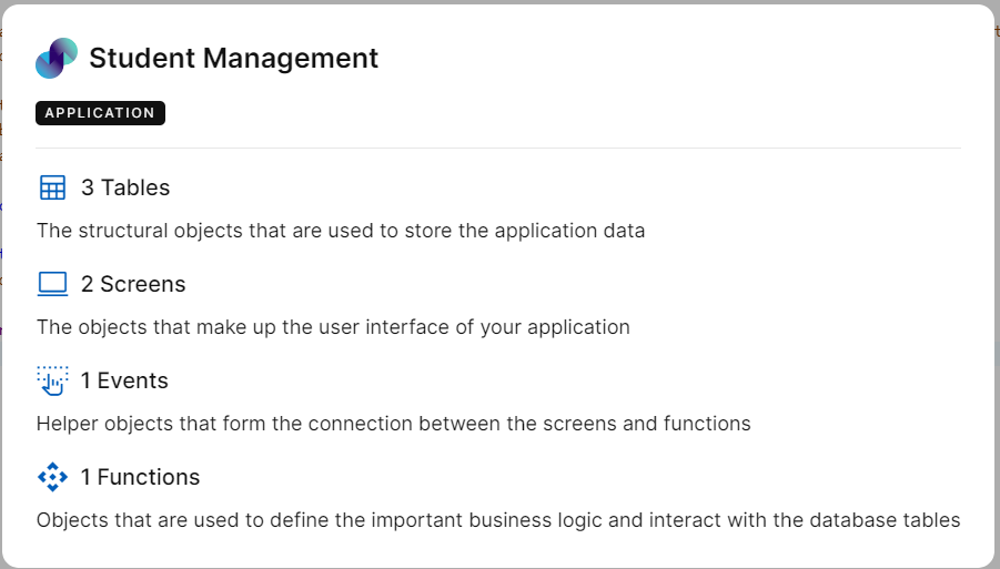
Fig 8: Help Pop Up
Automate
You can find this option on the top right corner of your Explorer screen. This option helps to automate the application development process. To understand this, we will look at an example.
Let’s say you want to create a CRUD-based application i.e. an application to display a list of records, view/update records & add records. The usual approach is to create necessary screens, events, functions, and menus and deploy the application. To minimize this manual process of creating every module individually, the Automate option can be used. Steps to automate CRUD operation is explained below:
Create a Data Model for your application under Database
To create application modules automatically, click Automate on the right corner of the explorer screen. In the tables dropdown, you will get a list of all created tables. You can either select all tables or choose individual tables. This is the reason why you should create a database first. Next, you can select the entities that you want to create via Automate according to your requirement & click Generate. Click Close to close the pop up window.
Modules will be automatically created. On the explorer pane, you will be able to find screens & events under the interfaces section. Backend processing functions can be found under the functions section. The system will automatically group relevant screens & events in one folder depending on the table name under Interfaces and all related functions in one folder depending on the table name under Functions.
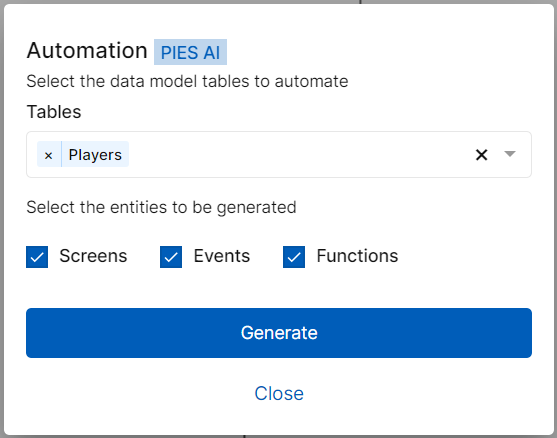
Fig 9: Automate Pop-Up
Fig 10: Screens, Events and Functions generated via Automate
Build
This option is to preview your application & analyze errors if any. More details on this feature can be found in the Deploysection

Fig 11: Build
AgBI
AgBI is an AI based virtual Assistant feature with the help of which you can generate code blocks or data model in PIES Studio.
How to use Code Blocks
When you are on the landing page, there will be an AgBI option right next to search option on top right corner. There will also be an AgBI option in the top right corner in explorer page of any application, right next to Build. Click on AgBI and a chatbot opens at the bottom of the screen.

Fig 12: AgBI Option on the top right corner
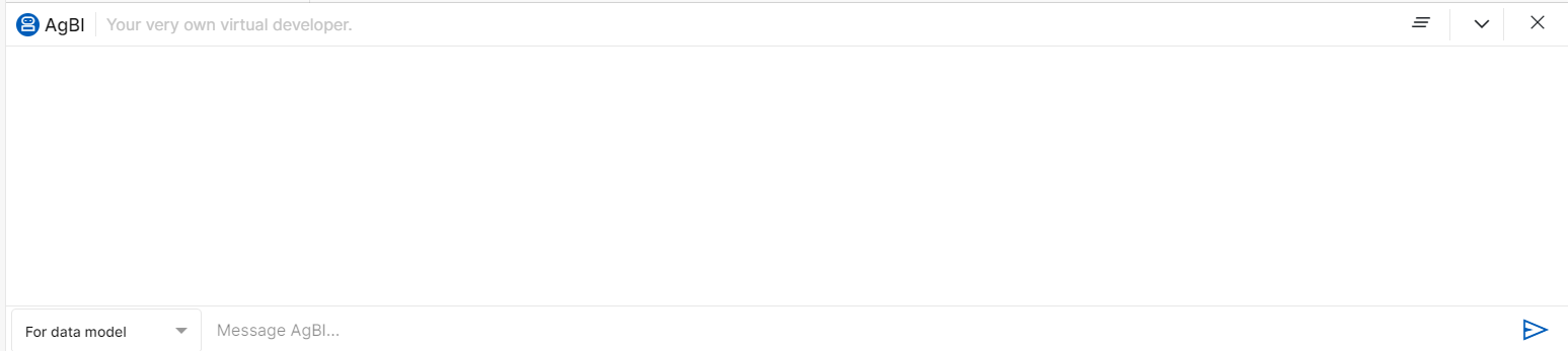
Fig 13: AgBI window
Chatbot consists of a dropdown on the bottom left corner which includes the following 3 options: -
1)For Data Model - This is used to generate data model for a particular application. You can type in the message or question in the text box below and the respective tables along with the column names will be displayed by AI.
Once the tables and column names are displayed in the chatbot, Generate Data Model option will appear on the right side of the window. You can select the respective table name and its columns and click on Generate Data Model on the right side of the chatbot window.
The selected tables and columns will be generated and added under Internal Tables section of Database in Explorer page and you can use them in Events, Screens and Functions.
eg- You can ask chatbot to generate a data model for student database management.
2)For Code-This option is used to generate code in python for a particular logic which you want in the application. You can use this AI generated code in the Code Blocks section of Explorer pane.
You can type in a message or question to generate the code for the same. The relevant code will be generated along with the description or information of the code. There will be an option to copy the code generated in AgBI. You can click on the copy icon at the right side of the chatbot. Once the code is copied you can use it by pasting it in the Code Blocks section. Once its pasted, you can make changes in the code as the language used for writing code blocks is golang.
eg- You can ask chatbot to generate code for calculating the factorial of first natural numbers.
3)For Information- This is used to give answers to the predefined questions to a user. User will be given options to choose predefined questions and on choosing the question, chatbot will respond with the information regarding chosen question.
Note-In this feature, user cannot ask their own customized questions by typing message or question in the text box below. They will have to select from the list of predefined questions only.
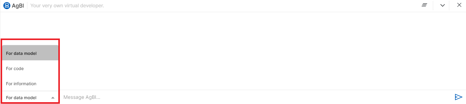
Fig 14: AgBI dropdown options
Chatbot also consists of 3 icons on the right side of the chatbot window as follows:
Clear Chat-Clear chat is used to clear any previous chats including messages, questions asked or information generated by AgBI.
Collapse-Collapse is used to minimize the chatbot window.
Close - Close is used to close th AgBI window.
Fig 15: Clear Chat, Collapse and Close icons in the right corner of chatbot window
Explorer Overview
On creating a new application, Explorer panel will be provided on the left side of screen. This explorer panel has various sections, which are the core modules for building a full-fledged application. These include:
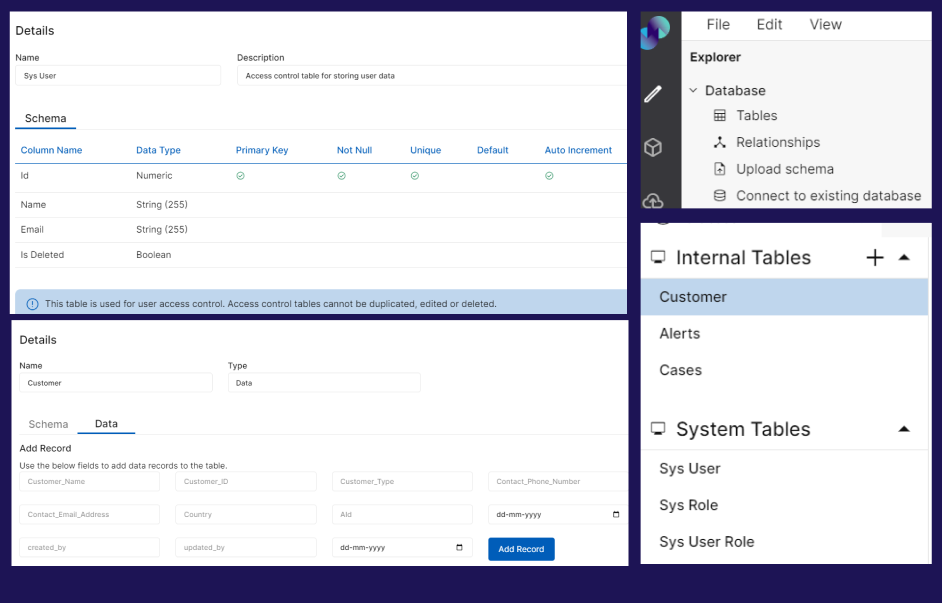
Database: This section helps in building or importing Data Model and creating schema of the data to be used in building the application.
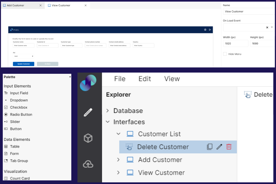
Interfaces: This section helps in building screens and frontend events of your application.
Functions: This section helps in building the backend functions of your application.
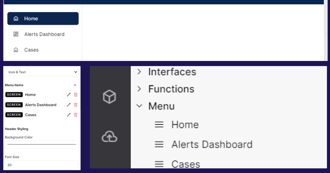
Menu: This section helps in building the navigation bar of your application.
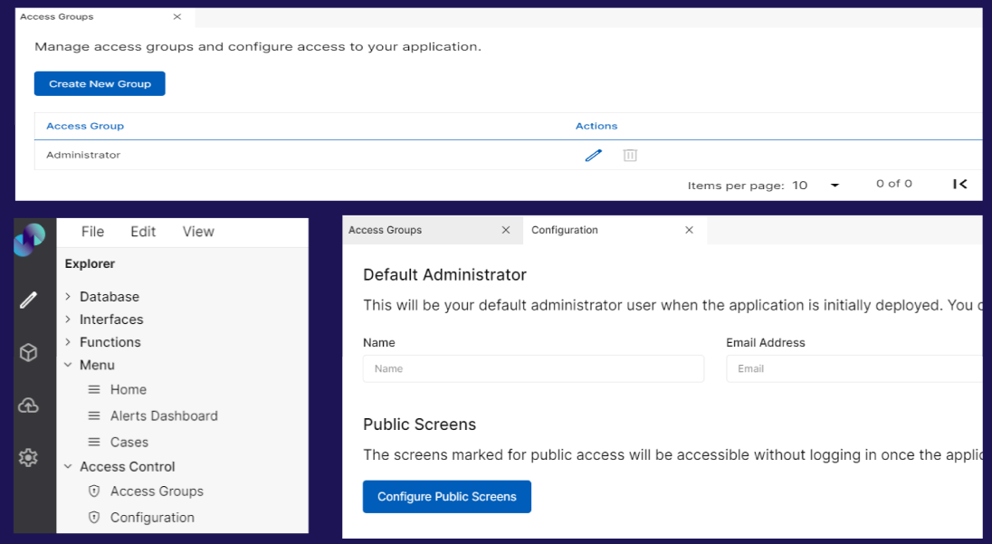
Access Control: This section helps in configuring the Access Control of your application.
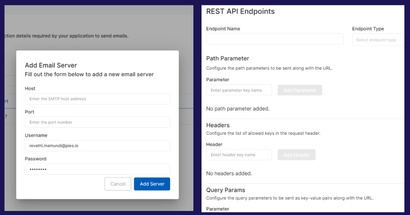
Resources: This section helps in storing SMTP connection details & creating REST API endpoints.
Code Blocks: Code Blocks is where you can write your own custom code that can be later used in your applications
You will find detailed information on the above in modules section.
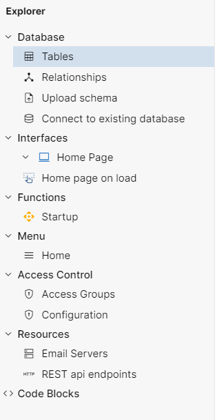
Fig 16: Explorer Panel
Fig 17: Explorer Overview
The explorer panel can be resized by dragging it to the right. This can be done with the help of a cursor. You can use the cursor to increase or decrease the width of the explorer panel.
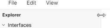
Fig 18: Resizing explorer panel
The explorer panel has various sections. It can get difficult for a user to differentiate between different options. Therefore, to minimize human error every feature is given a unique Icon such as below,
Screen

Events

Functions

Code Blocks <>
Module Functionalities
The below functionalities are possible in explorer pane modules.
Interfaces: Hovering over the Interfaces section reveals three icons - New Screen, New Event, and New Folder.
The First Icon (
 ) refers to the New Screen. Clicking on this Icon allows users to create a New Screen under the interfaces section.
 The Second Icon (
 ) refers to the New Event. Clicking on this Icon allows users to create a New Event under the interfaces section.
 The Third Icon (
 ) refers to the New Folder. Clicking on this Icon allows users to create a New Folder under the interfaces section. This option can be used to organize screens and events within Interfaces.
Note: In order to complete creating new screens or events, press enter after providing a name in the input field. If you wish to go back or cancel creating, click on delete icon against the entered name. A confirmation popup will appear and the changes will be discarded upon confirmation.

Fig 19: Features against Interfaces
1.1. Screen: Clicking on individual Screen reveals four icons - New Event, Duplicate Screen, Edit Screen, and Delete Screen.
a. The First Icon () refers to New Event. Clicking on this icon creates a New Event & groups it under the respective screen. i.e. an event can be created within a screen thereby allowing users to group relevant screens & events for better .
b. The Second Icon ( ) refers to Duplicate Screen. Clicking on this icon creates a copy of the screen at the end of existing screens & events list under Interfaces. Duplicated screen names will be suffixed by ‘copy’.
c. The Third Icon ( ) refers to Edit Screen. Clicking on this icon allows the user to edit the selected Screen name.
d. The Fourth Icon ( ) refers to Delete Screen. Upon clicking, you will get a confirmation popup to proceed with deletion. Selected screen will be deleted upon confirmation.

Fig 20: Feature Against a Particular Screen
1.2. Event: Clicking on an individual event reveals three icons - Duplicate Event, Edit Event, and Delete Event.
a. The First Icon ( ) refers to Duplicate Event. Clicking on this icon creates a copy of the event under interfaces section. The duplicated event name will be suffixed by ‘copy’.
b. The Second Icon ( ) refers to the Edit Event. Clicking on this icon allows the user to edit the event name.
c. The Third Icon ( ) refers to Delete Event. Upon clicking, you will get a confirmation popup to proceed with deletion. Selected event will be deleted upon confirmation.

Fig 21: Features Against Event
1.3. Folder: Hovering over an individual folder reveals five icons - New Screen, New Event, Edit Folder, New Folder and Delete Folder
The first Icon (
) refers to New Screen. Clicking on this icon allows users to create a new screen under the respective folder The second icon (
) refers to New Event. Clicking on this icon allows users to create a new event under the respective folderThe third Icon (
) refers to Edit folder. Clicking on this icon allows the user to edit the folder name.The fourth Icon (
 ) refers to New Folder. Clicking on this icon allows user to create another sub folder under the selected main folder.
The fifth Icon (
) refers to Delete folder. Upon clicking, you will get a confirmation popup to proceed with deletion. Selected folder will be deleted upon confirmation. Note: Deleting folder will also delete all the screens & events under that folder.
Icons against Interfaces, Screens & Events
Functions: Hovering over the Functions section reveals two icons - New Function and New Folder.
The First Icon (
) refers to New Function. Clicking on this icon creates a New Function under the Functions section. Duplicated function name will be suffixed by ‘copy’The Second Icon (
) refers to New Folder. Clicking on this icon creates a New Folder under the Functions section. This option can be used to organize functions based on preference.

Fig 22: Features against Functions
2.1. Function: Clicking on an individual Function reveals three icons - Duplicate Function, Edit Function, and Delete Function.
a. The First Icon () refers to a Duplicate Function. Clicking on this icon creates a copy of the function under Functions section. Duplicated function name will be suffixed by ‘copy’.
b. The Second Icon () refers to Edit Function. Clicking on this icon allows users to edit the function name.
c. The Third Icon () refers to Delete Function. Upon clicking, you will get a confirmation popup to proceed with deletion. Selected function will be deleted upon confirmation.

Fig 23: Feature Against a Particular Function
2.2. Folder: Hovering over an individual folder reveals four icons - New Function, Edit Folder, New Folder and Delete Folder
The first Icon (
) refers to New Function. Clicking on this icon allows users to create a new function under the respective folder in Functions section. The second Icon (
) refers to Edit folder. Clicking on this icon allows the user to edit the folder name.The third Icon (
) refers to New Folder. Clicking on this icon allows user to create another sub folder under the selected main folder.The fourth Icon (
) refers to Delete folder. Upon clicking, you will get a confirmation popup to proceed with deletion. Selected folder will be deleted upon confirmation. Note: Deleting folder will also delete all the functions under that folder.
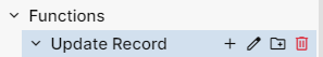
Fig 24: Features against functions folder
Icons against Functions
3.Code Blocks: Hovering over Code Blocks reveals New Code Block icon
New Code Block Icon ( ) refers to adding a new custom widget or code block. Clicking on this Icon allows users to create a new code block.

Fig 25: Feature against Code Blocks
3.1. Code Block: Clicking on an individual Code Block reveals two icons - Edit code_block and Delete code_block.
Edit code_block (
) - refers to Edit Code Event. Clicking on this Icon allows users to edit the existing code block name.Delete code_block (
) - refers to Delete Code Block. Clicking on this Icon allows users to delete the created code block. Upon clicking, you will get a confirmation popup to proceed with deletion. Selected code block will be deleted upon confirmation.
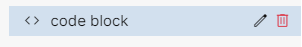
Fig 26: Features against individual Code Block
NOTE: The rest of the sections such as Database, Menu, Access Control, and Resources do not have any of the above-mentioned features against them.
Palette Information
A palette is a list of attributes that are used to build an application by dragging and dropping the attributes onto the canvas. The modules that have palette linked to them are Screens, Events, and Functions. Clicking on any of the Screen, Event or Function opens a Palette below the Explorer panel. Each module has a different set of attributes in its Palette. The palette will change depending on what the user has clicked or selected in Explorer. The palette can be resized just like the explorer panel with the help of a resizing cursor.
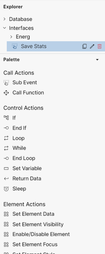
Fig 27: Palette Example for Events
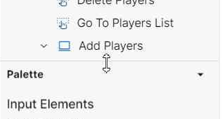
Fig 28: Palette Resizing with the Help of Cursor
Palette Information
Folder Structure
The Explorer panel has various sections that help in building the application as discussed above. To create a clean architecture, it is important to organize the application in a readable manner. This is where the folder structure feature come in handy.
As discussed above, the “New Folder“ icon creates a New Folder in their respective section namely, Interfaces and Functions. Users can also drag and reposition the created folders as desired. However, the only limitation while repositioning the folders is that they cannot be repositioned across different sections i.e. a folder from Interfaces cannot be moved to Functions & vice versa.
Users can rename the folder using the Edit Folder () icon.
Modules
Below are the different modules involved in building an end-to-end application.
DATABASE INTERFACES
Create and Modify Databases
Build User Interface & User Initiated Events
FUNCTIONS MENU
Create Processing Logic
Create & Style Menu
ACCESS CONTROL RESOURCES
Create & Define User Groups
Add Email Servers & REST API Endpoints