Application Configuration
Application Configuration consists of Top Panel & Explorer, which is required for building an application.
Top Panel
On the top left, we have File, Edit, View & Help and on the top right, we have Automate, Build & AgBI.

Fig 1: File, Edit & View
File
In this section, we have options to create new application modules, saving the configuration, duplicating modules & closing current module/window.
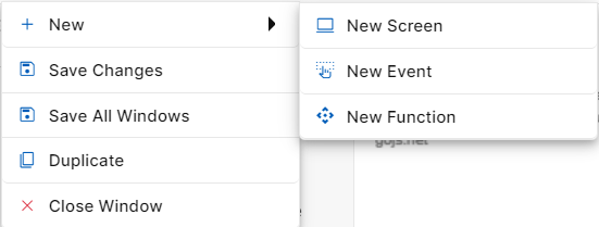
Fig 2. File Options
New
When you click on File, the first option will be New. When you hover over new, you will be able to see three options New Screen, New Event, and New Function.
New Screen: Clicking on “New Screen” will open a popup window to start creating a new screen. Here, you need to specify the name and description of the screen as per requirement. The created Screen will be visible on the Explorer Panel under Interfaces Section. A new screen can also be created by clicking on the “New Screen” icon against “Interfaces” section.
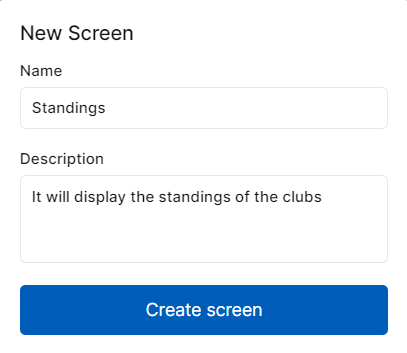
Fig 3. New Screen Pop-Up
New Event: Clicking on “New Event” will open a popup window to start creating a new event. Here, you need to provide a name to the event. The created event will be visible on the Explorer Panel under Interfaces Section. Events are front-end triggers that can be defined as changing the state or behavior of an object by performing certain actions. Actions can be a button click, cursor movement, keypress through the keyboard or page scrolling in your application’s UI. A new event can also be created by clicking on the “New Event” icon against “Interfaces” section.
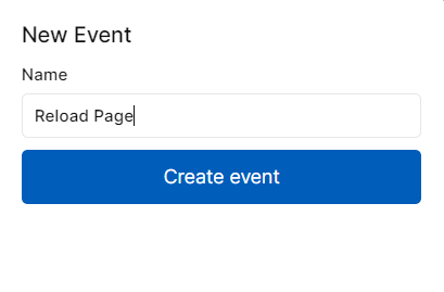
Fig 4. New Event Pop-Up
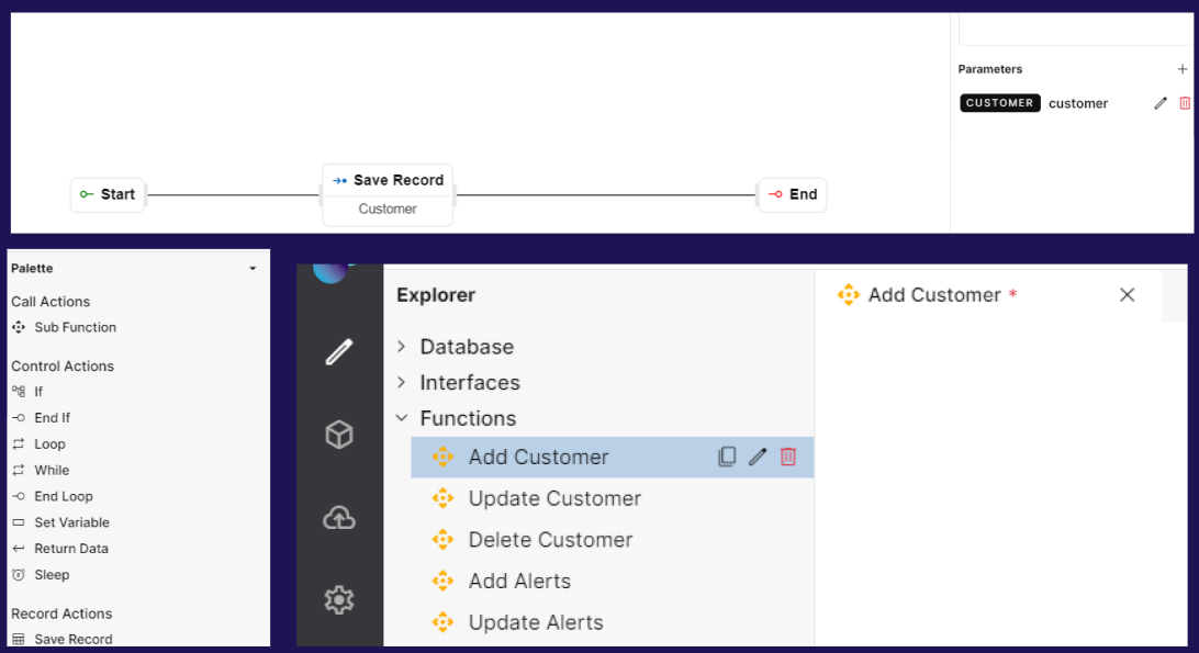
New Function: Clicking on “New Function” will open a popup window to start creating a new function. Here, you need to provide a name to the function. The created function will be visible on the Explorer Panel under the Functions Section. Functions help users to build backend processing logic that performs simple & complex tasks for the application. A new function can also be created by clicking on the New Function against “Functions” section.
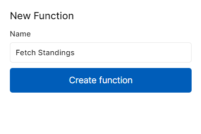
Fig 5. New Function Pop-Up
Save Changes
As the name suggests this option helps in saving all the changes you have made in your current canvas. It could be a data model, screen, event, function, application menu, access control, resources or code blocks. Once clicked, you will get a success message as “Saved“.
Save All Windows
This step helps in saving changes that have been made in all the windows/tabs in your application. Once clicked, you will get a success message as “Saved“.
Duplicate
Clicking this option will duplicate a screen, an event, or a function. This makes building an application easier by saving time for similar builds. You can also duplicate a module by using Duplicate Screen, Duplicate Event, or Duplicate Function icons against respective modules.
Close Window
Clicking on the close window will close the window that is open currently. You can also close a particular window by clicking on the “X” icon on the current tab.
Edit
In this section, we can perform actions like cut, copy, paste, and delete on elements/steps in application modules.
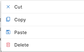
Fig 6: Edit Options
Cut
This feature is used to remove a selected step or content from its current location in the created screen, event or function
When you "cut" something, it's typically removed & placed into a temporary clipboard, allowing you to paste it elsewhere in the same screen, event or function or a different one.
Copy
This feature is used to duplicate or replicate a selected step or content of the screen, event or function
When you "copy" something, a duplicated version is placed into a temporary clipboard, leaving the original content in place. You can then "paste" the copied content elsewhere in the same screen, event or function or a different one.
Paste
This feature is used to insert the content from the clipboard into a new location
After "cutting" or "copying" something, you can use "paste" to place the content at the cursor's location or in the selected area
Delete
This feature is used to delete an event/function step or screen element from your workflow.
When working on a particular workflow or UI, if you wish to delete an event step or screen element due to any specific reason, just click on the event step or screen element and then click on Delete under the Edit section.
These basic editing functions are fundamental to manipulating and organizing content in application modules.
View
This section can be used to zoom in and out while building the application. There are four options you can choose from when you hover Zoom - 25%, 50%, 75% and 100%. The canvas size will change depending on the chosen zoom percentage. You can also zoom in and out using keyboard mouse scroll.
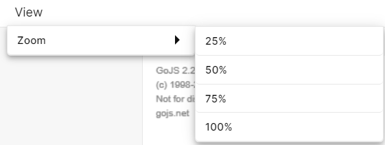
Fig 7: Zoom Options
Help
This section shows information on number of Tables, Screens, Events and Functions that currently exist in the application. When clicked on Help, there will be an option called About. When clicked on About, a popup window will open showing the number of tables, screens, events and functions that are currently present in the application.
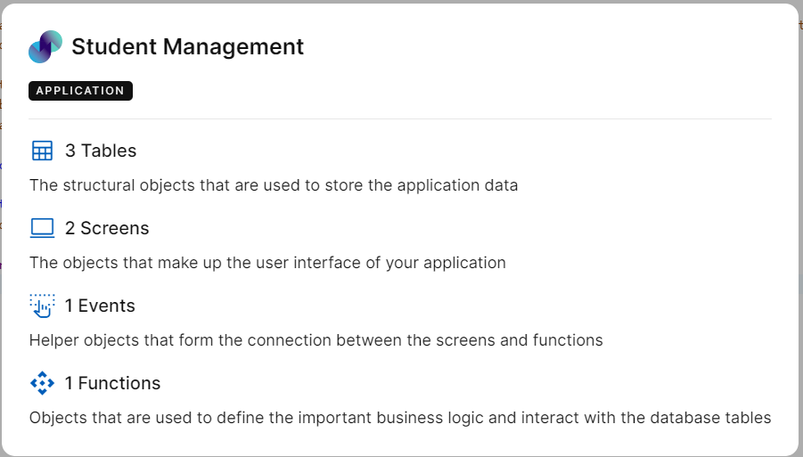
Fig 8: Help Pop Up
Automate
You can find this option on the top right corner of your Explorer screen. This option helps to automate the application development process. To understand this, we will look at an example.
Let’s say you want to create a CRUD-based application i.e. an application to display a list of records, view/update records & add records. The usual approach is to create necessary screens, events, functions, and menus and deploy the application. To minimize this manual process of creating every module individually, the Automate option can be used. Steps to automate CRUD operation is explained below:
Create a Data Model for your application under Database
To create application modules automatically, click Automate on the right corner of the explorer screen. In the tables dropdown, you will get a list of all created tables. You can either select all tables or choose individual tables. This is the reason why you should create a database first. Next, you can select the entities that you want to create via Automate according to your requirement & click Generate. Click Close to close the pop up window.
Modules will be automatically created. On the explorer pane, you will be able to find screens & events under the interfaces section. Backend processing functions can be found under the functions section. The system will automatically group relevant screens & events in one folder depending on the table name under Interfaces and all related functions in one folder depending on the table name under Functions.
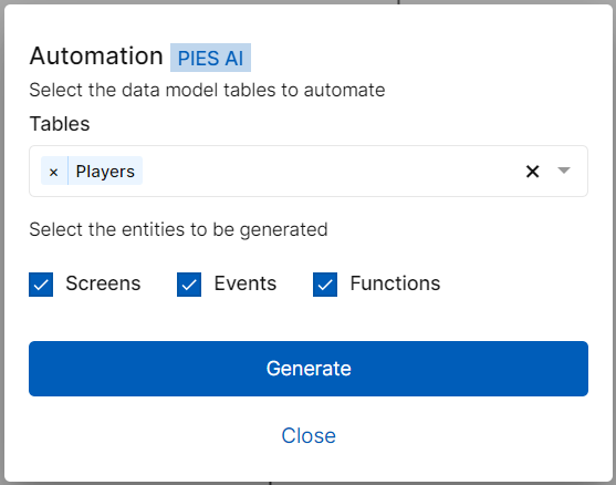
Fig 9: Automate Pop-Up
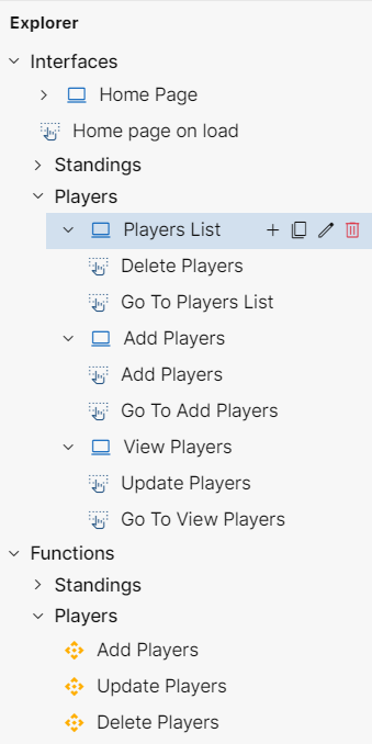
Fig 10: Screens, Events and Functions generated via Automate
https://youtu.be/g8Fx4uwLW3A?si=v7D77ZKseLhO272s
Build
This option is to preview your application & analyze errors if any. More details on this feature can be found in the Build & Preview section

Fig 11: Build
PIES AI
PIES AI is an AI development companion built directly into PIES Studio, designed to help users rapidly create app components using plain English prompts. It helps you build with zero syntax and zero code knowledge. Some of the key capabilities are,
Understands natural language
Converts intent into working modules (tables, screens, workflows)
Minimizes manual steps in app building
How to use PIES AI
When you are on the landing page, there will be an PIES AI option right next to search option on top right corner. There will also be an PIES AI option in the top right corner in explorer page of any application, right next to Build. Click on PIES AI and a chatbot opens at the bottom of the screen.
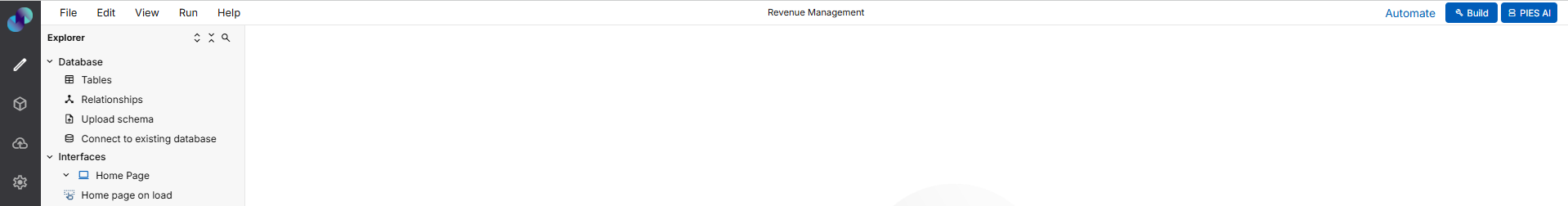
Fig 12: PIES AI button on top right corner
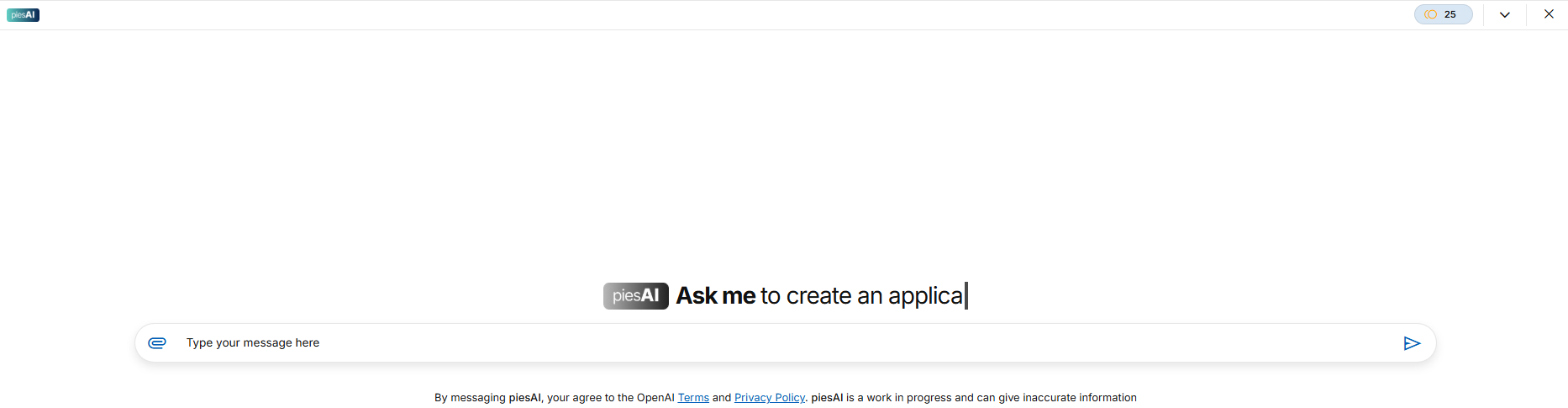
Fig 13: PIES AI Chat Window
Database & Screens
When a user enters a valid prompt, PIES AI intelligently interprets the intent and displays a set of contextual action buttons below the response. These buttons allow the user to generate various components of the application with a single click. For example, clicking the "Generate Database" button creates relevant tables and fields based on the described data entities in the prompt. The selected tables and columns will be generated and added under Internal Tables section of Database in Explorer page and you can use them in Events, Screens and Functions. The "Generate Screen" button builds user interface screens, placing form widgets, buttons, and layout elements according to the context. If you want to expand an existing screen, the "Add to Screen" button inserts new widgets seamlessly into that layout.
Enhanced Generation: Events & Functions
To automate logic or workflows, PIES AI offers the "Generate Event" button, which attaches events such as form submission, navigation, or validations to the screen. If you need reusable logic like calculations or condition checks, you can use the "Generate Function" button, which creates backend logic that can be invoked from different parts of the app.
For example, if a user types, “On clicking the button, validate the input fields and navigate to the next screen,” PIES AI understands this as a multi-step logic and creates a corresponding event with all required actions such as validations and navigation.
Similarly, if the query involves calculations, conditions, or reusable actions — like “Create a function that filters items based on category and price” — the AI creates a function block encapsulating all the relevant logic. The assistant supports up to 5 steps per event/function as part of the basic generation logic.
This enhancement dramatically reduces the manual effort involved in writing events and functions. Instead of creating events one step at a time, developers now receive a structured, multi-step logic flow that they can directly apply or further edit. The improvement not only saves time but also ensures consistency and reduces errors in logic configuration.
Code Blocks
Finally, for power users or advanced use cases, the "Generate Code Block" button lets you create Dart/Flutter code segments for direct insertion into the application logic. The relevant code will be generated along with the description or information of the code. There will be an option to copy the code generated in PIES AI. You can click on the copy icon at the right side of the chatbot. Once the code is copied you can use it by pasting it in the Code Blocks section. Once its pasted, you can make changes in the code as the language used for writing code blocks is golang.
These buttons ensure that users can act immediately on the AI’s output, streamlining the development process. You can choose to click only the buttons you need — each one independently generates the corresponding module and places it within your PIES Studio project.
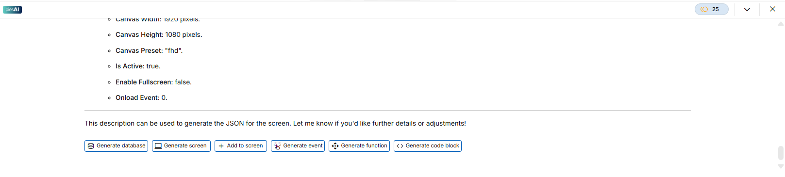
Fig 14: PIES AI Action Buttons
PIES AI Credits
PIES AI operates on a monthly credit-based usage model, which allows developers to access AI-powered assistance based on the number of credits they have (25 free credits per month). Each credit can be consumed through various AI interactions that assist in automating app development. To help users understand how far a single credit can go, a helpful estimation guide has been introduced. With 1 credit, a developer can approximately generate: 2 tables (with 5 columns each), 2 screens (with 5 widgets each), 2 events (with 5 steps each), 2 functions (with 5 steps each), or 2 code blocks (about 500 lines of code). These estimates are displayed as informational text in two key locations: (1) in the PIES AI console, accessible when the user clicks on the credit count, and (2) in the Licensing portal, visible under Add-ons → PIES AI → Purchase Credits section when a developer views an organization.
It is also important to note that these numbers are approximations, and the actual credit usage may vary depending on the complexity of the app being developed or the nature of the prompt given. This breakdown is designed to improve transparency, so users can plan and purchase credits effectively without surprises. In the event of low or exhausted credits, users are restricted from performing AI-related actions such as uploading files or generating components — which helps manage usage efficiently within an organization.
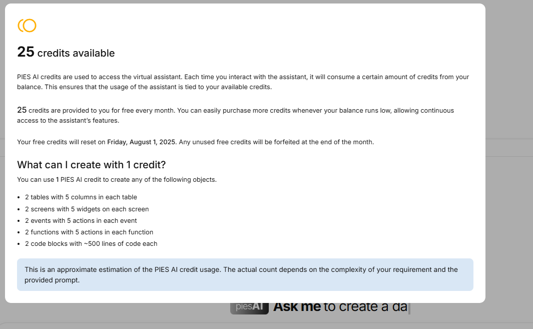
Fig 15: PIES AI Credits
Smart Prompt Filtering
PIES AI is designed to intelligently understand the context of user queries and respond accordingly. During implementation, a key requirement was to ensure that the AI responds appropriately to application-specific prompts while gracefully handling general or unrelated questions. If a user asks something relevant to app development (e.g., generating screens, code, or database tables), PIES AI processes the query and offers actionable buttons like “Generate Code Block,” “Add to Screen,” “Create Table,” etc. — but only when an application is open and in focus. These buttons allow the developer to instantly apply AI-generated results into the app, streamlining productivity.
For irrelevant or unrelated queries (e.g., “What is your name?” or “Tell me about fruits”), PIES AI typically responds with a neutral or general answer. In many cases, the system includes a follow-up message such as “If you have any queries related to PIES AI, feel free to ask.” While this fallback line is not guaranteed to appear every time (given the nature of AI), it does appear in most instances to redirect the user toward relevant topics. Notably, no action buttons are shown when a query is deemed irrelevant or not tied to an application context — avoiding confusion or misuse of AI-generated content.
Importantly, irrelevant queries are not fully restricted, as developers might need to ask domain-specific questions depending on the app they're building. For example, a scientific app might require clarification on physics formulas, or a grocery app might involve queries about types of vegetables. This flexible design ensures PIES AI remains helpful and context-aware while gently guiding users toward productive, app-related interactions.
Upload File Support via PIES AI
PIES AI now includes the capability for developers to upload files directly into the console to enhance query relevance and depth. This feature was introduced to support more complex use cases where users may want to ask queries based on structured or unstructured data present in external documents. A paperclip (📎) attachment icon has been permanently added next to the message input box in the PIES AI console. This allows users to attach and upload files such as XLS/XLSX, CSV, PDF, JSON, TXT, PPTX, DOCX, JPEG, and PNG — with a maximum file size limit of 100MB. The icon remains visible at all times but will be disabled when the user has run out of PIES AI credits, consistent with how other restricted features behave in the console.
Once a user uploads a file, they can ask a question either before or after uploading — the AI is designed to interpret the query and extract relevant information from the attached file. For example, if the user uploads a PDF and asks for a summary, PIES AI will analyze the content and return a concise gist. If the user asks specific questions like "How many records are in this Excel sheet?" or "What is the highest value in column B?" — the AI processes the file to return accurate, contextual responses based on its content.
In cases where the uploaded file is present but the user’s query is unrelated to the file or entirely general (e.g., "What is Flutter?"), the AI will respond as per the standard conversational model, without referencing the uploaded document. This ensures that user interaction flows remain intuitive and that irrelevant queries don't produce confusing or erroneous results.
Furthermore, the credit deduction mechanism is integrated with this feature. While the exact credit calculation logic is to be finalized, PIES AI will deduct credits based on the type and size of the uploaded file. If a user does not have enough credits, uploading is restricted, and the upload icon becomes inactive — prompting the user to purchase more credits if needed. This enhancement helps developers gain deeper insights from data files directly within the development flow, without needing to switch tools or perform manual analysis.
Explorer Overview
On creating a new application, Explorer panel will be provided on the left side of screen. This explorer panel has various sections, which are the core modules for building a full-fledged application. These include:
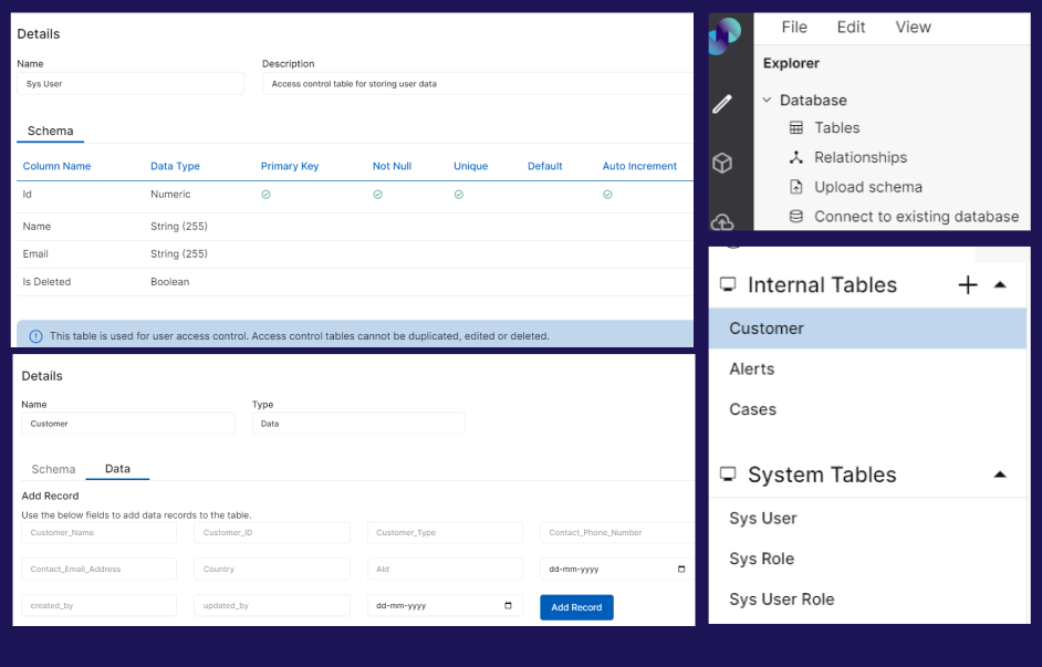
Database: This section helps in building or importing Data Model and creating schema of the data to be used in building the application.
Interfaces: This section helps in building screens and frontend events of your application.
Functions: This section helps in building the backend functions of your application.
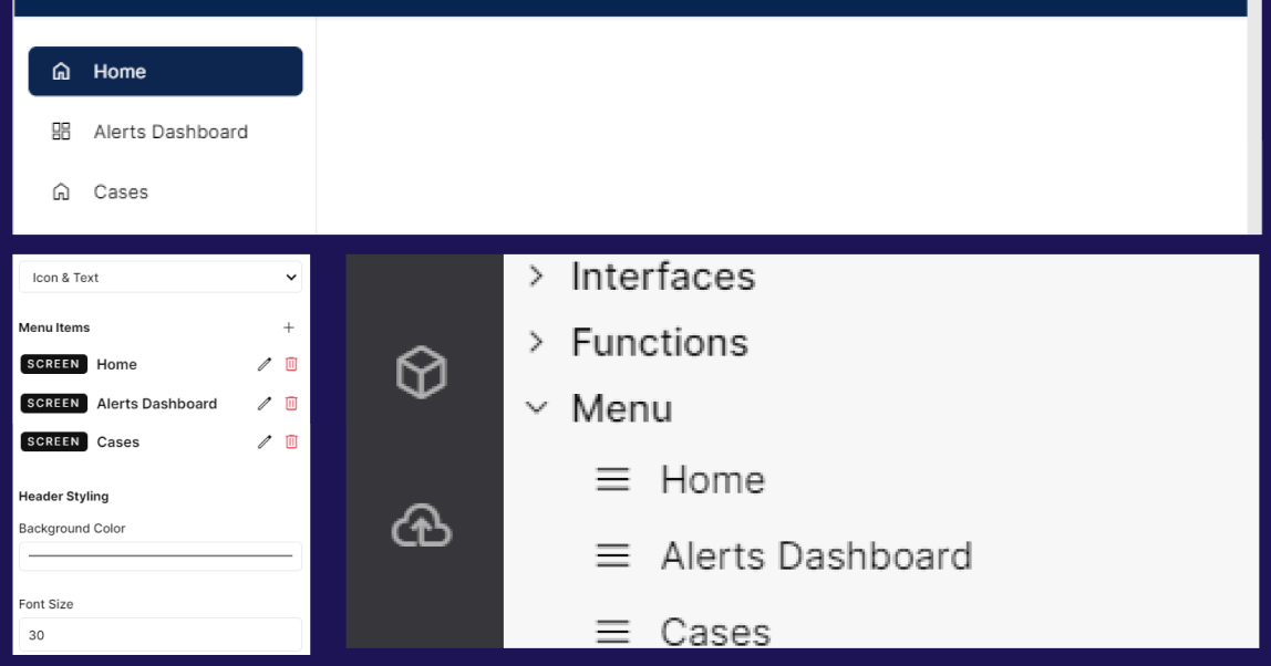
Menu: This section helps in building the navigation bar of your application.
Access Control: This section helps in configuring the Access Control of your application.
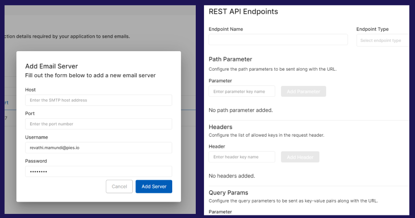
Resources: This section helps in storing SMTP connection details & creating REST API endpoints.
Code Blocks: Code Blocks is where you can write your own custom code that can be later used in your applications
You will find detailed information on the above in modules section.
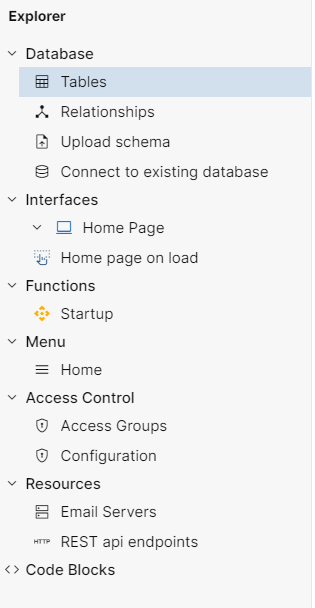
Fig 16: Explorer Panel
https://youtu.be/jRsKntqqQYE?si=QqPuTC_nimFii0sT
The explorer panel can be resized by dragging it to the right. This can be done with the help of a cursor. You can use the cursor to increase or decrease the width of the explorer panel.
Fig 18: Resizing explorer panel
The explorer panel has various sections. It can get difficult for a user to differentiate between different options. Therefore, to minimize human error every feature is given a unique Icon such as below,
Screen

Events

Functions

Code Blocks <>
Module Functionalities
The below functionalities are possible in explorer pane modules.
Interfaces: Hovering over the Interfaces section reveals three icons - New Screen, New Event, and New Folder.
The First Icon (
 ) refers to the New Screen. Clicking on this Icon allows users to create a New Screen under the interfaces section.
 The Second Icon (
 ) refers to the New Event. Clicking on this Icon allows users to create a New Event under the interfaces section.
 The Third Icon (
 ) refers to the New Folder. Clicking on this Icon allows users to create a New Folder under the interfaces section. This option can be used to organize screens and events within Interfaces.
Note: In order to complete creating new screens or events, press enter after providing a name in the input field. If you wish to go back or cancel creating, click on delete icon against the entered name. A confirmation popup will appear and the changes will be discarded upon confirmation.

Fig 19: Features against Interfaces
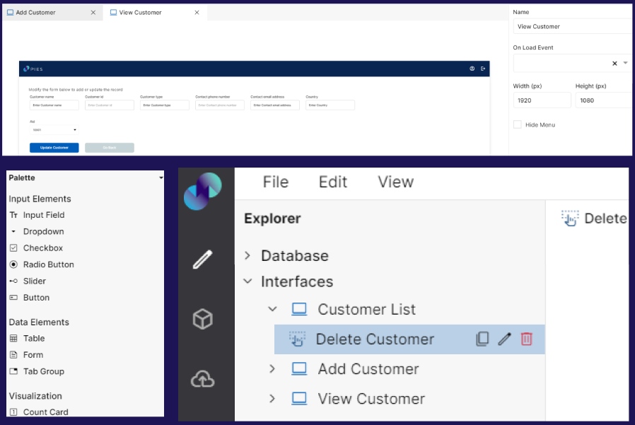
1.1. Screen: Clicking on individual Screen reveals four icons - New Event, Duplicate Screen, Edit Screen, and Delete Screen.
a. The First Icon () refers to New Event. Clicking on this icon creates a New Event & groups it under the respective screen. i.e. an event can be created within a screen thereby allowing users to group relevant screens & events for better .
b. The Second Icon ( ) refers to Duplicate Screen. Clicking on this icon creates a copy of the screen at the end of existing screens & events list under Interfaces. Duplicated screen names will be suffixed by ‘copy’.
c. The Third Icon ( ) refers to Edit Screen. Clicking on this icon allows the user to edit the selected Screen name.
d. The Fourth Icon ( ) refers to Delete Screen. Upon clicking, you will get a confirmation popup to proceed with deletion. Selected screen will be deleted upon confirmation.

Fig 20: Feature Against a Particular Screen
1.2. Event: Clicking on an individual event reveals three icons - Duplicate Event, Edit Event, and Delete Event.
a. The First Icon ( ) refers to Duplicate Event. Clicking on this icon creates a copy of the event under interfaces section. The duplicated event name will be suffixed by ‘copy’.
b. The Second Icon ( ) refers to the Edit Event. Clicking on this icon allows the user to edit the event name.
c. The Third Icon ( ) refers to Delete Event. Upon clicking, you will get a confirmation popup to proceed with deletion. Selected event will be deleted upon confirmation.

Fig 21: Features Against Event
1.3. Folder: Hovering over an individual folder reveals five icons - New Screen, New Event, Edit Folder, New Folder and Delete Folder
The first Icon (
) refers to New Screen. Clicking on this icon allows users to create a new screen under the respective folder The second icon (
) refers to New Event. Clicking on this icon allows users to create a new event under the respective folderThe third Icon (
) refers to Edit folder. Clicking on this icon allows the user to edit the folder name.The fourth Icon (
 ) refers to New Folder. Clicking on this icon allows user to create another sub folder under the selected main folder.
The fifth Icon (
) refers to Delete folder. Upon clicking, you will get a confirmation popup to proceed with deletion. Selected folder will be deleted upon confirmation. Note: Deleting folder will also delete all the screens & events under that folder.
https://youtu.be/4IrWpXYR5ZQ?si=vPbf2nsMfYKIBzmf
Functions: Hovering over the Functions section reveals two icons - New Function and New Folder.
The First Icon (
) refers to New Function. Clicking on this icon creates a New Function under the Functions section. Duplicated function name will be suffixed by ‘copy’The Second Icon (
) refers to New Folder. Clicking on this icon creates a New Folder under the Functions section. This option can be used to organize functions based on preference.

Fig 22: Features against Functions
2.1. Function: Clicking on an individual Function reveals three icons - Duplicate Function, Edit Function, and Delete Function.
a. The First Icon () refers to a Duplicate Function. Clicking on this icon creates a copy of the function under Functions section. Duplicated function name will be suffixed by ‘copy’.
b. The Second Icon () refers to Edit Function. Clicking on this icon allows users to edit the function name.
c. The Third Icon () refers to Delete Function. Upon clicking, you will get a confirmation popup to proceed with deletion. Selected function will be deleted upon confirmation.

Fig 23: Feature Against a Particular Function
2.2. Folder: Hovering over an individual folder reveals four icons - New Function, Edit Folder, New Folder and Delete Folder
The first Icon (
) refers to New Function. Clicking on this icon allows users to create a new function under the respective folder in Functions section. The second Icon (
) refers to Edit folder. Clicking on this icon allows the user to edit the folder name.The third Icon (
) refers to New Folder. Clicking on this icon allows user to create another sub folder under the selected main folder.The fourth Icon (
) refers to Delete folder. Upon clicking, you will get a confirmation popup to proceed with deletion. Selected folder will be deleted upon confirmation. Note: Deleting folder will also delete all the functions under that folder.
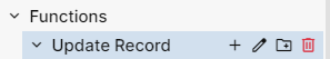
Fig 24: Features against functions folder
https://youtu.be/ebyqQrDDcws?si=reh49JJ-dJQ3EdlG
3.Code Blocks: Hovering over Code Blocks reveals New Code Block icon
New Code Block Icon ( ) refers to adding a new custom widget or code block. Clicking on this Icon allows users to create a new code block.

Fig 25: Feature against Code Blocks
3.1. Code Block: Clicking on an individual Code Block reveals two icons - Edit code_block and Delete code_block.
Edit code_block (
) - refers to Edit Code Event. Clicking on this Icon allows users to edit the existing code block name.Delete code_block (
) - refers to Delete Code Block. Clicking on this Icon allows users to delete the created code block. Upon clicking, you will get a confirmation popup to proceed with deletion. Selected code block will be deleted upon confirmation.
Fig 26: Features against individual Code Block
NOTE: The rest of the sections such as Database, Menu, Access Control, and Resources do not have any of the above-mentioned features against them.
Palette Information
A palette is a list of attributes that are used to build an application by dragging and dropping the attributes onto the canvas. The modules that have palette linked to them are Screens, Events, and Functions. Clicking on any of the Screen, Event or Function opens a Palette below the Explorer panel. Each module has a different set of attributes in its Palette. The palette will change depending on what the user has clicked or selected in Explorer. The palette can be resized just like the explorer panel with the help of a resizing cursor.
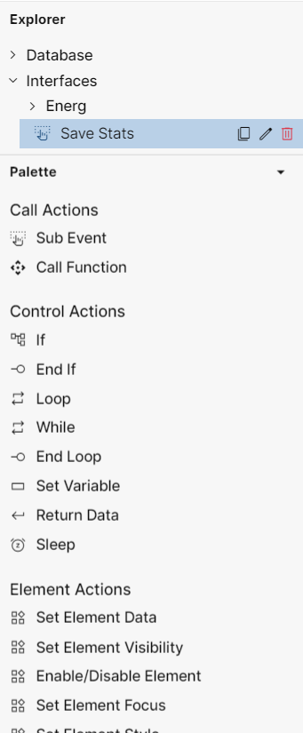
Fig 27: Palette Example for Events
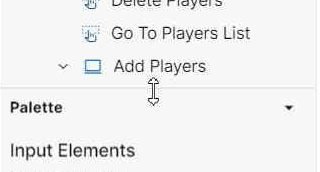
Fig 28: Palette Resizing with the Help of Cursor
https://youtu.be/oqMxDavAkO0?si=PGhV38xoln-YwDod
Folder Structure
The Explorer panel has various sections that help in building the application as discussed above. To create a clean architecture, it is important to organize the application in a readable manner. This is where the folder structure feature come in handy.
As discussed above, the “New Folder“ icon creates a New Folder in their respective section namely, Interfaces and Functions. Users can also drag and reposition the created folders as desired. However, the only limitation while repositioning the folders is that they cannot be repositioned across different sections i.e. a folder from Interfaces cannot be moved to Functions & vice versa.
Users can rename the folder using the Edit Folder () icon.
Modules
Below are the different modules involved in building an end-to-end application.
DATABASE INTERFACES
Create and Modify Databases
Build User Interface & User Initiated Events
FUNCTIONS MENU
Create Processing Logic
Create & Style Menu
ACCESS CONTROL RESOURCES
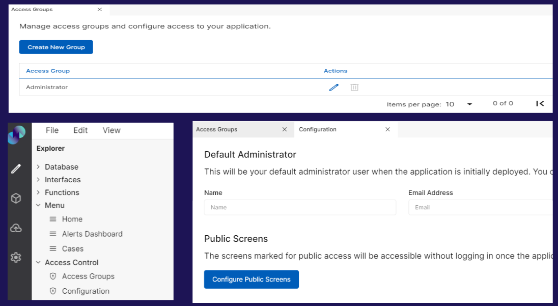
Create & Define User Groups
Add Email Servers & REST API Endpoints